
Building a landing page can sound like one of those projects that requires coding skills, expensive software, or hours of fighting with a page builder.
It doesn’t have to.
In this guide, I’m going to show you how to build a landing page in WordPress using Divi 5 and the same kind of hands-on process I use while building LaunchForge Studio.
We aren’t going to start with a finished template and pretend it magically appeared. We’re going to build the page from scratch so you can see how the pieces actually fit together.
By the end, you’ll have a simple landing page with a clear headline, supporting content, a call to action, and a layout that works across desktop, tablet, and mobile.
More importantly, you’ll understand why each part of the page is there, so you can use the same process when building landing pages for your own business, offers, lead magnets, or marketing campaigns.
What We’re Going to Build
For this tutorial, we’re keeping the landing page intentionally simple.
We’ll build a page that includes a strong hero section, supporting copy, a clear call to action, and the essential structure needed to guide a visitor toward one specific next step.
That’s one of the biggest differences between a landing page and a typical website page.
A normal website might give visitors several places to go. A landing page is usually built around one primary goal.
That goal could be joining an email list, requesting information, registering for something, downloading a resource, or clicking through to an offer.
For our example, the goal is simple: create a clean landing page in Divi 5 and learn the process behind building it.
Before You Start Building
Before opening the Divi 5 Visual Builder, it helps to decide what you want your landing page to accomplish.
You don’t need a complicated marketing plan. You just need to answer one question:
What is the one action I want someone to take on this page?
For LaunchForge Studio, that might mean joining the Build Along email audience, exploring a business tool, reading a guide, or visiting a specific resource.
Your goal may be completely different.
The important part is choosing that goal before you start designing. Otherwise, it is easy to start adding sections, buttons, images, and other elements simply because they look good rather than because they help the page do its job.
For this tutorial, we’ll keep the structure straightforward:
- A hero section that immediately explains the purpose of the page
- Supporting content that gives the visitor a reason to keep reading
- A clear call to action
- A simple visual hierarchy that makes the page easy to scan
- Responsive adjustments for desktop, tablet, and mobile
Once you know what the page needs to accomplish, you’re ready to start building.
Step 1: Build a Landing Page in WordPress
From your WordPress dashboard, go to Pages → Add New.
Give the page a descriptive title. This can be changed later, so don’t spend too much time trying to come up with the perfect name.
Once the page has been created, you’ll see the option to Use The Divi Builder.
Click that button to begin working with Divi 5.
Step 2: Build the Basic Landing Page Structure in Divi 5
Once the Divi 5 Visual Builder opens, you can begin building the actual landing page.
For this example, I chose Build From Scratch because I wanted to keep the page simple and show how the basic pieces fit together instead of starting with a premade layout.
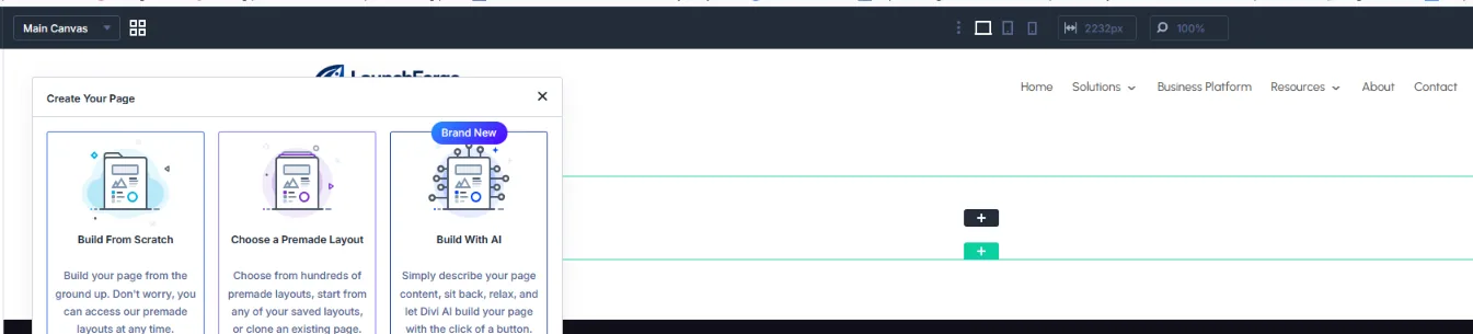
Divi 5 gives you three ways to begin a page. For this tutorial, I chose Build From Scratch so we could create the landing page one piece at a time.
Divi 5 gives you a flexible page structure where sections, rows, columns, and modules work together to create the layout.
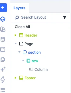
The Divi 5 Layers panel makes it easy to see the basic page structure: a section containing a row and column.
For this landing page, we only need a simple one-column structure.
Inside that column, we’ll add the three main elements of the page:
- A clear headline
- Supporting text
- A call-to-action button
That’s enough to create the foundation of a focused landing page without making the design more complicated than it needs to be.
Step 3: Add the Headline and Supporting Copy
With the basic structure in place, the next step is adding the message visitors will see first.
I started with a simple headline:
Build a Landing Page That Turns Visitors Into Leads
The goal of the headline is not to explain everything. It should quickly tell visitors what the page is about and give them a reason to keep reading.
Directly underneath it, I added a short supporting sentence:
Create a focused landing page with a clear message, a strong call to action, and a layout designed to guide visitors toward one specific goal.
This gives the headline a little more context without overwhelming the visitor with a large block of text.

The landing page headline and supporting copy added inside the Divi 5 Visual Builder before adding the call-to-action button.
When you’re building your own landing page, keep this opening area focused. A visitor should be able to understand the purpose of the page within a few seconds.
The headline gets their attention. The supporting copy explains the value. The next element gives them something to do.
Step 4: Add a Clear Call to Action
Once the headline and supporting copy are in place, the landing page needs to tell the visitor what to do next.
In Divi 5, I added a Button module directly below the text and changed the button copy to:
GET STARTED
I then linked the button to the LaunchForge Studio Build Along signup page.
Your call to action will depend on the goal of your landing page. You might want visitors to join an email list, download a guide, register for an event, request more information, or visit an offer.
Whatever the goal is, keep the button text clear and easy to understand.
I also gave the button some simple styling using the LaunchForge Studio brand colors:
- Background: #FF6B2C
- Text: #FFFFFF
- Border: 0px
- Border Radius: 6px
- Padding: 14px top and bottom, 24px left and right
There is no need to overdesign a call-to-action button. It simply needs to stand out from the rest of the page and make the next step obvious.

The finished GET STARTED call-to-action button added below the headline and supporting copy in Divi 5.
At this point, our basic landing page has everything it needs: a headline, supporting copy, and one clear action.
Step 5: Keep the Landing Page Focused on One Goal
One of the easiest mistakes to make when building a landing page is adding too much.
More buttons. More links. More sections. More information.
Before long, the visitor has several different directions they can go.
For this example, I intentionally kept the landing page basic because the goal is simple: guide the visitor toward one primary action.
That is also why the headline, supporting copy, and GET STARTED button all work together instead of competing for attention.
As you build your own page, ask yourself one question:
What is the single most important thing I want someone to do after landing here?
Once you know the answer, build the page around that action.
You can always add testimonials, benefits, images, frequently asked questions, or other supporting content later. But those elements should strengthen the primary goal rather than distract from it.
A simple landing page with a clear purpose can be more effective than a complicated page filled with elements that do not help move the visitor forward.
Step 6: Check the Landing Page on Desktop, Tablet, and Mobile
A landing page is not finished just because it looks good on a desktop computer.
Visitors may reach your page from a phone, tablet, laptop, or larger screen, so responsive design needs to be part of the building process.
Divi 5 includes responsive editing tools that let you preview and adjust the design for different screen sizes.
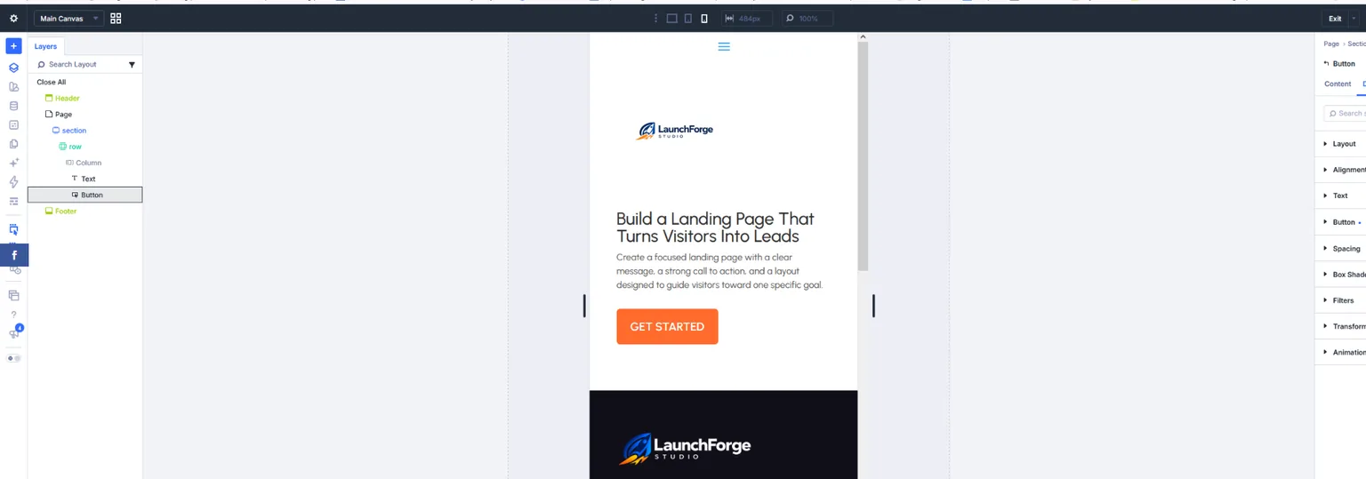
Divi 5’s responsive preview makes it easy to check how a landing page looks and functions on smaller screens before publishing.
Before publishing your page, check things such as:
- Headline size and line breaks
- Paragraph readability
- Button size and placement
- Spacing between elements
- Images that may be too large on smaller screens
- Sections that feel crowded or leave too much empty space
You do not need to redesign the entire landing page for every device.
The goal is simply to make sure the message remains clear, the page is easy to read, and the call to action is easy to find and use.
For a simple page like the one we built, this process should be fairly quick. But it is still worth checking before the page goes live.
A landing page only works if visitors can comfortably use it on the device they happen to be holding.
Step 7: Preview, Test, and Publish Your Landing Page
Before publishing, take a few minutes to test the page as if you were a visitor seeing it for the first time.
Read the headline and supporting copy from top to bottom. Make sure the message is clear and that the call to action naturally feels like the next step.
Most importantly, click the button yourself.
Make sure it goes to the correct destination and that any signup form, offer, download, or other action on the other side works as expected.
It is surprisingly easy to spend time designing a page and forget to test the one thing the page was created to do.
Once everything is working, save your changes in Divi 5 and publish the page in WordPress.
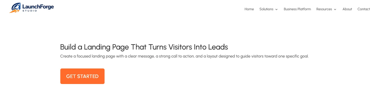
The finished landing page shown outside the Divi 5 Visual Builder, giving us the same clean view a visitor will see.
What We Built
We started with a blank WordPress page and built a simple landing page from scratch using Divi 5.
The finished page includes:
- A focused one-column layout
- A clear headline
- Supporting copy
- One primary call to action
- Simple button styling
- A working destination for the CTA
- A structure that can be adjusted for different screen sizes
Nothing about the page is particularly complicated — and that is the point.
You do not need dozens of sections, complicated animations, or an elaborate design to start building useful landing pages.
Start with the goal.
Build the essential pieces around it.
Then improve the page as you learn what your visitors actually need.
Final Thoughts: Start Simple and Improve From There
The biggest lesson from building this landing page is that you do not need to make the process complicated.
Divi 5 gives you plenty of options for creating more advanced layouts, adding additional modules, building responsive designs, and customizing nearly every part of a page.
But having more options does not mean you need to use all of them.
When you’re learning how to build a landing page in WordPress, starting with a simple structure makes it much easier to understand what each part of the page is actually doing.
Create a clear message.
Give visitors a reason to care.
Show them exactly what you want them to do next.
Then test the page and improve it over time.
That is the same approach I have been taking while building LaunchForge Studio — learn the tools by actually using them, keep what works, change what doesn’t, and continue building from there.
If you’re working on your own website, funnel, or online business, don’t wait until you have every detail figured out before you start.
Build the first version. Learn from it. Make the next version better.
That is how the tools eventually stop feeling like tools and start becoming part of the business you’re building.