What is a landing page, and why do so many online businesses use them?
At its simplest, a landing page is a focused web page designed to get a visitor to take one specific action.
That action might be joining an email list, downloading a guide, registering for a webinar, requesting more information, starting a free trial, or buying a product.
Unlike a typical website page that may give visitors several places to go, a landing page usually removes unnecessary distractions and focuses attention on a single goal.
That simplicity is what makes landing pages such an important part of online marketing.
A visitor clicks a link in an email, advertisement, social media post, search result, or other traffic source. They arrive on the landing page, see a message related to what brought them there, and are presented with a clear next step.
When the visitor completes that action, marketers call it a conversion.
While building LaunchForge Studio, I have been using landing pages as part of the same process we are documenting throughout this site: build something, understand why it works, and then improve it.
In this guide, we are going to break down how landing pages work, what they should include, when to use one, common mistakes to avoid, and how a landing page fits into the larger process of turning website traffic into leads and customers.
By the end, you will not only know what a landing page is—you will understand what job it is supposed to do for your online business.
What Is a Landing Page?
A landing page is a web page created around one specific goal or action.
Instead of giving visitors a full menu of choices, a landing page guides them toward a particular next step. That might be entering an email address, clicking a button, downloading something, registering for an event, requesting a quote, or making a purchase.
The key word is focus.
A normal business website may need to introduce the company, explain its services, display articles, provide contact information, and help visitors explore different areas of the site.
A landing page has a much narrower job.
For example, imagine you create a free checklist called 10 Things You Need Before Starting an Online Business.
You could send visitors to your homepage and hope they find the checklist.
Or you could create a dedicated landing page that explains what the checklist provides and gives the visitor one obvious action:
Enter your email address to get the checklist.
That second approach removes many of the decisions the visitor would otherwise have to make.
This is why landing pages are commonly used with advertising campaigns, email marketing, social media promotions, lead magnets, product launches, webinars, and other campaigns where you want traffic to take a measurable action.
The page does not need to be complicated.
It needs to make three things clear:
Why am I here?
What am I being offered?
What should I do next?
When a landing page answers those questions quickly, the visitor has a much clearer path forward.
How Does a Landing Page Work?
A landing page works by creating a focused path between where a visitor comes from and what you want that visitor to do next.
The basic process looks like this:
Traffic → Landing Page → Call to Action → Conversion
Let’s break that down.
1. Someone Clicks a Link
Every landing page needs visitors.
Someone might arrive after clicking an advertisement, email link, social media post, search result, banner, or another link somewhere online.
The important part is that the visitor usually arrives with a reason for clicking.
If an email promises a free guide about starting an online business, the landing page should immediately continue that same message.
2. The Landing Page Presents the Offer
Once the visitor arrives, the page explains what is being offered and why it matters to them.
This is where the headline, supporting copy, images, benefits, and other page elements work together.
The goal is not to explain everything about your entire business.
The goal is to give the visitor enough relevant information to decide whether they want to take the next step.
3. The Visitor Sees a Call to Action
The call to action, often shortened to CTA, tells the visitor exactly what to do next.
A CTA might say:
Get the Free Guide
Join the Email List
Register Now
Start Your Free Trial
Get Started
The CTA should make the next step obvious rather than leaving the visitor wondering what they are supposed to do.
4. The Visitor Takes Action
If the visitor completes the action the landing page was designed to encourage, that action becomes a conversion.
For a lead-generation page, a conversion might mean someone submits an email address.
For a sales page, it might mean someone completes a purchase.
For a webinar page, it could mean someone registers for the event.
The exact conversion changes depending on the purpose of the page, but the principle stays the same:
One page → One primary goal → One measurable action.
That simple process is the foundation behind how landing pages work.
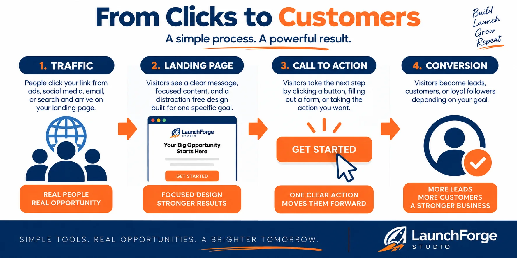
A landing page creates a focused path from traffic to one clear call to action and a measurable conversion.
Landing Page vs. Regular Website Page
A landing page and a regular website page can look similar, but they are usually built for different purposes.
A typical website is designed to help visitors explore.
Your homepage might introduce your business, explain what you do, link to your services, feature recent articles, provide contact information, and give visitors several different paths to follow.
That makes sense because a website often needs to serve people who arrive with different questions and intentions.
A landing page is different.
Instead of encouraging exploration, it usually tries to reduce the number of choices and guide the visitor toward one primary action.
For example, the LaunchForge Studio website gives visitors several options. Someone can explore guides and tutorials, learn about business tools, read articles, investigate different solutions, or join the Build Along.
A landing page promoting one specific offer would narrow those choices considerably.
The difference can be summarized simply:
Website page → Explore and learn
Landing page → Focus and act
Neither approach is better in every situation. They simply serve different jobs.
If someone searches for information about your company, sending them to your main website may make perfect sense.
But if you send an email offering a specific download, run an advertisement for a particular product, or invite people to register for an event, a focused landing page can provide a clearer path between the original message and the action you want them to take.
This distinction becomes especially important as an online business grows.
Your website can serve as the larger home for your business, while individual landing pages can support specific campaigns, offers, audiences, and goals.
“Your website can serve as the larger home for your business, while individual landing pages can support specific campaigns, offers, audiences, and goals.”
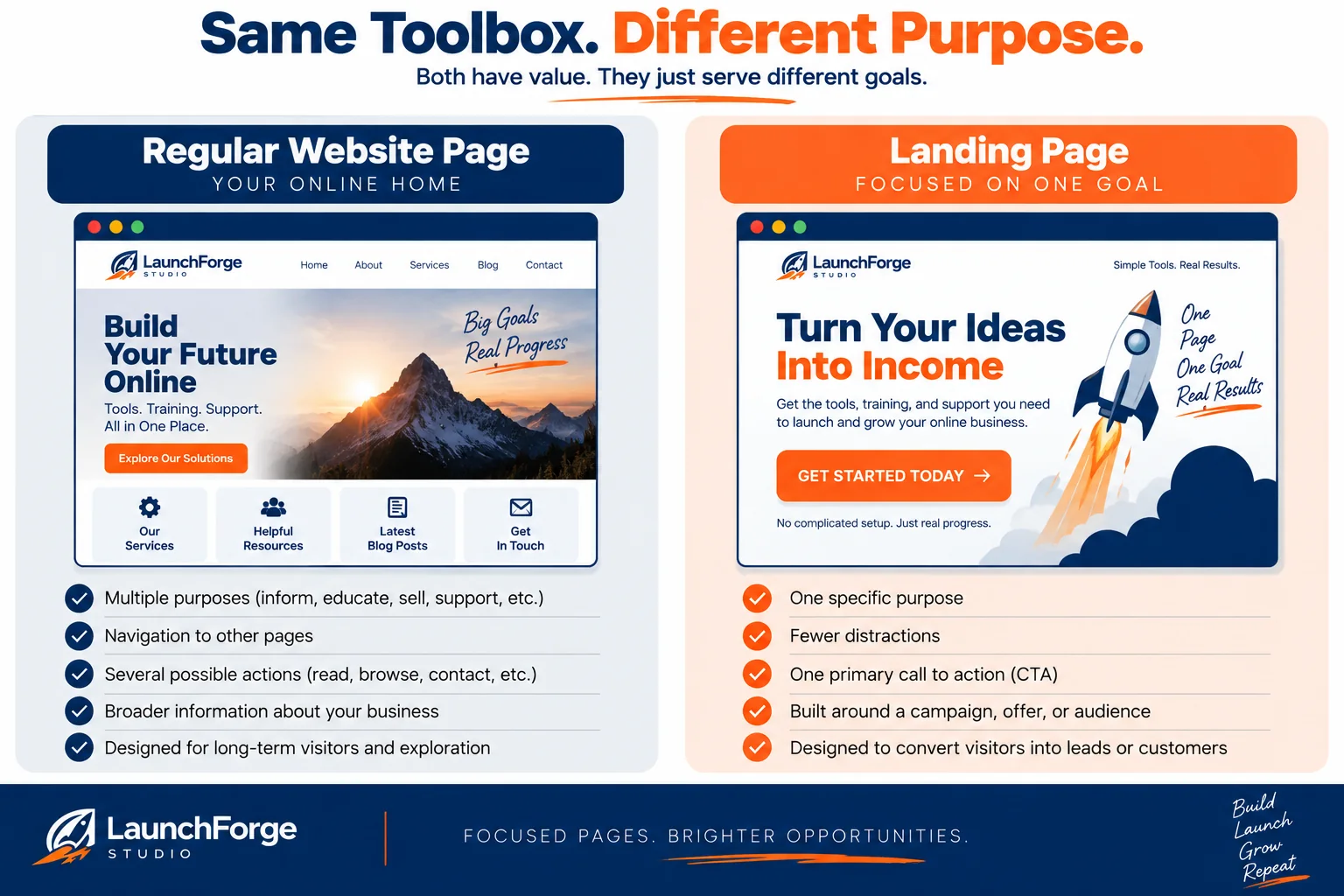
A regular website page can serve multiple purposes, while a landing page is designed around one specific goal and one primary call to action.
What Should a Landing Page Include?
Landing pages can range from extremely simple to highly detailed, but most effective pages are built from the same basic ingredients.
You do not necessarily need every possible landing page element.
What matters is that each element helps the visitor understand the offer and move toward the page’s primary goal.
A Clear Headline
The headline is usually one of the first things a visitor notices.
Its job is to quickly communicate what the page is about and why the visitor should keep reading.
A vague headline forces the visitor to figure things out for themselves. A clear headline immediately connects the page with the reason they clicked.
When we built the simple landing page for our LaunchForge Studio Divi 5 tutorial, we used:
Build a Landing Page That Turns Visitors Into Leads
There is no mystery about what the page is focused on.
Supporting Copy
The headline gets attention. The supporting copy adds enough context for the visitor to understand what comes next.
This could be one sentence, several bullet points, or a longer explanation depending on the offer.
For our example, we followed the headline with:
Create a focused landing page with a clear message, a strong call to action, and a layout designed to guide visitors toward one specific goal.
The supporting copy reinforces the purpose without burying the visitor under unnecessary information.
A Clear Offer or Value Proposition
The visitor should understand what they are getting and why it is worth taking action.
For a lead magnet, that could be a checklist, guide, template, report, or other useful resource.
For a product, it is the benefit or solution being offered.
For an email signup, it is the reason someone should want to hear from you again.
Whatever the offer is, the visitor should not have to hunt through the page to understand it.
A Strong Call to Action
Every landing page needs a clear way for the visitor to complete its primary goal.
That action should match the goal of the page.
A button might say Download the Guide, Join Now, Register Free, Get Your Quote, or Get Started.
On our simple LaunchForge example, we used:
GET STARTED
The wording itself does not need to be clever. Clarity is more important than creativity when someone is deciding what to click.
A Form or Clear Destination
Some landing pages collect information directly through a form.
Others use a button that takes the visitor to another step, such as a signup page, checkout, scheduling page, or registration form.
If you are asking someone to complete a form, only request information you actually need.
Every unnecessary field gives the visitor another reason to stop.
Relevant Visuals
Images, screenshots, illustrations, videos, or product previews can help visitors understand an offer more quickly.
But visuals should have a purpose.
Adding an image simply because there is empty space does not automatically make a landing page better. A useful visual should reinforce the message, demonstrate the product, explain the offer, or help establish context.
Trust Elements
Depending on the goal of the page, visitors may need reassurance before taking action.
Trust elements can include testimonials, customer reviews, recognizable client or partner logos, guarantees, security information, results, credentials, or other evidence supporting the offer.
The key is authenticity.
Real evidence is more valuable than decorative “trust” elements that do not actually prove anything.
A simple landing page may not need all of these components. The more important question is whether the elements you include are helping the visitor move toward the page’s primary goal.
“The more important question is whether the elements you include are helping the visitor move toward the page’s primary goal.”
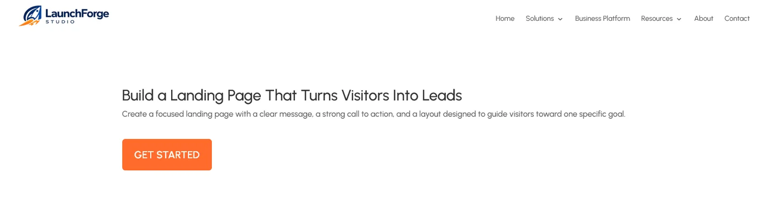
The finished landing page shown outside the Divi 5 Visual Builder, giving us the same clean view a visitor will see.
Different Types of Landing Pages
Not every landing page is designed to accomplish the same thing.
Some collect leads. Others move visitors toward a purchase, registration, download, or another step in a marketing funnel.
Here are several common types you are likely to encounter.
Lead Generation Landing Pages
A lead generation landing page is designed to collect information from a visitor, usually through a form.
The most common example is asking for an email address in exchange for something valuable, such as a guide, checklist, template, newsletter, free training, or other resource.
The visitor receives something useful, and the business gains permission to continue the conversation.
Click-Through Landing Pages
A click-through landing page prepares the visitor for another step rather than collecting information directly on the page.
For example, the page might explain the benefits of a product or service and then use a button to send the visitor to a checkout page, signup form, or another part of the funnel.
Its primary job is to help the visitor understand the offer before asking them to continue.
Sales Landing Pages
A sales landing page is designed to persuade a visitor to purchase a product or service.
These pages may be considerably longer because the visitor often needs more information before making a buying decision.
They can include benefits, product details, demonstrations, testimonials, frequently asked questions, guarantees, pricing information, and a clear way to purchase.
Registration Landing Pages
Registration pages are commonly used for webinars, online events, workshops, demonstrations, courses, and other activities that require someone to reserve a place or create an account.
The goal is straightforward:
Get the visitor registered.
Lead Magnet or Download Pages
These pages focus on a specific downloadable resource.
That might be an ebook, checklist, worksheet, template, report, cheat sheet, or another resource created to solve a particular problem.
In many cases, the visitor provides an email address before receiving the download, making this type of page part of a larger lead-generation system.
The names and designs may vary, but the underlying principle remains the same.
The type of landing page you choose should be determined by what you want the visitor to do next.
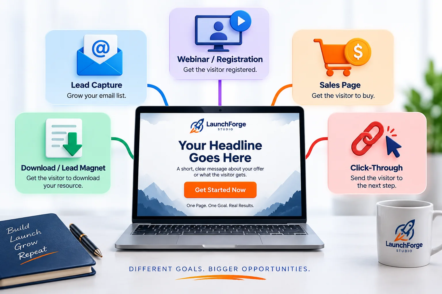
Landing pages can support different goals, from capturing leads and registrations to generating sales, downloads, and click-throughs.
When Should You Use a Landing Page?
You do not need a landing page for every link, promotion, or piece of content you create.
Landing pages are most useful when you have a specific audience, a specific message, and a specific action you want people to take.
Here are some common situations where a dedicated landing page makes sense.
Building an Email List
If your goal is to turn visitors into email subscribers, a landing page can give people a clear reason to join your list.
Instead of sending someone to a busy homepage, you can create a focused page explaining what they will receive by subscribing and provide a simple signup form.
This is especially useful when the signup is connected to a lead magnet, newsletter, email course, or an ongoing series like the LaunchForge Studio Build Along.
Promoting a Lead Magnet
If you create a free checklist, guide, template, ebook, report, or other downloadable resource, a landing page gives that resource its own destination.
The page can explain what the resource contains, who it is for, and why it is useful before asking the visitor to exchange their email address for access.
Running a Paid Advertising Campaign
When someone clicks an advertisement, the page they reach should closely match the message that convinced them to click.
Sending every advertisement to your homepage can force visitors to search for the offer they were promised.
A dedicated landing page lets you continue the same message and direct the visitor toward the intended action.
Promoting a Webinar or Event
Webinars, workshops, demonstrations, live streams, and other events usually have one obvious goal:
Registration.
A landing page can explain what the event covers, who it is for, when it takes place, and what attendees can expect before presenting the registration form or button.
Launching a Product or Offer
When introducing a particular product, service, course, membership, or special offer, a landing page can keep the visitor focused on that specific opportunity.
Instead of competing with everything else on your website, the offer gets a page built specifically around explaining its value and presenting the next step.
Sending Traffic From Email or Social Media
Landing pages can also create a smoother path from an email or social media promotion to the action being promoted.
If a social post says Download the Free Checklist, the landing page should continue talking about that checklist rather than dropping the visitor onto a general website and making them find it.
The closer the landing page matches the message that brought the visitor there, the easier it is for that visitor to understand what to do next.
You probably do not need a landing page when your goal is simply to let someone explore your business or read general information.
But when you can finish this sentence—
“I want this visitor to ______.”
—you may have a good reason to create one.
What Makes a Landing Page Effective?
A landing page does not become effective simply because it has a headline, some copy, and a button.
Those pieces need to work together around the same purpose.
A useful way to think about it is:
One audience. One message. One goal. One obvious action.
One Audience
Start by knowing who the page is for.
Trying to speak to everyone usually produces a message that does not feel particularly relevant to anyone.
A landing page created for someone starting their first online business may need very different language from one created for an experienced marketer looking for advanced automation tools.
The more clearly you understand the visitor, the easier it becomes to decide what belongs on the page.
One Message
The message that brings someone to the landing page should continue when they arrive.
If someone clicks a link promising a guide about building an email list, they should immediately see that same subject reflected in the headline and content of the landing page.
Do not make them wonder whether they landed in the right place.
That connection between the original message and the landing page helps create a smoother experience for the visitor.
One Goal
Before building the page, decide what success actually means.
Do you want the visitor to subscribe?
Download something?
Register?
Request information?
Buy?
If several unrelated actions are competing for attention, the purpose of the page becomes less clear.
A focused landing page makes the primary goal easy to identify.
One Obvious Action
Once you know the goal, make the next step obvious.
Your call to action should be easy to find and clearly connected to what the visitor is being asked to do.
You should not need a treasure map to locate the button or form. 😂
If the goal is to download a guide, make the download action clear.
If the goal is to join an email list, make the signup process clear.
If the goal is to purchase something, make the buying process clear.
Keep Unnecessary Distractions Under Control
Every additional element on a landing page should earn its place.
Extra navigation, unrelated offers, unnecessary links, competing buttons, oversized blocks of copy, and decorative elements can pull attention away from the primary action.
That does not mean every landing page needs to be tiny or completely stripped down.
Some offers require considerably more explanation than others.
The question is whether each element helps the visitor understand the offer, trust the offer, or take the next step.
If it does none of those things, ask whether it needs to be there.
A strong landing page is not necessarily the page with the most impressive design.
It is the page where the visitor can quickly understand:
This is for me.
This is what I get.
This is what I do next.
That is the kind of clarity we want to build around.
Common Landing Page Mistakes
Even a good-looking landing page can struggle if the visitor cannot quickly understand the message or what they are supposed to do next.
Many landing page problems come from adding too much, saying too little, or losing sight of the page’s original goal.
Trying to Accomplish Too Many Things
One of the easiest ways to weaken a landing page is to give it several competing goals.
Join the email list.
Read the blog.
Follow us on social media.
Check out another product.
Contact us.
Download something else.
Suddenly the focused landing page has turned into a digital yard sale. 😂
Decide what the primary action should be and build the page around it.
Using a Weak or Confusing Headline
Visitors should not need several paragraphs to understand why they landed on the page.
If the headline is vague, overly clever, or disconnected from the link they clicked, you risk losing their attention before they ever reach the offer.
A strong headline quickly confirms:
You are in the right place, and this is what this page is about.
Hiding the Call to Action
If the visitor is interested but cannot figure out what to do next, the landing page has created unnecessary friction.
Buttons and forms should be easy to identify.
That does not mean covering the page with flashing BUY NOW buttons.
It means making the primary next step clear when the visitor is ready to take it.
Sending Visitors to the Wrong Message
Imagine clicking an advertisement for a free online business checklist and arriving on a page that mostly talks about website hosting.
Even if both belong to the same business, the experience feels disconnected.
The landing page should continue the promise that caused the visitor to click in the first place.
Adding Too Many Distractions
Navigation menus, unrelated links, competing offers, popups, unnecessary animations, and other page elements can pull attention away from the main goal.
Ignoring Mobile Visitors
A landing page that looks great on a desktop computer can become difficult to use on a smaller screen.
Headlines may wrap awkwardly, buttons can become difficult to tap, forms may be frustrating to complete, and images can overwhelm the screen.
Always check the page on different screen sizes before sending traffic to it.
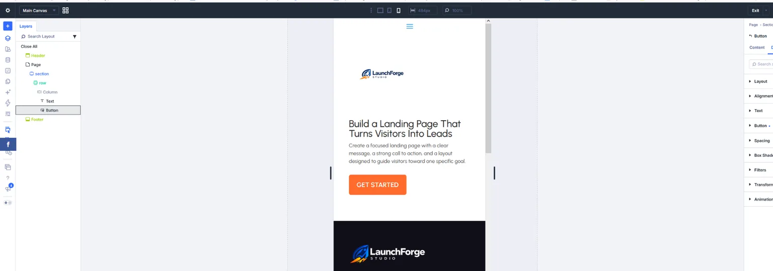
Divi 5’s responsive preview makes it easy to check how a landing page looks and functions on smaller screens before publishing.
Never Testing the Page
Publishing the landing page is not necessarily the end of the process.
Click the buttons.
Submit the forms.
Check the links.
Read the page on desktop and mobile.
Make sure the visitor can actually complete the action you spent all that time asking them to take.
Later, once the page receives enough traffic, you can also evaluate how visitors respond and test changes to elements such as the headline, offer, copy, layout, or call to action.
The goal is not to create a “perfect” landing page on the first attempt.
The goal is to create a clear, functional page, learn from what happens, and improve it over time.
How to Build Your First Landing Page
Once you understand what a landing page is supposed to accomplish, building one becomes much easier.
You do not need to begin with an elaborate design, complicated funnel, or dozens of page elements.
Start with the basics.
Choose One Goal
Before opening a page builder, decide what you want the visitor to do.
Complete this sentence:
The primary goal of this landing page is to get the visitor to ______.
That answer should guide almost every decision that follows.
Decide What You Are Offering
Give the visitor a reason to take that action.
Maybe you are offering a free resource, access to an email series, a webinar registration, information about a product, a consultation, or another clear benefit.
Be able to explain the offer in one or two sentences before trying to build an entire page around it.
Write the Headline and Supporting Message
Create a headline that tells visitors what the page is about.
Then add enough supporting copy to explain the value of the offer and why someone should care.
You can always refine the wording later.
At this stage, clarity matters more than cleverness.
Add the Call to Action
Decide exactly what the visitor needs to do next.
Add the appropriate button, form, or link and make sure the action is easy to understand.
Then test it yourself.
If you cannot move through the process smoothly, your visitor probably cannot either.
Build the Page
Now you can put those pieces together:
Headline → Supporting Copy → Offer → Call to Action
That is enough to build a simple first landing page.
In fact, that is exactly the approach I used when building the demonstration page for LaunchForge Studio.
Rather than starting with a finished template, I built a simple page from scratch so I could document the entire process—creating the page, adding the structure, writing the headline and supporting copy, adding the call-to-action button, checking the mobile layout, and previewing the finished result.
If you want to follow that process yourself, I documented it step by step in:
How to Build a Landing Page in WordPress With Divi 5
That guide takes the concepts we have covered here and turns them into an actual working page.
The important thing is to start simple enough that you understand what you are building.
Once the basic page works, you can improve the design, copy, offer, trust elements, and conversion process as you learn more.
What Happens After the Landing Page?
A landing page is often only one step in a larger journey.
Getting someone to click a button, submit a form, or provide an email address is valuable—but what happens next can be just as important.
This is where landing pages begin connecting with sales funnels and marketing systems.
A simple journey might look like this:
Traffic → Landing Page → Signup → Thank-You Page → Follow-Up Email
For example, imagine someone discovers a LaunchForge Studio post offering a free guide for starting an online business.
They click the link and arrive on a landing page.
The landing page explains what the guide provides and asks for an email address.
The visitor signs up.
They are then taken to a thank-you page and receive an email containing the resource.
Over the following days, additional emails could provide useful tutorials, introduce related resources, or help that subscriber take the next step.
The landing page did its job—but it was only one part of the complete process.
This Is Where Funnels Begin
A funnel is essentially a series of connected steps designed to move someone from one stage of a customer journey to another.
Not every funnel needs to be complicated.
In fact, one of the simplest funnels could be:
Visitor → Landing Page → Email Subscriber
A more developed funnel might continue:
Visitor → Landing Page → Email Subscriber → Follow-Up → Offer → Customer
Understanding this relationship is important because a landing page should not be built in isolation.
Before publishing one, ask yourself:
Where is the visitor coming from?
What do I want them to do on this page?
What happens immediately after they do it?
Those three questions help connect the landing page to the larger system behind your online business.
As we continue building LaunchForge Studio, this is also where our Landing Pages & Funnels guides will expand.
We can build the individual pieces, connect them together, test what happens, and document the process along the way.
That is when a collection of individual pages starts becoming an actual online business system.
Landing Page FAQs
Do I Need a Website to Have a Landing Page?
Not necessarily.
A landing page can exist as part of a larger website, but it can also function as a standalone page created for a particular campaign or offer.
If you are building a long-term online business, having a main website can provide a central home for your content, brand, products, services, and resources while landing pages handle more focused goals.
Can a Landing Page Be My Homepage?
Technically, yes, but the two usually serve different purposes.
A homepage typically introduces the broader business and gives visitors several paths to explore.
A landing page usually focuses on one audience, message, goal, and action.
If your entire website has one very specific purpose, the distinction can become less obvious. For most businesses, however, the homepage and landing pages have different jobs.
Do Landing Pages Need Navigation?
Not always.
Because landing pages are designed around a focused action, some remove or reduce the normal website navigation to limit distractions.
That does not mean navigation is automatically bad.
The decision should depend on the purpose of the page and whether those additional links help the visitor or pull attention away from the primary goal.
Can a Landing Page Rank in Google?
Yes, landing pages can appear in organic search results when they are accessible to search engines and provide content relevant to what people are searching for.
However, not every landing page needs to be created for SEO.
A page built specifically for a short advertising campaign, email promotion, or temporary offer may have a completely different purpose from an informational page designed to attract organic search traffic.
The important thing is to understand where you expect your visitors to come from before deciding how the page should be built and optimized.
How Many Landing Pages Can a Business Have?
There is no single number that works for every business.
A business might have separate landing pages for different products, lead magnets, advertising campaigns, audiences, events, services, or offers.
Creating more pages simply for the sake of having more pages is not the goal.
Each landing page should have a clear reason to exist.
How Long Should a Landing Page Be?
Long enough to give the visitor the information they need to make the next decision—and no longer simply for the sake of length.
A simple email signup might require only a headline, short explanation, and form.
A higher-priced product or service may require considerably more information before someone feels comfortable taking action.
Instead of asking whether a landing page should be short or long, ask:
What does this visitor need to know before taking the next step?
That answer should help determine how much content belongs on the page.
Final Thoughts: One Page, One Goal
Landing pages can become sophisticated, but the basic idea behind them is surprisingly simple.
You bring a visitor to a page for a reason.
The page continues the message that brought them there.
It explains what is being offered.
And it gives them a clear next step.
That is why the principle we have used throughout this guide is worth remembering:
One audience. One message. One goal. One obvious action.
You do not need to master conversion optimization, advanced funnels, or complicated marketing automation before building your first landing page.
Start with the purpose.
Build the simplest version that accomplishes that purpose.
Make sure it works.
Then learn from what happens and improve it.
That is the same approach we are taking while building LaunchForge Studio.
Rather than pretending every system arrived perfectly assembled, we are building the pieces, testing the tools, documenting the decisions, and sharing what we learn along the way.
If you are ready to move from understanding landing pages to actually building one, the next step is our hands-on guide:
How to Build a Landing Page in WordPress With Divi 5
There, you can follow the process from a blank WordPress page to a finished landing page with a headline, supporting copy, call to action, and responsive layout.
Because ultimately, understanding the concept is useful.
Building it is where the learning really begins.