A high converting landing page is not simply a page with a bold headline, a bright button, and a form asking for someone’s email address.
It is a focused page built around one specific goal. Every major element—from the headline and supporting copy to the call to action, trust signals, images, and page layout—should help move the visitor toward that goal.
That does not mean there is one perfect landing page design or a universal conversion rate every business should chase. A page that works well for a free guide may look very different from one promoting a webinar, software trial, service, or paid product. What matters is whether the page makes the offer clear, reduces unnecessary friction, builds enough trust, and gives the right visitor a compelling reason to take the next step.
That is what we are going to focus on in this guide.
We will break down the elements that can make a landing page more effective, how those elements work together, and how to approach the page as a complete conversion path rather than a collection of disconnected design tricks.
The goal is not to build a page that merely looks impressive.
The goal is to build a page that makes it easier for the right visitor to understand the offer, decide whether it is relevant, and take action.
What Makes a Landing Page High Converting?
A high-converting landing page does one important thing well: it helps the right visitor move from interest to action with as little confusion and unnecessary friction as possible.
That action might be joining an email list, downloading a lead magnet, registering for a webinar, requesting information, starting a trial, or purchasing a product. The specific conversion can change, but the page still needs a clear purpose.
This is why conversion starts before choosing colors, images, button styles, or page-building tools. You first need to know exactly what you want the visitor to do and why that action should matter to them.
An effective landing page usually brings several elements together:
- One clearly defined conversion goal
- A headline that quickly communicates the main value
- Supporting copy that explains the offer without unnecessary clutter
- A clear call to action
- Visuals that support rather than distract from the message
- Trust signals that reduce uncertainty
- A simple path from arrival to action
- A page experience that works well on both desktop and mobile devices
None of these elements works entirely on its own. A great headline cannot rescue an irrelevant offer. A beautiful design cannot fix confusing copy. A strong call to action will struggle if visitors do not understand what they are getting.
The real strength of a landing page comes from how these pieces work together around one focused goal.

Effective landing pages combine a clear message, focused call to action, trust signals, minimal distractions, and continuous improvement.
That gives us the first principle for building a page designed to convert:
Start with the conversion goal before you start designing the page.
1. Start With One Clear Conversion Goal
Before writing the headline or designing the page, decide exactly what you want the visitor to do.
Not three things. Not five different options competing for attention. One primary action.
For example, the goal might be to:
- Join your email list
- Download a free guide
- Register for a webinar
- Request a quote
- Start a free trial
- Schedule a consultation
- Purchase a specific product
Once that goal is clear, every major decision on the landing page becomes easier to evaluate.
Ask a simple question:
Does this element help the visitor understand the offer and move toward the primary action?
If it does, it may belong on the page. If it creates another path, introduces an unrelated message, or distracts from the main objective, consider removing it.
This does not mean a landing page has to be extremely short or stripped of useful information. Some offers require more explanation, evidence, or reassurance than others. A visitor considering a higher-priced product may need considerably more information than someone downloading a free checklist.
The important distinction is that additional content should support the same conversion goal rather than introduce competing goals.
That focus is one of the biggest differences between a landing page and a traditional website. A website can invite visitors to explore multiple pages and learn about different parts of a business. A landing page usually works best when the path forward is much more deliberate.
Before building anything else, write down the single action you want the visitor to take.
That becomes the foundation for the rest of the page.
2. Make the Value Clear Immediately
Once you know the conversion goal, the next job is making the value of the offer obvious.
Visitors should not have to study the page to figure out what they are looking at, who it is for, or why they should care.
The top of the landing page should quickly communicate three things:
- What you are offering
- Who or what it can help
- What the visitor should do next
This is where the headline and supporting message do much of the heavy lifting.
A vague headline such as “Take Your Business to the Next Level” may sound polished, but it tells the visitor very little. What kind of business? What will improve? What are they actually being offered?
Compare that with a more specific message:
“Build Your First Landing Page Without Writing Code”
The second version immediately gives the visitor more context. They know what the offer is about and can quickly decide whether it is relevant to them.
Lead With the Benefit, Not Just the Feature
Features explain what something includes. Benefits help visitors understand why those features matter.
Suppose you are offering an email marketing platform with automated follow-up sequences.
The feature might be:
Automated email sequences
The benefit might be:
Follow up with new leads automatically without sending every email yourself.
Both pieces of information can be useful, but the benefit connects the feature to an outcome the visitor can understand.
This does not mean every headline needs to make an enormous promise. In fact, exaggerated claims can make a page less believable.
Clear and specific usually beats clever and vague.
Before moving farther down the page, a visitor should have a reasonable understanding of what you are offering and why taking the next step could be worthwhile.
If that message is unclear at the top of the page, everything underneath it has to work much harder.
3. Keep the Message Focused and Easy to Scan
People do not always read a landing page from top to bottom.
They scan.
They notice the headline, glance at subheadings, look at images, read a few bullet points, and decide whether something deserves more of their attention.
That means the page needs to communicate its message even when someone is moving through it quickly.
Build a Clear Information Hierarchy
The most important information should be the easiest to notice.
A useful structure might include:
- A clear primary headline
- A short supporting message
- The main benefits of the offer
- Relevant proof or trust signals
- Additional details that answer important questions
- A clear call to action
Headings and subheadings help break the page into logical sections, while short paragraphs make the content easier to process.
The goal is not to remove useful information simply to make the page shorter. The goal is to organize that information so visitors can understand the offer without digging through unnecessary clutter.
Remove Competing Messages
Every additional message asks for a little more of the visitor’s attention.
If a landing page is promoting a webinar, for example, that probably is not the place to introduce three unrelated products, promote your latest five blog posts, and ask visitors to follow every social media account you own.
Those things may be useful elsewhere on your website, but they compete with the reason the visitor arrived on the landing page.
Keep asking:
Does this help the visitor move toward the conversion goal?
If the answer is no, the element may not need to be there.
A focused page does not have to feel empty. It simply gives each piece of content a reason to exist.
4. Create a Clear and Specific Call to Action
A visitor can understand the offer, like what they see, and still leave without converting if the next step is unclear.
That is why the call to action is one of the most important elements on a landing page.
Your call to action should tell visitors what you want them to do next.
Generic button text such as:
Submit
or
Click Here
may technically describe an action, but it does not communicate much about what happens after the click.
More specific calls to action can reinforce the offer:
Download the Free Guide
Reserve My Spot
Start My Free Trial
Get the Checklist
See the Plans
The wording should match the action the visitor is actually taking. Do not make the button promise something different from what happens next.
Make the Primary Action Easy to Find
Visitors should not have to hunt for the next step.
The primary call to action should be visually noticeable and positioned where it makes sense in the visitor journey. On a longer landing page, repeating the same primary call to action can also make sense as visitors move through different sections.
Repetition is different from competition.
Several buttons leading toward the same goal can reinforce the conversion path. Several buttons asking visitors to take unrelated actions can weaken it.
The surrounding copy matters too. If someone is being asked to provide an email address, start a trial, schedule a call, or make a purchase, they may need additional context before they are comfortable clicking.
The job of the page is to provide enough clarity and confidence that the call to action feels like a logical next step rather than an abrupt demand.
A strong CTA does not need to scream at the visitor.
It needs to make the next step unmistakably clear.
5. Build Trust and Reduce Uncertainty
A landing page asks visitors to take some kind of action.
Even a simple email signup requires the visitor to give you something. A purchase requires considerably more trust. The greater the commitment, the more questions and uncertainty the visitor may have before taking the next step.
Trust signals help answer those concerns.
Depending on the offer, useful trust signals might include:
- Customer testimonials
- Reviews or ratings
- Real examples or results
- Client or partner logos
- Clear contact information
- Guarantees or refund policies
- Secure payment information
- Privacy information near a signup form
- Specific details about what the visitor will receive
The important word is real.
Do not manufacture testimonials, exaggerate results, or fill a landing page with impressive-looking claims you cannot support. Trust is much easier to lose than it is to build.
Answer the Questions That Could Stop the Conversion
Trust is not created only through testimonials and logos.
Clarity itself builds confidence.
Before asking someone to take action, consider what might make them hesitate.
If you are offering a free download, visitors may want to know what is included and whether they will receive additional emails.
If you are promoting a webinar, they may want to know when it takes place, how long it lasts, and what they will learn.
If you are selling a product or service, questions about pricing, delivery, support, cancellation, or refunds may become much more important.
You do not need to answer every imaginable question on the page. Focus on the questions most likely to affect the visitor’s decision.
The easier it is for someone to understand what they are getting, what happens next, and who is behind the offer, the less uncertainty stands between the visitor and the conversion goal.
Trust does not come from making the biggest promise.
It comes from giving visitors enough credible information to make an informed decision.
6. Reduce Friction Between the Visitor and the Goal
Every extra step between a visitor and the conversion goal creates another opportunity for that person to leave.
That does not mean every landing page should contain nothing more than a headline and a button. It means you should avoid asking visitors to do unnecessary work.
One of the easiest places to see this is in a lead capture form.
If someone is downloading a simple free checklist, do you really need their first name, last name, phone number, company name, job title, mailing address, and favorite breakfast cereal?
Probably not.
If all you need to deliver the resource and continue the conversation is an email address, asking for substantially more information can create friction without adding much value.
Match the Commitment to the Offer
The amount of information you request should make sense for what the visitor receives.
A simple newsletter signup might require only an email address.
A consultation request may reasonably need a name, email address, phone number, and a few details about what the person needs.
A purchase may require billing and payment information because those details are necessary to complete the transaction.
The goal is not always to make the form as short as physically possible.
The goal is to remove fields and steps that do not need to be there.
Look Beyond the Form
Friction can appear elsewhere on the page too.
A visitor may hesitate because:
- The page loads slowly
- The offer is difficult to understand
- The button is hard to find
- The form asks for too much information
- The next step is unclear
- The page does not work well on a phone
- Important pricing or terms are difficult to find
- The visitor is unexpectedly sent somewhere different after clicking
Each of these creates another moment where someone can stop and reconsider.
A high converting landing page should make the desired action feel straightforward. Visitors should understand what they are being asked to do, why they might want to do it, and what will happen afterward.
Removing unnecessary friction does not mean pressuring people into acting faster.
It means removing obstacles that should not have been there in the first place.
7. Use Design to Guide Attention
Good landing page design is not about adding as many impressive visual effects as possible.
It is about helping visitors notice the right information in the right order.
The headline should look important because it is important. The primary call to action should stand out because you want visitors to notice it. Supporting information should be easy to find without competing with the main message.
Design creates a visual hierarchy that helps guide the visitor through the page.
Give Important Elements Room to Breathe
Crowding too many elements together can make even good content difficult to understand.
Whitespace gives headlines, images, benefits, forms, and calls to action enough separation that visitors can quickly recognize what each section is doing.
You do not need to fill every empty area of the page.
Sometimes empty space is doing useful work.
Use Visuals With a Purpose
Images, screenshots, graphics, videos, and other visual elements can make a landing page easier to understand, but they should support the offer rather than simply decorate the page.
A product screenshot can show visitors what they are getting.
A diagram can explain a process.
A photograph can help establish context.
A short video may demonstrate something that would take several paragraphs to explain.
But an unrelated stock image added simply because the page “needs a picture” may contribute very little.
Before adding a visual, ask:
What job is this image doing?
If there is no good answer, the page may be stronger without it.
Keep the Design Consistent
Consistency also helps reduce distraction.
Fonts, button styles, spacing, colors, and visual treatments should feel like parts of the same page rather than pieces borrowed from several unrelated designs.
That does not mean everything has to look identical. Contrast is useful when you intentionally want something to attract attention.
The key word is intentionally.
A high-converting landing page does not need to be the most visually complicated page on the internet.
It needs to make the important things easy to notice and the next step easy to understand.
8. Make the Landing Page Work on Mobile
A landing page can look excellent on a desktop computer and become frustrating the moment someone opens it on a phone.
That matters because mobile visitors are not experiencing a smaller version of your desktop page. They are interacting with the page differently.
They have less screen space. Buttons are tapped instead of clicked. Forms are completed with an on-screen keyboard. Headlines wrap differently. Images resize. Sections that looked compact on a large monitor can suddenly require several swipes to get through.
That means mobile usability should be considered while building the page, not treated as a final cleanup task.
Check the Important Elements First
When reviewing a landing page on mobile, pay particular attention to:
- Headline readability
- Text size and line spacing
- Button size and placement
- Form fields
- Image scaling
- Section spacing
- Page speed
- Unnecessary horizontal scrolling
- Popups or overlays that interfere with the page
- How quickly visitors can understand the offer
The primary call to action should also remain easy to find and use.
A button that looks perfectly sized on desktop may be awkward to tap on a phone. A form that feels simple with a keyboard and mouse may become tedious when someone has to complete several fields using their thumbs.
Test the Actual Page
Responsive previews inside a page builder are useful, but they should not be the only test.
Open the published page on an actual phone.
Scroll through it.
Tap the buttons.
Try the form.
Read the headline at normal viewing distance.
Check whether anything overlaps, disappears, becomes difficult to read, or requires awkward zooming.
This is one of those situations where a few minutes of real-world testing can reveal problems that are easy to miss while staring at a desktop editor.
A high-converting landing page should make the conversion path clear regardless of the device someone uses to reach it.
If the page becomes difficult to use on mobile, the strength of the desktop design will not rescue that visitor’s experience.
9. Keep the Message Consistent With the Traffic Source
The landing page experience begins before someone reaches the page.
Visitors may arrive from an email, social media post, advertisement, search result, affiliate link, or another page on your website.
Whatever brought them there created an expectation.
The landing page should continue that conversation.
If an advertisement promises a free landing page checklist, the page visitors reach should immediately make that checklist recognizable.
If an email promotes a webinar about building an online business, clicking the link should not lead to a generic homepage where the visitor has to figure out where the webinar went.
This connection between the message that generated the click and the message on the landing page is often called message match.
Continue the Same Promise
The wording does not need to be identical everywhere, but the core offer should remain consistent.
Look at the traffic source and landing page together.
Ask:
- Is the same offer clearly recognizable?
- Does the landing page continue the promise that earned the click?
- Is the visitor immediately in the right place?
- Does the call to action match what they expected to do?
- Are there any surprises that could create confusion?
The stronger the connection between the source and destination, the easier it is for visitors to understand why they landed on the page.
Do Not Make Visitors Start Over
Imagine clicking an ad for a specific free guide and landing on a company’s homepage.
The guide may technically exist somewhere on the website, but now the visitor has to search for it.
That creates unnecessary friction.
A focused landing page lets the visitor continue the journey they already started.
Traffic source → relevant landing page → clear offer → specific action
Each step should feel connected to the one before it.
Getting the click is only part of the job.
The page visitors reach after that click needs to deliver on the expectation that caused them to click in the first place.
10. Make Speed Part of the Landing Page Experience
A landing page cannot persuade someone who gets tired of waiting for it to load.
Large images, unnecessary scripts, excessive animations, third-party widgets, videos, tracking tools, and poorly optimized page elements can all add weight to a page.
Some of those elements may serve a legitimate purpose.
The question is whether the value they provide is worth the additional cost to the visitor experience.
Keep the Page as Lean as the Goal Allows
A landing page often has an advantage over a full website page because it can be built around a narrower purpose.
Use that advantage.
Optimize images before uploading them. Avoid adding plugins or scripts simply because they are available. Be selective with animations and visual effects. If you embed video, forms, tracking scripts, or other third-party tools, understand that they can affect how the page loads and behaves.
This does not mean chasing a perfect performance score at the expense of everything else.
It means avoiding unnecessary weight.
Test More Than the Homepage
It is easy to spend time optimizing the main website while assuming every landing page will perform the same way.
A campaign page may contain different images, forms, scripts, tracking codes, or embedded content than the rest of the website.
Check how the actual page performs on both desktop and mobile, and pay attention to the experience rather than only the score produced by a testing tool.
If a visitor clicks through with genuine interest and is greeted by a slow or unstable page, you have created friction before they have even had the opportunity to consider the offer.
Speed is not the entire conversion strategy.
But it is part of the experience that strategy depends on.
11. Test, Measure, and Improve the Page
You can follow landing page best practices and still not know exactly how visitors will respond until real people begin using the page.
That is why publishing should not be treated as the end of the process.
It is the beginning of the feedback loop.
Once traffic starts reaching the page, pay attention to what visitors actually do.
Depending on the conversion goal, useful measurements might include:
- Landing page visits
- Form submissions
- Button clicks
- Downloads
- Registrations
- Purchases
- Conversion rate
- Where visitors leave the page
The numbers give you a starting point for deciding what may need improvement.
Change One Meaningful Thing at a Time
If a landing page is not performing the way you hoped, resist the temptation to redesign everything at once.
Changing the headline, button text, image, form, offer, page layout, and call to action at the same time may produce a different result, but it becomes difficult to understand which change actually mattered.
Instead, identify something worth testing.

Testing one meaningful change at a time can help reveal what actually improves landing page performance.
You might test:
- A clearer headline
- Different supporting copy
- A more specific call to action
- A shorter form
- Different proof or trust signals
- A different image
- The placement of the primary CTA
- A simplified section of the page
Then measure what happens.
This does not mean every small business needs an elaborate testing operation or enormous amounts of traffic before making a sensible improvement. Sometimes usability problems are obvious enough to fix immediately.
The larger point is to stop treating the first version of a landing page as permanently finished.
Let Evidence Challenge Your Assumptions
You may love a headline that visitors do not respond to.
You may think an image is essential when it is actually distracting.
You may assume people understand the offer when their behavior suggests otherwise.
That is useful information.
The purpose of testing is not to prove that the original page was right.
It is to learn how to make the page better.
A high-converting landing page is often the result of continuous improvement rather than one brilliant design decision made before launch.
Build the page.
Send qualified traffic to it.
Measure what happens.
Then improve it based on what you learn.
12. Use Enough Content to Support the Decision
There is no universal rule that says a high-converting landing page must be short.
There is also no rule that says longer pages automatically convert better.
The right amount of content depends on the offer, the audience, the traffic source, and how much information someone reasonably needs before taking action.
A visitor downloading a simple free checklist may need very little convincing.
Someone considering an expensive product or service may want considerably more information before making a decision.
Let the Offer Determine the Length
Instead of asking whether the landing page should be long or short, ask:
What does the visitor need to know before they can confidently take the next step?
That might include:
- What the offer is
- Who it is for
- The primary benefit
- What is included
- How it works
- Proof that supports the claims
- Answers to common questions
- Pricing or important terms
- What happens after the visitor takes action
Once those questions have been answered clearly, adding more content simply to make the page feel substantial can work against you.
The opposite can also happen.
Removing useful information just because someone said landing pages should always be short can leave visitors with unanswered questions that prevent them from converting.
Earn the Visitor’s Attention as They Scroll
Longer landing pages need structure.
Each section should give the visitor a reason to continue by adding useful information, answering a question, addressing uncertainty, or reinforcing the value of the offer.
Avoid repeating the same promise in six different ways simply to make the page longer.
More words do not automatically create more persuasion.
Useful information does.
The goal is not to build the shortest landing page or the longest one.
It is to build a page long enough to support the decision without making visitors work through information they do not need.
13. Build the Landing Page as One Connected Experience
A high-converting landing page is not created by collecting a list of best practices and checking them off one at a time.
The elements have to work together.
Your headline introduces the value.
The supporting copy explains it.
The design guides attention.
The visuals reinforce the message.
Trust signals reduce uncertainty.
The call to action provides the next step.
The form or checkout process allows the visitor to complete that step.
And the experience after the conversion should deliver what the page promised.
When those pieces support the same goal, the page feels natural to move through.
When they do not, even individually strong elements can create a confusing experience.
Review the Entire Conversion Path
Before publishing, go through the landing page as if you were seeing it for the first time.

A practical landing page checklist: stay focused on one goal, communicate clearly, build trust, remove distractions, test the experience, and keep improving.
Ask yourself:
- Can I quickly understand what this page is offering?
- Is the primary benefit clear?
- Do I know what action I am supposed to take?
- Is anything distracting me from that action?
- Does the page give me enough information to make a decision?
- Are the claims supported by credible information?
- Is the call to action easy to find?
- Does the form ask only for information that makes sense?
- Does the page work properly on mobile?
- Do the buttons, forms, and links actually work?
- Is it clear what happens after I convert?
Then complete the conversion yourself.
Submit the form.
Click the button.
Check the confirmation page.
Open the email.
Follow the next link.
A landing page can look perfect inside the editor while something important in the actual conversion path is broken.
Testing the complete experience helps catch those problems before you start sending traffic.
Do Not Optimize Individual Elements in Isolation
It is tempting to search for the perfect headline, perfect button color, perfect image, or perfect page length.
Those things can matter, but visitors experience the entire page.
A powerful headline followed by confusing copy is still a problem.
A strong offer buried beneath unnecessary distractions is still a problem.
A persuasive page connected to a broken form is still a problem.
Think of the landing page as a system.
Every important element should help the visitor move from arrival to understanding, from understanding to confidence, and from confidence to action.
That is ultimately what a high-converting landing page is designed to do.
A Simple Framework for Building Your Landing Page
If you are building your first landing page, all of these elements can seem like a lot to think about at once.
They do not have to be.
Start with the fundamentals.
Before worrying about advanced optimization, complicated testing strategies, or tiny design details, make sure you can answer five questions:
- What is the goal of this page?
- What am I offering the visitor?
- Why should the visitor care about it?
- What information does the visitor need before taking action?
- What exactly do I want the visitor to do next?
Those answers give you the foundation for the page.
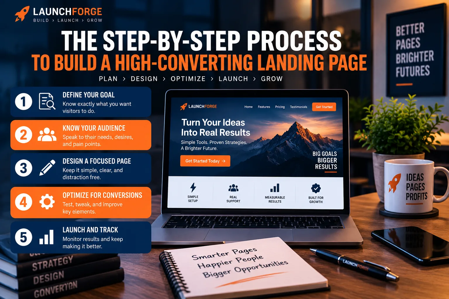
Build with a clear goal, create a focused page, optimize the conversion path, and measure what happens after launch.
From there, build the experience around them.
Create a clear headline. Explain the value. Organize the supporting information. Add relevant proof where it is needed. Remove unnecessary distractions. Make the call to action obvious. Test the page on desktop and mobile. Then complete the conversion yourself to make sure the entire process works.
After the page is live and receiving traffic, you can begin learning from what visitors actually do.
That is a much more practical approach than trying to create the perfect landing page before anyone has ever seen it.
Build First, Then Improve
Your first version does not need to be your final version.
In fact, it probably will not be.
As you gain traffic, collect feedback, and learn more about your audience, you may discover opportunities to improve the headline, offer, copy, design, form, call to action, or other parts of the page.
That is part of the process.
Build something focused enough to test.
Make sure it works.
Put it in front of the right people.
Learn from what happens.
Then make the next version better.

Build the page, drive qualified traffic, measure the results, and keep improving what works.
That approach turns landing page optimization from guesswork into an ongoing process of building, measuring, and improving.
Build a Landing Page With a Purpose
A high-converting landing page is not built around a secret formula.
It is built around clarity.
Know what you want the visitor to do. Make the offer easy to understand. Give people the information they need to make a decision. Remove unnecessary distractions and friction. Create a clear next step. Then test the complete experience and improve it as you learn.
You do not need to get every detail perfect before publishing.
You need a focused page with a real purpose that you can put in front of real visitors.
That is how we approach landing pages at LaunchForge Studio.
We build them, use them, test them, and learn from what happens.
Because the most useful lessons rarely come from endlessly planning what you might build.
They come from building something real.