A landing page can have a strong headline, clear messaging, great visuals, and an offer people genuinely want.
But eventually, the visitor reaches the moment that matters.
What should they do next?
That is the job of the call to action.
A landing page call to action gives visitors a clear next step. It might ask them to download a guide, start a free trial, register for a webinar, request a quote, schedule a consultation, join an email list, or buy a product.
The words may be short, but the decision behind them matters.
A vague button like “Submit” tells someone very little. A button surrounded by competing actions can make the next step harder to understand. And even a well-written call to action can struggle if it appears at the wrong point in the page or asks for more commitment than the visitor is ready to make.

Specific CTA wording makes the next step easier to understand than a vague button such as Learn More.
A strong CTA does more than sit at the bottom of a form.
It connects the promise of the landing page to the action you want the visitor to take.
That means the wording, placement, design, surrounding message, and level of commitment should all work together.
In this guide, we are going to break that process down step by step. We will look at what a landing page CTA actually does, how to write clearer CTA copy, where to place it, how to reduce friction around it, and how different types of offers may require different calls to action.
We will also look at practical examples you can adapt for lead generation, webinars, free trials, services, and other common landing page goals.
The objective is not to find a magical button phrase that supposedly works for every business.
There isn’t one.
The objective is to create a clear next step that makes sense for the visitor, the offer, and the reason the landing page exists in the first place.
Let’s start with what a landing page call to action actually is.
What Is a Landing Page Call to Action?
A landing page call to action, often shortened to CTA, is the instruction that tells a visitor what action to take next.
The CTA is commonly associated with a button, but the button itself is only part of it.
A complete call to action can include the words on the button, the message immediately around it, and the context the rest of the landing page creates before the visitor reaches that decision.
For example, imagine a landing page offering a free guide.
The headline gets the visitor’s attention.
The supporting copy explains what the guide contains and why it may be useful.
The form asks for the information needed to deliver it.
Then the CTA gives the visitor a clear next step:
Get the Free Guide
That is much more informative than a generic button such as:
Submit
Both buttons may technically perform the same action, but they communicate very different things to the visitor.
“Submit” describes what happens to the form.
“Get the Free Guide” describes what the visitor receives.
That distinction is important because people arriving on a landing page are constantly deciding whether continuing is worth their time, attention, information, or money.
The CTA sits directly at that decision point.
The CTA Connects the Message to the Action
A landing page usually exists for a specific purpose.
Maybe you want someone to:
- Download a resource
- Join an email list
- Register for an event
- Start a free trial
- Request a quote
- Schedule a consultation
- Create an account
- Purchase a product
The rest of the page helps the visitor understand the offer and decide whether it is relevant.
The call to action turns that interest into a specific next step.
That is why CTA strategy should not begin with questions like:
“What color should the button be?”
or:
“Should I write Learn More or Get Started?”
Those details can matter, but they come later.
The first question is much simpler:
What exactly do we want the visitor to do?
Once that answer is clear, writing the call to action becomes much easier.
Why the Call to Action Matters
A visitor can read every word on a landing page, understand the offer, and even believe it could help them.
But none of that automatically produces a conversion.
At some point, the visitor has to make a decision.
The call to action is where the landing page turns from explanation into action.
That does not mean the CTA deserves all the credit when someone converts. A strong button cannot rescue an unclear offer, weak headline, confusing page, or message that does not match what brought the visitor there.
The CTA works because the rest of the page has prepared the visitor to make a decision.
Think of the landing page as a path.
The headline establishes why someone should pay attention.
The supporting message explains the value.
The page answers questions, reduces uncertainty, and gives the visitor reasons to continue.
The call to action then says:
Here is what to do next.
If that next step is unclear, the path suddenly becomes harder to follow.
A CTA Removes Guesswork
Visitors should not have to figure out how to respond to your offer.
If someone wants the resource but cannot immediately tell where to get it, that creates friction.
If someone is interested in a service but does not know whether the next step is requesting a quote, scheduling a call, or creating an account, that creates uncertainty.
If several buttons compete for attention and lead to different places, the visitor has another decision to make before they can complete the decision you actually care about.
A focused CTA removes as much of that guesswork as possible.
It tells the visitor what action is available and helps set an expectation for what happens after they take it.
Small Words Can Carry a Big Decision
CTA copy is usually short.
Sometimes it is only two or three words.
That can make it tempting to treat the button text as an afterthought.
But those few words appear at one of the most important moments on the page: the point where the visitor is being asked to move forward.
Compare:
Submit
with:
Send Me the Guide
Or:
Continue
with:
Start My Free Trial
The second version in each example provides more context about the action or outcome.
That does not mean longer CTA copy is automatically better. It means the words should help the visitor understand what they are choosing.
The goal is not to make the CTA clever.
The goal is to make the next step clear.
And that starts by defining exactly what action the landing page is supposed to produce.
1. Start With the Action You Want Visitors to Take
Before writing a single word of CTA copy, decide what action the landing page is supposed to produce.
That sounds obvious, but it is easy to skip.
People often begin designing a landing page by thinking about the headline, images, button colors, layouts, forms, and other visible elements before clearly defining what the visitor should actually do.
Start with the action instead.
Ask:
What is the one primary action I want someone to take on this page?
The answer should be specific.
Not:
Engage with the business.
Not:
Learn about our services.
Not:
Explore what we offer.
Those are broad objectives.
A landing page needs something more concrete.
For example:
- Download the checklist
- Register for the webinar
- Join the email list
- Start the free trial
- Request a quote
- Book a consultation
- Create an account
- Purchase the product
Now you have something you can build around.
One Goal Makes the CTA Easier to Write
When the conversion goal is clear, the CTA can reflect that goal directly.
If the page offers a free checklist, the CTA might say:
Get the Free Checklist
If the page promotes a webinar:
Reserve My Spot
If the goal is starting a software trial:
Start My Free Trial
If the page is designed to generate consultation requests:
Schedule a Consultation
None of these examples is automatically the perfect CTA.
The right wording depends on the offer, audience, traffic source, and what happens after the click.
But each example has something important in common:
The action is clear.
That gives the visitor less to interpret.
Do Not Ask the CTA to Solve an Unclear Goal
If you cannot decide what the primary CTA should say, the problem may not be the button copy.
The page itself may have too many goals.
Imagine a landing page asking visitors to:
- Download a guide
- Read the blog
- Follow the business on social media
- Watch a video
- Request a consultation
- View several products
- Subscribe to a newsletter
Every one of those actions might be useful somewhere in your marketing system.
Putting all of them on the same focused landing page is another matter.
Now the visitor has to decide which action matters most because the page did not decide for them.
That is why defining the conversion goal comes first.
Once you know exactly what the landing page is supposed to accomplish, you can make the CTA support that purpose instead of asking a tiny button to fix a page that never had a clear direction.
With the action defined, the next step is turning it into CTA copy that tells the visitor exactly what they are being asked to do.
2. Make the CTA Specific
Once you know what action you want the visitor to take, make the CTA specific enough that the visitor understands what the click actually means.
Generic CTA copy is easy to write.
Submit
Continue
Click Here
Learn More
Get Started
Those phrases are not automatically wrong.
The problem is that they often place the burden on the surrounding page to explain what happens next.
A more specific CTA can carry some of that information itself.
Compare:
Submit
with:
Get the Free Guide
Or:
Click Here
with:
Reserve My Webinar Seat
Or:
Get Started
with:
Start My Free Trial
The more specific versions connect the action to an outcome.
That gives the visitor another small piece of confirmation that they are taking the step they intended to take.
Tell Visitors What Happens Next
Good CTA copy helps answer a simple question:
What will happen when I click this?
That does not mean the button needs to explain the entire process.
It should remain easy to read and understand quickly.
But whenever possible, the wording should reduce ambiguity.
If clicking the button downloads something, say what they are getting.
Download the Checklist
If clicking begins a registration process, make that clear.
Register for the Webinar
If the visitor is requesting information:
Request Pricing
If they are scheduling time with someone:
Book a Consultation
The CTA and the action that follows should agree with each other.
A button promising Download the Guide should not unexpectedly send someone into an unrelated sales process.
A button saying Start My Free Trial should not lead to a page where the visitor discovers there is no trial.
A CTA builds an expectation.
The experience after the click should fulfill it.
Specific Does Not Mean Complicated
There is another extreme to avoid.
Trying to make CTA copy specific does not mean stuffing an entire sentence onto the button.
Something like:
Click Here Now to Enter Your Information and Receive Our Free Marketing Guide
may technically explain the action, but it makes the CTA harder to scan.
Usually, the surrounding headline, copy, form, and supporting text can provide the details.
The button only needs to make the next step clear.
Think of it as a balance:
Enough information to remove uncertainty.
Few enough words to understand immediately.
Once the action is specific, we can improve the CTA further by connecting that action to something the visitor actually values.
3. Connect the CTA to the Value
A call to action becomes stronger when it connects the action to something the visitor actually wants.
Businesses naturally think about CTAs from their own perspective.
We want the lead.
We want the registration.
We want the trial signup.
We want the consultation request.
The visitor is looking at the decision from the opposite direction.
They are thinking about what they will receive, learn, solve, experience, or accomplish by taking the next step.
That difference matters.
Consider a landing page offering a free website planning checklist.
The business might think:
Capture the lead.
But the visitor is not clicking because they want to become a lead in somebody’s marketing system.
They are clicking because they want the checklist.
That makes:
Get the Website Checklist
more closely connected to the visitor’s motivation than:
Submit My Information
Both may result in exactly the same lead being added to exactly the same email system.
But only one describes the value the visitor came to receive.
Write From the Visitor’s Point of View
One useful way to evaluate CTA copy is to read it from the visitor’s perspective.
Ask:
Does this CTA describe something the visitor wants, or does it mainly describe something the business wants them to do?
For a guide:
Get My Free Guide
For a webinar:
Save My Seat
For a software trial:
Start My Free Trial
For a quote:
Get My Quote
For a consultation:
Schedule My Consultation
The word “my” is not required, and it will not magically increase conversions.
The larger principle is what matters.
The CTA should feel connected to the outcome the visitor is trying to reach.
Let the Page Build the Value First
CTA wording cannot create value that the landing page never established.
If the visitor does not understand why the guide is useful, changing Download Now to Get My Free Guide probably will not solve the larger problem.
If the software offer is unclear, a perfectly written trial button cannot explain the entire product.
If the visitor does not trust the business, clever CTA copy will not automatically remove that concern.
The landing page has to do the work leading up to the CTA.
That includes explaining the offer, communicating the benefit, answering important questions, and giving the visitor enough information to decide whether taking action makes sense.
The CTA then gives that decision somewhere to go.
This is why the headline, supporting message, offer, and call to action should feel like parts of the same conversation.
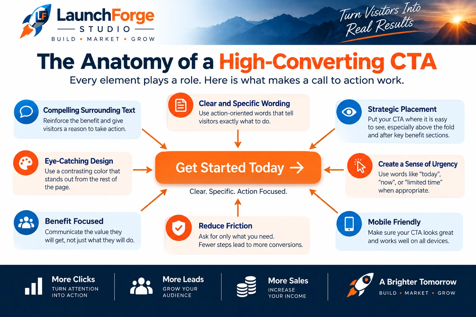
Clear wording, strong placement, visible design, reduced friction, and message consistency all contribute to an effective call to action.
If the headline promises one thing and the CTA suddenly asks for something that feels unrelated, the visitor has to stop and reconsider what is happening.
When the message stays connected from the top of the page through the CTA, the next step feels more natural.
Now we can take that value-focused message and make sure the CTA itself stays clear, concise, and easy to understand.
4. Keep CTA Copy Clear and Concise
A call to action has very little time to communicate its message.
Visitors are usually scanning a landing page, not carefully analyzing every word on a button.
That makes clarity especially important.
The CTA should be easy to recognize, easy to read, and easy to understand without forcing someone to stop and decode what the button means.
Consider:
Access Your Complimentary Educational Resource
versus:
Get the Free Guide
The first version sounds more elaborate.
The second version communicates the action almost immediately.
That is usually what we want.
Clarity Beats Cleverness
It can be tempting to make CTA copy unusual because you want the landing page to sound different from everyone else’s.
Personality can absolutely have a place in marketing.
Confusion should not.
A clever phrase that makes perfect sense to the person who wrote it may mean very little to someone visiting the page for the first time.
Imagine a CTA that says:
Let’s Make Some Magic
What happens when the visitor clicks?
Are they creating an account?
Booking a call?
Buying something?
Starting a trial?
Downloading a resource?
The phrase has personality, but without enough surrounding context, the action is unclear.
Now compare it with:
Build My Free Account
or:
Schedule My Strategy Call
The visitor has a much better idea of what comes next.
That does not mean every CTA has to sound generic.
You can still use the voice of your brand.
Just make sure personality does not bury the action.
Use Strong Action Words
Many effective CTAs begin with a verb because the visitor is being asked to do something.
Words such as:
- Get
- Start
- Download
- Join
- Register
- Reserve
- Book
- Request
- Create
- Try
- View
- Buy
can make the action immediately recognizable.
The best verb depends on what actually happens next.
If the visitor receives a downloadable resource, Download may make sense.
If they begin a free trial, Start or Try may fit better.
If they are securing a place at an event, Register or Reserve may be clearer.
The objective is not to collect a list of supposedly high-converting power words and force them onto every page.
It is to choose language that accurately describes the next step.
Remove Words That Do Not Help
After writing a CTA, read it again and ask whether every word contributes something useful.
For example:
Click Here to Download Your Free Checklist Now
could potentially become:
Download the Free Checklist
The shorter version still communicates the action and the value.
This matters visually as well.
CTA buttons have limited space, especially on mobile devices. Long button copy can become awkward, wrap onto multiple lines, or make the interface harder to scan.
Keep enough information to make the action clear.
Remove what the visitor does not need.
Once the CTA copy is clear, the next challenge is making sure visitors can actually find it.
5. Make the CTA Easy to See
A well-written call to action cannot do much if visitors do not notice it.
The CTA should stand out as an important action without making the rest of the landing page feel like a flashing billboard.
This is where visual hierarchy matters.
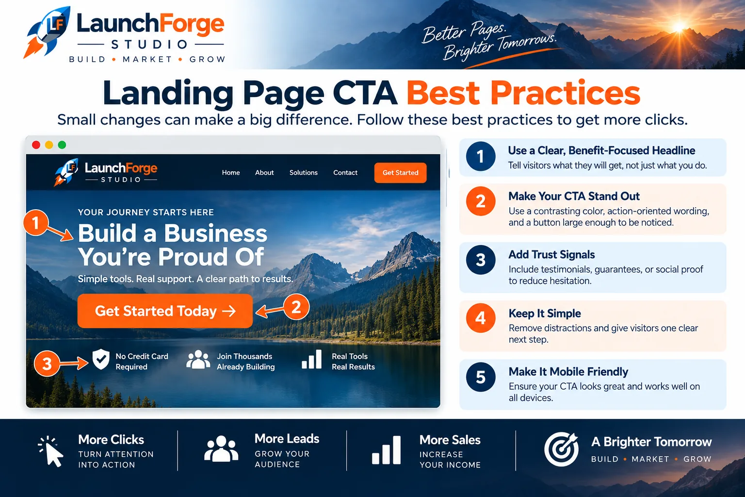
Strong CTA performance comes from clear messaging, visible placement, reduced distractions, trust, and a mobile-friendly experience.
A landing page naturally contains elements competing for attention:
- Headlines
- Supporting copy
- Images
- Forms
- Testimonials
- Feature lists
- Trust signals
- Navigation or footer elements
- Calls to action
The design should help visitors understand which elements deserve attention and in what order.
Your primary CTA should be one of the easiest interactive elements to recognize.
Use Contrast and Space With a Purpose
Contrast can help separate the CTA from the surrounding design.
That does not mean there is one magical button color that converts better on every landing page.
A bright orange button is not automatically better than a blue, green, black, or white one.
What matters is whether the CTA is visually distinct within the design around it.
A button that uses nearly the same color as its background may disappear into the page.
A button surrounded by several equally prominent elements may have to compete for attention.
A CTA with enough contrast and breathing room is easier to identify.
Whitespace can help here.
Giving the CTA some room around it can separate the action from nearby copy, images, or other elements without requiring an oversized button or aggressive design.
Make the Button Look Like Something Visitors Can Click
Creativity should not come at the expense of usability.
If an element performs an important action, visitors should be able to recognize that it is interactive.
Buttons generally benefit from looking like buttons.
The exact style can match the visual identity of the website, but the visitor should not have to hover over random pieces of text trying to discover where the CTA is hiding.
The same principle applies to mobile devices, where there is no mouse pointer to provide clues.
The action needs to be recognizable on its own.
Check the CTA in the Context of the Whole Page
Do not evaluate the button only while editing the individual module.
Preview the complete landing page.
Scroll through it as a visitor would.
Ask:
Does my attention naturally reach the CTA?
Can I distinguish the primary action from everything around it?
Is the button readable without effort?
Does it still stand out on a smaller screen?
Sometimes the CTA itself is perfectly fine.
The surrounding page is simply too busy.
In that case, adding more visual effects to the button may not be the answer.
Removing unnecessary competition may work better.
Once the CTA is easy to recognize, the next question becomes equally important:
Where should it appear on the landing page?
6. Put the CTA Where It Makes Sense
Where you place a call to action can influence whether visitors see it at the right moment.
The obvious temptation is to create a universal rule.
Put the CTA above the fold.
Put it at the bottom.
Put one after every section.
Make it sticky.
Repeat it three times.
The problem is that landing pages are not all asking visitors to make the same decision.
Someone downloading a simple free checklist may need very little information before taking action.
Someone considering an expensive service may want to understand the offer, process, benefits, and level of commitment before scheduling a consultation.
CTA placement should support the decision the visitor is being asked to make.
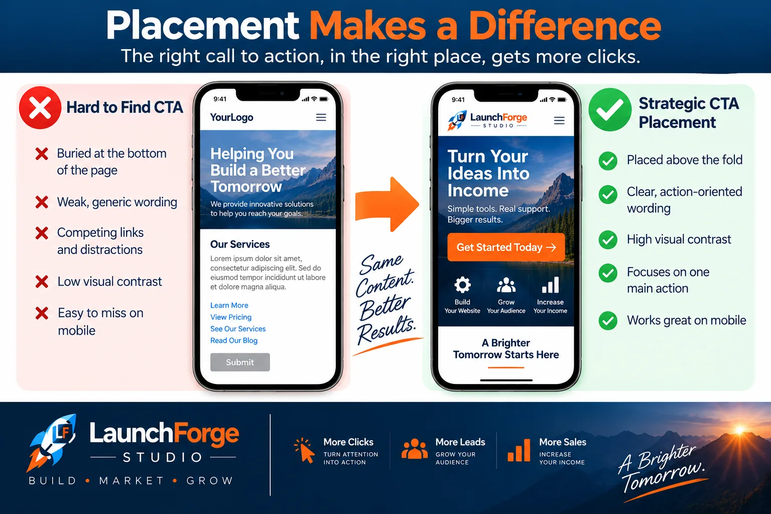
CTA placement should make the primary action easy to find without forcing visitors to hunt for the next step.
Above the Fold Is Not the Only Answer
The area visible before someone begins scrolling is valuable because almost every visitor has an opportunity to see it.
That makes it a logical place for a CTA when the offer can be understood quickly.
For example, if someone clicks an advertisement promising a free checklist and arrives on a landing page with the same promise, they may already know what they want.
A clear headline, short explanation, and CTA near the top of the page may be enough.
But that does not mean every visitor is ready to act immediately.
Some offers require more explanation.
If the visitor needs to understand how a service works, compare features, evaluate credibility, or answer several questions before deciding, asking for the conversion before providing that information may be premature.
The CTA can still appear near the top.
It just should not be the only opportunity to act.
Repeat the CTA When the Page Needs It
Longer landing pages can benefit from repeating the primary CTA at logical points.
The key word is logical.
Do not scatter buttons across the page simply because more buttons must mean more conversions.
Instead, consider where a visitor may naturally become ready to take the next step.
That might be:
- After the initial explanation of the offer
- After a section describing the main benefits
- After testimonials or other trust signals
- After answering common objections
- Near the end of the page
If the same primary action appears more than once, keep the wording and purpose consistent enough that visitors understand they are moving toward the same destination.
For example, a landing page might use Start My Free Trial near the top and repeat that same CTA after explaining the product.
That creates another opportunity to act without introducing another decision.
Match Placement to the Amount of Decision-Making Required
A useful way to think about CTA placement is to consider how much information someone reasonably needs before taking the requested action.
A low-friction offer may need very little explanation.
A higher-commitment offer may require more.
The page should provide enough information to support the decision without forcing every visitor through unnecessary content before they can act.
This is also why repeating a CTA can be useful.
Visitors who are ready early can take action.
Visitors who need more information can continue reading and encounter the same next step later.
Placement should make the conversion path easier to follow, not turn the landing page into a minefield of buttons.
Once the CTA appears at the right moments, we need to make sure its message also matches what the visitor expected when they arrived.
7. Match the CTA to Visitor Intent
A landing page does not exist in isolation.
Visitors arrive from somewhere.
They may click an advertisement, search Google, follow a link in an email, tap a social media post, or come from another page on your website.
Whatever brought them to the landing page created an expectation.
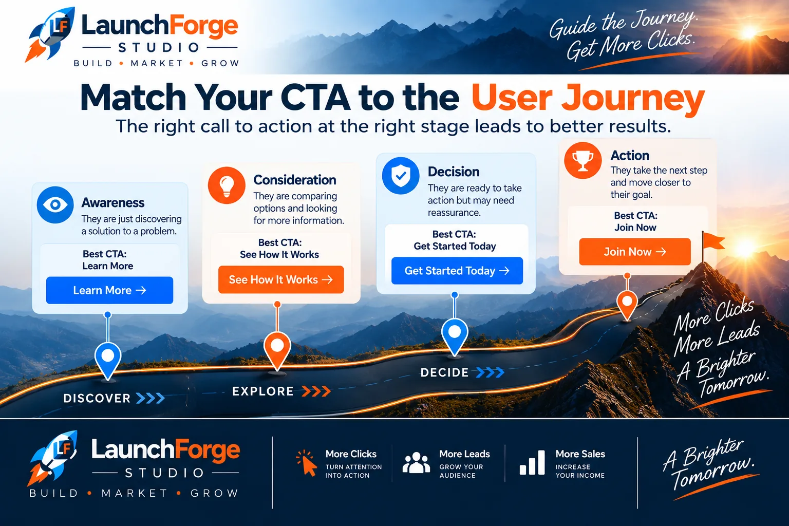
The right call to action depends on what the visitor already knows and what they are ready to do next.
The CTA should continue that expectation rather than suddenly changing direction.
Imagine someone clicks an ad offering:
Free Landing Page Checklist
They arrive on a page with the headline:
Build a Better Landing Page With This Free Checklist
So far, everything matches.
Then the primary CTA says:
Talk to Sales
That creates a disconnect.
The visitor arrived expecting a checklist.
The CTA suddenly asks for a sales conversation.
Even if the business ultimately wants to generate customers, that is not necessarily the action the visitor agreed to consider when they clicked.
A better CTA for that particular offer might be:
Get the Free Checklist
The message now continues naturally from traffic source to landing page to action.
Keep the Promise Consistent
This consistency is often called message match.
The basic idea is simple:
What the visitor sees before reaching the landing page should connect logically with what they see after arriving.
That includes the CTA.
If an email promotes webinar registration, the landing page should clearly continue that webinar offer and make registration the obvious next step.
If a search ad promotes a free trial, the landing page should not suddenly make a product demo the only available action unless that was made clear beforehand.
If a social post promises a downloadable template, the CTA should help the visitor get that template.
The visitor should not feel as though the rules changed after the click.
Consider What the Visitor Is Ready to Do
Intent is not only about the words used in the traffic source.
It is also about the level of commitment the visitor is likely prepared to make.
Someone searching for basic information may not be ready to schedule a sales call.
Someone comparing software may be interested in viewing pricing or starting a trial.
Someone who deliberately clicks a Book a Consultation link has already expressed stronger intent.
The CTA should make sense for that stage of the journey.
This is one reason the same business may need different landing pages for different campaigns.
A visitor coming from an educational article may need a different next step than someone clicking a retargeting ad after already exploring the product.
Trying to force every visitor toward the highest-commitment action can create unnecessary friction.
Continue the Conversation
A useful way to evaluate message match is to read the visitor journey as one continuous conversation.
The traffic source says:
Here is something that may interest you.
The headline says:
Yes, you are in the right place.
The landing page says:
Here is why this offer may be useful.
The CTA says:
Here is how to get it.
When those pieces agree, the conversion path is easier to understand.
When they contradict each other, the visitor has to stop and figure out what changed.
The next step is making sure that once visitors reach the CTA, we are not creating unnecessary obstacles between them and the action they already want to take.
8. Reduce Friction Around the CTA
A visitor can understand the offer, want what you are offering, and still hesitate before taking action.
That hesitation is friction.
Some friction is unavoidable.
If you need an email address to deliver a guide, the visitor has to provide one.
If someone is requesting a quote, you may need enough information to understand what they are asking for.
If a customer is purchasing a product, payment information has to be collected somewhere in the process.
The goal is not to eliminate every step.
The goal is to avoid creating unnecessary obstacles between the visitor and the action they already want to take.
Ask Only for What You Actually Need
Forms are one of the easiest places for friction to appear.
Imagine someone wants a simple downloadable checklist.
The form asks for:
- First name
- Last name
- Email address
- Phone number
- Company name
- Company size
- Job title
- Website address
- Monthly marketing budget
The visitor may reasonably wonder why downloading a checklist requires an autobiography.
Every additional field asks for more effort and potentially more personal information.
That does not mean short forms are always better.
A consultation request may legitimately require more information than an email signup.
A business-to-business sales team may need qualifying information before scheduling a call.
The important question is:
Do we actually need this information at this stage?
If the answer is no, consider removing it.
Supporting Copy Can Make the Click Easier
Sometimes the CTA itself cannot answer every question a visitor has.
A short line of supporting copy near the CTA can help reduce uncertainty.
For example:
Start My Free Trial
No credit card required.
Or:
Get the Free Guide
Delivered instantly to your inbox.
Or:
Schedule a Consultation
Choose a time that works for you.
The supporting copy addresses a question or concern without forcing all of that information into the button.
This can be especially useful when visitors may be wondering about cost, commitment, privacy, timing, or what happens after they click.
Avoid Surprises After the Click
Friction does not end when someone presses the CTA.
What happens next is part of the conversion experience.
If the button says Get the Free Guide and the visitor is suddenly sent through several unexpected steps, the experience no longer feels as simple as the CTA suggested.
If View Pricing requires creating an account before any prices are visible, visitors may feel that the action was not accurately described.
If Start My Free Trial immediately requests payment information, that should not come as a surprise if the surrounding message implied otherwise.
The CTA creates an expectation.
The next step should respect it.
Make the Path Feel Proportionate to the Offer
The amount of effort you ask from the visitor should make sense compared with what they are receiving.
A simple free resource usually calls for a relatively simple conversion path.
A high-value consultation may reasonably require more information.
A paid purchase naturally involves additional steps.
There is no universal number of fields, clicks, or screens that works for every offer.
Instead, review the process from the visitor’s perspective.
Ask:
What am I asking them to give up in time, information, money, or commitment?
Then ask:
Does that feel reasonable for what they receive in return?
Reducing friction does not mean removing everything from the conversion path.
It means making each step earn its place.
Once the path is as clear and reasonable as possible, we can make another important decision: whether the landing page should offer one primary action or several competing ones.
9. Use One Primary CTA
A focused landing page usually works best when visitors can quickly identify the one action that matters most.
That does not necessarily mean the page can contain only one button.
As we discussed earlier, a longer page may repeat the same CTA several times.
The important distinction is between multiple buttons supporting one goal and multiple competing goals asking for attention.
A landing page might have three buttons that all say:
Start My Free Trial
Those buttons appear in different places, but they support the same conversion goal.
That is very different from a page asking visitors to:
Start a Free Trial
Read Our Blog
Follow Us on Facebook
Download a Guide
Watch Our Latest Video
Contact Sales
View All Products
Now the visitor is being offered several different paths.
Instead of making the next step obvious, the page asks them to decide which destination matters most.
Avoid Competing Actions
Every additional action creates another opportunity for the visitor to leave the primary conversion path.
That does not mean secondary links are forbidden.
Some pages legitimately need links to a privacy policy, terms, login page, accessibility information, or other supporting resources.
The question is whether those elements compete visually or strategically with the primary CTA.
If your goal is webinar registration, Reserve My Spot should not have to fight for attention against a giant Follow Us on Instagram button.
If the page exists to generate consultation requests, a prominent link sending visitors to the general blog may pull them away just as they are considering taking action.
Secondary options should remain secondary.
One Goal Creates a Clearer Decision
Think about the landing page from the visitor’s perspective.
They arrived because something brought them there with a particular promise or purpose.
The page explains that offer.
Then the CTA presents the next step.
That creates a simple path:
Arrive → Understand → Decide → Act
Competing CTAs can turn that into:
Arrive → Understand → Decide → Decide Again → Explore Something Else → Forget Why You Came
The more choices you introduce, the more directions the visitor can travel.
A focused landing page removes unnecessary decisions so the primary action remains easy to understand.
Repetition Is Not Competition
This distinction is worth emphasizing.
Repeating the same primary CTA on a longer page does not automatically create competing actions.
If someone sees Get the Free Guide near the top, reads several sections, and sees Get the Free Guide again near the bottom, the goal has not changed.
You have simply made the same action available at another logical point in the journey.
Consistency matters.
The wording does not always have to be identical, but visitors should understand that repeated CTAs lead toward the same outcome.
Once you have one clear primary action, you can adapt the wording to the specific type of landing page and offer you are building.
That is where practical CTA examples become especially useful.
10. Write CTAs for Different Landing Page Goals
There is no single call to action that works for every landing page.
The right CTA depends on what the page offers, what the visitor expects, and what action moves them naturally toward the goal.
A lead generation page may ask for an email address in exchange for a useful resource.
A webinar page may ask someone to reserve a seat.
A software landing page may encourage visitors to begin a trial.
A service business may want qualified prospects to schedule a consultation.
Those are different decisions.
The CTA should reflect that.
Instead of searching for one supposedly perfect button phrase, start with the offer and ask:
What is the clearest way to describe the next step for this particular visitor?
Here are several common landing page goals and CTA approaches that can fit them.
Lead Generation CTA Examples
Lead generation landing pages often exchange something useful for contact information.
That might include:
- Guides
- Checklists
- Templates
- Reports
- Worksheets
- Email courses
- Resource libraries
- Other lead magnets
The CTA can reinforce what the visitor receives.
Examples include:
Get the Free Guide
Download the Checklist
Send Me the Template
Get My Free Copy
Access the Resource
Send Me the Report
Notice how these CTAs connect the action to the offer.
A visitor who arrived for a checklist sees a button about getting the checklist.
That creates continuity between the promise and the action.
Generic wording such as Submit may still function technically, but it does little to reinforce why the visitor is completing the form.
Webinar and Registration CTA Examples
Registration pages have a different goal.
The visitor is not necessarily receiving a downloadable resource. They are securing access to an event, presentation, training session, or other scheduled experience.
Possible CTAs include:
Register for the Webinar
Reserve My Spot
Save My Seat
Join the Training
Register for the Event
Get My Access
The surrounding copy should clarify important details such as the date, time, format, cost if applicable, and what the attendee can expect.
If registration is free, that may also be worth communicating near the CTA when it helps reduce uncertainty.
The button itself does not need to carry every detail.
Its job is to make the registration action clear.
Product and Trial CTA Examples
Software and product landing pages can involve several levels of commitment.
Someone may be ready to purchase.
Another visitor may want to try the product first.
Another may need to see plans or pricing before deciding.
That means CTA copy should accurately represent the action being offered.
Examples include:
Start My Free Trial
Try It Free
Create My Account
View Plans and Pricing
Choose My Plan
Buy Now
Get Started Today
Be particularly careful with words such as free.
If the visitor needs to enter payment information, automatically enters a paid subscription after a trial, or faces other important conditions, the surrounding page should make those terms clear.
The CTA should help create confidence, not hide the details of the offer.
Service and Consultation CTA Examples
Service businesses often use landing pages to begin a conversation rather than complete the entire sale.
The visitor may need to explain a project, request pricing, schedule a call, or determine whether the service is a good fit.
Possible CTAs include:
Schedule a Consultation
Book a Discovery Call
Request a Quote
Tell Us About Your Project
Check Availability
Request More Information
Get a Project Estimate
The level of commitment matters here.
Request More Information feels different from Book a Consultation.
Neither is automatically better.
The right choice depends on what happens next and what the visitor is likely prepared to do.
If clicking the CTA opens a scheduling calendar, Schedule a Consultation creates a clear expectation.
If the next step is a project inquiry form, Tell Us About Your Project may describe the experience more accurately.
Use Examples as Starting Points, Not Rules
CTA examples are useful because they show different ways to communicate an action.
They should not become a collection of phrases that you copy onto every landing page without thinking about the context.
A CTA that works well for one business may perform differently for another.
Even two landing pages from the same business may need different wording because the visitors, traffic sources, offers, and conversion goals are different.
Use examples to generate ideas.
Then return to the questions we have been using throughout this guide:
What does the visitor want?
What action are we asking them to take?
What happens after they click?
Does the CTA describe that next step clearly?
If those pieces align, you have a much stronger starting point than simply choosing a button phrase because somebody included it on a list of “best CTAs.”
Now that we have several examples to work from, we can look at the mistakes that commonly weaken otherwise solid landing page calls to action.
Landing Page CTA Mistakes to Avoid
Most CTA problems are not caused by one catastrophic mistake.
They usually come from small decisions that make the next step less clear, less relevant, or harder to complete.
The good news is that many of these problems are relatively easy to spot once you know what to look for.
Here are some of the most common mistakes worth checking before you publish a landing page.
Using Vague CTA Copy
A CTA such as:
Submit
Continue
Click Here
may technically work, but it often provides very little information about the action.
Whenever possible, connect the CTA to what the visitor is actually doing or receiving.
Instead of:
Submit
consider:
Get the Free Checklist
Instead of:
Continue
consider:
Start My Free Trial
The goal is not to make every CTA longer.
It is to make the next step easier to understand.
Creating Too Many Competing Actions
A focused landing page should make the primary action obvious.
If several buttons compete for attention and send visitors toward unrelated destinations, the conversion path becomes less focused.
Before publishing, look at every prominent link and button on the page.
Ask:
Does this help the visitor complete the primary goal, or does it pull them somewhere else?
Not every secondary link needs to disappear.
But it should not compete with the action the landing page was created to generate.
Making the CTA Difficult to Find
A CTA can have excellent copy and still fail visually.
Common problems include:
- Low contrast
- Small buttons
- Crowded layouts
- Too little space around the CTA
- Buttons that blend into surrounding elements
- Important CTAs buried deep in the page without another opportunity to act
Preview the complete page rather than judging the CTA only inside the editor.
Make sure the primary action is recognizable within the overall design.
Asking for Too Much Too Soon
The requested action should make sense for the visitor’s level of intent.
Someone who arrived looking for introductory information may not be ready to schedule a sales call.
Someone who clicked an advertisement specifically offering a consultation may be much more prepared for that step.
The same principle applies to forms.
Asking for extensive personal or business information in exchange for a simple resource can make the commitment feel disproportionate to the offer.
Match the size of the request to the value and context of the action.
Creating a Message Mismatch
The CTA should continue the promise that brought the visitor to the page.
If an advertisement offers a free template, the landing page and CTA should make obtaining that template straightforward.
Changing the goal after the visitor arrives can create confusion and distrust.
Review the complete journey:
Traffic source → Headline → Offer → CTA → Next step
Each part should feel connected to the one before it.
Making Promises the Next Step Does Not Keep
CTA copy creates expectations.
If the button says:
View Pricing
visitors should reasonably expect to see pricing.
If it says:
Download the Guide
they should be able to access the guide through the process that follows.
If it says:
Start My Free Trial
the actual conditions of that trial should be communicated clearly.
Do not use CTA wording merely because it sounds attractive.
Use wording that accurately represents the experience.
Ignoring Mobile Visitors
A CTA that looks great on a desktop monitor can become awkward on a smaller screen.
Long button text may wrap.
Spacing can disappear.
Buttons can become difficult to tap.
Forms can become tedious to complete.
Other page elements may push the CTA farther down than expected.
Always check the actual mobile experience before publishing.
Do not assume that because the page builder says the design is responsive, every part of the conversion path is automatically easy to use.
Treating the First Version as the Final Version
You can follow every best practice in this guide and still not know exactly how visitors will respond.
That is normal.
The first version gives you something real to put in front of visitors.
From there, actual behavior can help you decide what deserves improvement.
That brings us to the next part of the process:
Testing the CTA instead of assuming our first idea must be the best one.
How to Test and Improve Your CTA
A landing page call to action is not finished simply because the button looks good and the wording makes sense to us.
The real test begins when visitors start using the page.
Until then, we are working with informed assumptions.
We can use clear copy, logical placement, strong visual hierarchy, and everything else covered in this guide to create a solid starting point.
But visitors may still respond differently than we expect.
That is why testing matters.
Start With a Reason to Test
Do not change CTA elements randomly just because testing sounds sophisticated.
Start with a question.
Maybe visitors are reaching the landing page but very few are taking action.
Maybe people begin completing the form but abandon it.
Maybe visitors scroll through most of the page before leaving.
Maybe one traffic source converts differently from another.
Those observations can help you develop a useful hypothesis.
For example:
Visitors may not understand what they receive after clicking the CTA.
Now you have something specific to investigate.
You might test clearer CTA wording rather than randomly changing the button color, headline, form, image, and page layout at the same time.
Test One Meaningful Change at a Time
Changing several important elements simultaneously makes the results harder to interpret.
Imagine you change:
- The CTA wording
- Button placement
- Button design
- Form length
- Headline
- Hero image
and conversions improve.
What caused the improvement?
You do not really know.
Testing one meaningful change at a time gives you a better chance of understanding what influenced the result.
For example, you could compare:
Get Started
with:
Start My Free Trial
Or test the same CTA in two different logical positions on the page.
Or compare a longer form with a version that asks only for essential information.
The objective is not to test every tiny detail forever.
It is to learn something useful.
Measure the Action That Actually Matters
Clicks can be useful information, but they are not always the final conversion.
Suppose the CTA says:
Start My Free Trial
A visitor clicking that button is important.
But if almost nobody completes the signup process afterward, the real problem may exist beyond the CTA.
Look at the complete conversion path whenever possible.
Depending on the landing page, useful measurements might include:
- CTA clicks
- Form starts
- Form completions
- Registrations
- Trial signups
- Consultation requests
- Purchases
- Conversion rate
The measurement should connect to the goal you defined when building the page.
Give the Test Enough Information to Be Useful
Do not declare a winner after three visitors.
Small amounts of traffic can produce results that look dramatic without telling you very much.
At the same time, smaller businesses may not have enough traffic to run sophisticated experiments constantly.
That is okay.
Testing does not have to become a laboratory exercise before you are allowed to improve a landing page.
Use the information you actually have.
Look for meaningful patterns.
Combine quantitative data with what you learn from customer questions, form behavior, feedback, and your own review of the conversion path.
The objective is continuous improvement, not pretending every decision has perfect statistical certainty.
Let Real Behavior Challenge Your Assumptions
Sometimes the CTA you personally prefer will not produce the strongest response.
That is useful information.
The purpose of testing is not to prove that our first idea was brilliant.
It is to learn what helps visitors understand the offer and move through the conversion path more effectively.
Build the first version with a clear reason behind every decision.
Put it to work.
Measure what happens.
Then improve it based on what you learn.
That process is far more useful than endlessly searching for a supposedly perfect CTA before the landing page ever sees a real visitor.
Before we wrap everything together, let’s turn the principles from this guide into a simple checklist you can use when reviewing your own landing page.
A Simple Landing Page CTA Checklist
Before publishing your landing page, review the call to action as part of the complete visitor experience.
You do not need to make the CTA complicated.
You need to make the next step clear.
Use this checklist as a final review:
- Is there one clear primary conversion goal?
- Does the CTA describe the action visitors are taking?
- Does the wording connect to something the visitor values?
- Is the CTA clear without relying on clever language?
- Can visitors quickly recognize the CTA as clickable?
- Does the button stand out from the surrounding design?
- Is there enough space around the CTA to make it easy to notice?
- Does the CTA appear at a logical point in the visitor’s decision process?
- If the CTA is repeated, does each instance support the same primary goal?
- Does the CTA match the message that brought visitors to the landing page?
- Is the requested commitment appropriate for the offer?
- Are you asking only for information you actually need?
- Does supporting copy answer important questions or reduce uncertainty?
- Does the experience after the click match what the CTA promised?
- Is the CTA easy to see, read, and use on mobile devices?
- Are secondary links prevented from competing with the primary action?
- Do you have a way to measure whether visitors complete the desired action?
You do not need every CTA to look or sound the same.
Different offers require different approaches.
What matters is whether the visitor can understand the offer, recognize the next step, and take that step without unnecessary confusion or friction.
If you can answer those questions confidently, you have a strong starting point.
Then let real visitor behavior show you what deserves improvement.
Give Visitors a Clear Next Step
A strong landing page call to action does not need to be complicated.
It needs to make sense.
The visitor should understand what you are asking them to do, what they can expect after taking action, and why that next step connects to the reason they came to the landing page in the first place.
That starts long before choosing the words on a button.
You need a clear conversion goal.
You need an offer the visitor can understand.
You need messaging that communicates the value.
You need a conversion path that removes unnecessary distractions and friction.
Then the CTA gives the visitor a clear way to move forward.
Sometimes that might be:
Get the Free Guide
Sometimes:
Start My Free Trial
Sometimes:
Reserve My Spot
And sometimes:
Schedule a Consultation
The wording changes because the offer and the visitor’s intent change.
The principle does not.
Make the next step clear.
Do not worry about finding a magical CTA phrase that supposedly guarantees more conversions.
There isn’t one.
Build the CTA around the real purpose of the page. Make it specific. Connect it to the value. Put it where visitors can find it. Make sure the experience after the click keeps the promise you made before it.
Then put the landing page to work.
Watch what visitors actually do.
Test meaningful changes when you have a reason to test them.
Learn from the results.
And make the next version better.
That is the approach we use throughout LaunchForge Studio.
We do not want to spend forever debating what the perfect landing page might look like.
We want to build something useful, put it in front of real people, learn from what happens, and use those lessons to improve the next version.
Because ultimately, the job of a call to action is right there in the name.
You have earned the visitor’s attention.
You have explained the offer.
Now give them a clear reason and a clear way to take action.