
Building an online business becomes much easier when you have a reliable way to turn visitors into leads. That is exactly what a lead capture page is designed to do.
Instead of giving visitors dozens of links, navigation choices, and competing distractions, a lead capture page focuses attention on one simple goal: encouraging the visitor to provide their contact information in exchange for something they value.
That could be a free guide, checklist, training resource, newsletter, discount, webinar, or another offer that gives someone a reason to join your email list.
But an effective lead capture page is more than a form sitting on a website.
The offer needs to be clear. The headline needs to communicate value. The form needs to be simple. The call to action needs to tell visitors exactly what happens next. And the entire page should make taking that next step feel easy.
In this guide, we are going to walk through how to build a lead capture page in WordPress, what elements the page should include, how those elements work together, and what you should consider before sending traffic to it.
By the end, you will have a practical framework you can use to build a focused page designed to turn more of your website visitors into leads.
What Is a Lead Capture Page?
A lead capture page is a focused web page designed to collect contact information from visitors, usually through a signup form.
In many cases, the visitor receives something in return for providing that information. This exchange gives the visitor a reason to take action while giving the business permission to continue the conversation through email or another follow-up channel.
The information you request depends on what you actually need.
For a simple email list, a first name and email address may be enough. Other businesses may need additional information to qualify a lead, such as a company name, phone number, business type, or another relevant detail.
The important part is that every additional field creates another decision for the visitor.
That means a lead capture form should not automatically ask for every piece of information you might eventually want. It should ask for the information necessary to accomplish the goal of the page.
A good lead capture page creates a straightforward exchange:
You provide something useful. The visitor provides enough information to continue the relationship.
That simple exchange can become the starting point for your email marketing, follow-up system, sales funnel, or broader lead generation strategy.
Lead Capture Page vs. Landing Page: What’s the Difference?
The terms lead capture page and landing page are often used interchangeably, but they do not always mean exactly the same thing.
A landing page is a broad category of focused web page built around a specific campaign or action. Depending on the goal, that action might be purchasing a product, registering for an event, downloading a resource, requesting information, or joining an email list.
A lead capture page is more specific.
Its primary purpose is to collect information from a visitor so the business can continue communicating with that person after they leave the page.
In other words, a lead capture page can be a type of landing page, but not every landing page is designed to capture leads.
For example, imagine you are promoting a free checklist that helps new entrepreneurs organize the tools they need to start an online business.
Your lead capture page might include:
- A headline explaining what the checklist helps accomplish
- A short description of what the visitor will receive
- A few benefits explaining why the resource is useful
- A simple form asking for a name and email address
- A clear button inviting the visitor to get the checklist
- A small amount of supporting information that builds trust
Everything on the page supports one primary action: completing the form.
Compare that with a regular website page.
Your homepage might contain navigation menus, several calls to action, links to articles, information about your business, social links, service descriptions, and multiple paths a visitor can follow.
Those elements make sense on a website because the visitor may arrive with many different intentions.
A lead capture page removes most of those choices.
The page is intentionally focused because you already know what you want the visitor to do next.
What About a Squeeze Page?
You may also hear the term squeeze page when researching lead generation.
A squeeze page is generally an especially simple form of lead capture page. It typically contains very little content and focuses almost entirely on convincing someone to provide an email address in exchange for an offer.
A broader lead capture page may contain more supporting information, trust elements, benefit statements, or additional form fields when the situation requires them.
The terminology matters less than the strategy.
Whether someone calls it a lead capture page, opt-in page, or squeeze page, the important question is:
Does the page make the value of taking action clear while keeping unnecessary distractions out of the way?
If it does, you have the foundation for an effective lead capture experience.
Start With the Goal of Your Lead Capture Page
Before you open WordPress, add a form, or start adjusting colors and button styles, decide what your lead capture page is supposed to accomplish.
This sounds obvious, but it is easy to begin designing a page before defining exactly what the visitor should do.
A lead capture page works best when it has one primary conversion goal.
For most pages, that goal can be expressed in a simple sentence:
I want this visitor to provide their contact information so they can receive ________.
Fill in that blank before you build the page.
Maybe you want visitors to receive:
- A downloadable guide
- A checklist or worksheet
- Access to a free training
- A newsletter subscription
- A coupon or discount
- A product demonstration
- A webinar registration
- A free consultation
- Updates about an upcoming launch
The offer will influence nearly everything else on the page.
It affects the headline you write, the benefits you emphasize, the information you request, the call to action you use, and how much explanation the visitor may need before completing the form.
Give Visitors a Clear Reason to Opt In
People generally do not provide their contact information simply because a website asks for it.
There needs to be a clear reason for the exchange.
That does not mean your offer needs to be complicated or expensive to create. It means the visitor should quickly understand what they will receive and why it may be useful to them.
Consider the difference between these two approaches:
Join Our Email List
and:
Get the 10-Step Online Business Launch Checklist
The first asks for something without communicating much immediate value.
The second tells the visitor what they will receive and gives them a clearer reason to consider providing their email address.
Specificity helps.
Instead of trying to make an offer sound enormous, make the benefit understandable.
Match the Offer to the Visitor
A useful lead magnet is not simply something you can give away. It should make sense for the audience arriving on the page.
If someone arrives after reading an article about building their first website, a checklist for planning a WordPress website may be a natural next step.
If someone arrives from an article about email marketing, a welcome-email template may make more sense.
This is where lead capture pages can become part of a larger online business system rather than isolated pages.
The content attracts someone with a particular problem or interest.
The lead capture page offers a useful next step.
The form captures permission to continue the relationship.
Your follow-up system then continues the conversation.
Each piece has a specific job.
Decide What Happens After the Form Is Submitted
Before building the page, also decide what happens immediately after someone opts in.
Will they:
- See a thank-you page?
- Receive the promised resource by email?
- Be redirected to another page?
- Enter an automated welcome sequence?
- Receive instructions about the next step?
The visitor should never submit a form and be left wondering whether anything happened.
Planning the post-submission experience before building the page helps you create a smoother path from visitor to lead.
Once you know the goal, the offer, and what happens after the opt-in, you are ready to decide what the page itself needs to contain.
The Essential Elements of a Lead Capture Page
Once the goal and offer are clear, the next step is deciding what belongs on the page.
There is no single layout that every lead capture page must follow. A visitor downloading a simple checklist may need very little information before opting in, while someone requesting a consultation may need considerably more reassurance.
But most effective lead capture pages are built from the same core elements.
1. A Clear Headline
The headline is usually one of the first things visitors notice, so it needs to quickly communicate why they should keep reading.
Avoid making visitors work to understand the offer.
A strong headline usually connects the offer with a benefit, outcome, or problem the visitor already cares about.
For example:
Get the 10-Step Checklist for Launching Your First Online Business
That tells the visitor what they are getting and who it is intended to help.
Compare that with:
Subscribe Today
The second headline asks for action without giving the visitor much reason to take it.
Clarity usually matters more than cleverness.
2. Supporting Copy That Explains the Value
The headline gets attention. The supporting copy gives visitors enough information to decide whether the offer is relevant to them.
This does not necessarily require several paragraphs.
A short description followed by a few benefit-focused points may be enough.
Instead of simply listing what the resource contains, explain what those things help the visitor accomplish.
For example, a business-launch checklist might help someone:
- Organize the first steps of launching online
- Identify the tools they actually need
- Avoid getting overwhelmed by unnecessary software
- Create a clearer path from idea to launch
The goal is not to make the offer sound bigger than it is.
The goal is to make its usefulness easy to understand.
3. A Focused Signup Form
The form is where the conversion actually happens.
Every field you add asks the visitor to provide more information and spend more effort completing the process.
That does not mean every form should contain only an email field. It means each field should have a reason for being there.
If you only need a first name and email address to deliver a guide and begin an email sequence, asking for a phone number, company name, mailing address, and job title may create unnecessary friction.
Ask for what you need for the next step in the relationship.
You can always learn more about the subscriber later.
4. A Strong Call to Action
The call to action tells visitors what to do next.
Generic button text such as Submit technically works, but it does not reinforce the value of completing the form.
Whenever possible, connect the button text to what the visitor is about to receive.
Examples might include:
- Get the Free Checklist
- Send Me the Guide
- Start the Free Training
- Reserve My Spot
- Get the Template
The visitor should understand what clicking the button will do.
5. Trust and Reassurance
Even when an offer is free, visitors may hesitate before providing their contact information.
A few simple trust elements can reduce that uncertainty.
Depending on the page, those might include:
- A short privacy statement near the form
- A recognizable business name or logo
- Testimonials when they are genuine and relevant
- A clear explanation of what happens after signup
- Information about how the visitor’s email will be used
- An easy way to unsubscribe from future emails
Trust does not require covering the page with badges, testimonials, and guarantees.
Often, straightforward communication is enough.
6. A Page Without Unnecessary Distractions
A lead capture page should make the next step obvious.
That is why many lead capture pages reduce or remove elements that might pull attention away from the primary action.
You may not need your full website navigation, multiple unrelated buttons, social feeds, several promotional banners, or links to every other section of your website.
Every additional option gives the visitor another path away from the form.
That does not mean the page should feel empty.
It means every major element should support the same conversion goal.
When the headline, supporting copy, offer, form, call to action, and trust elements all point in the same direction, the page becomes much easier for visitors to understand.
Now we can take those pieces and start putting them together in WordPress.
How to Build a Lead Capture Page in WordPress
Now that we know what the page needs to accomplish and which elements it should contain, we can start building it.
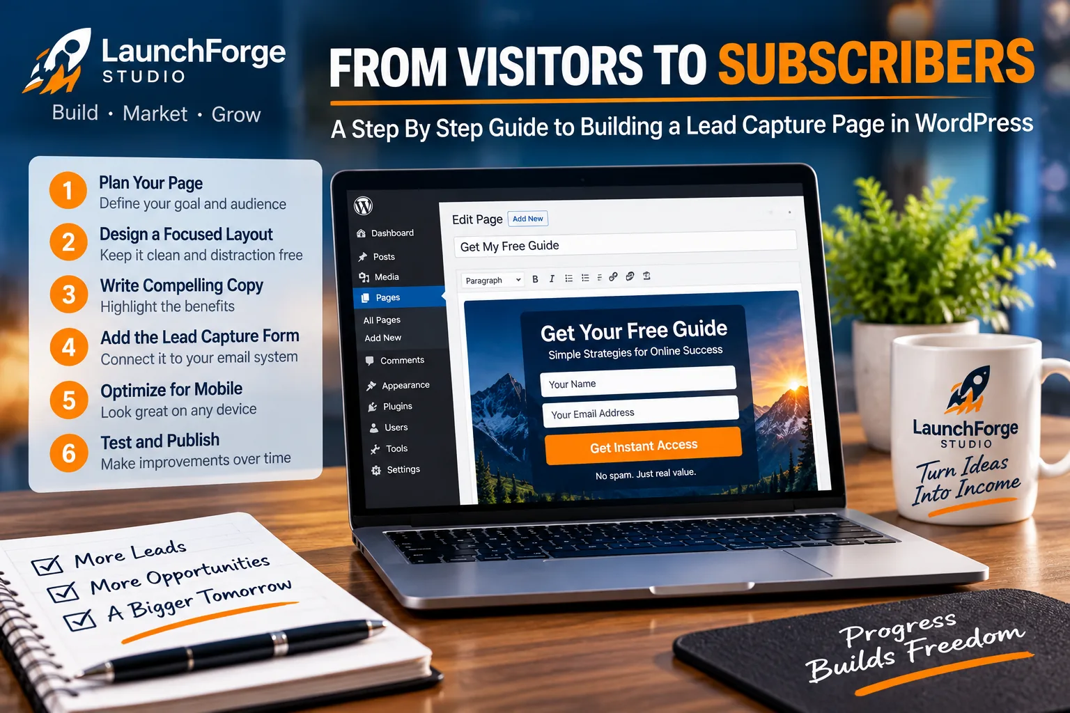
A focused lead capture page combines a clear goal, strong copy, a signup form, mobile optimization, and testing.
For this guide, we are using WordPress as the foundation. The exact controls you see will depend on your WordPress setup, theme, page builder, and form or email marketing tools, but the underlying process remains largely the same.
At LaunchForge Studio, we build with WordPress and Divi 5, so that is the setup we will use as our practical example.
You do not need to copy every design decision exactly.
The goal is to understand the structure so you can apply the same process with the tools you use.
Step 1: Create a New Page in WordPress
From your WordPress dashboard, go to:
Pages → Add New
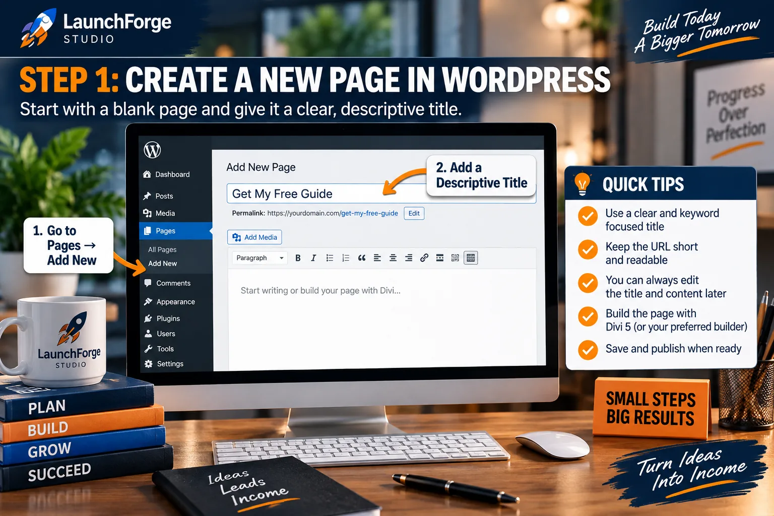
Start your lead capture page by creating a new WordPress page and giving it a clear, descriptive title.
Give the page a descriptive internal title.
For example, if you are building a page for an online business checklist, you might name it:
Online Business Launch Checklist
The page title inside WordPress does not need to be a clever marketing headline. Its first job is to help you recognize and manage the page later.
Before you begin designing, save the page as a draft.
This gives WordPress a page to work with while you build and lets you establish the URL before publishing.
Step 2: Choose a Clean Page Layout
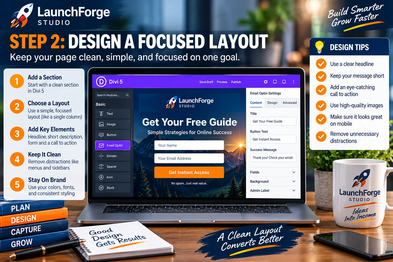
Keep your lead capture page clean and focused so the headline, offer, form, and call to action all support one goal.
Next, decide how much of your normal website structure should remain visible.
A regular website page may include your main navigation, footer navigation, sidebar, recent posts, social links, and other elements that encourage exploration.
A lead capture page has a different job.
Its purpose is to move visitors toward one primary action.
Because of that, consider using a cleaner layout that removes elements that do not help the visitor make that decision.
You do not necessarily need to remove every piece of site navigation. The right choice depends on the page, traffic source, and offer.
But ask yourself a simple question:
Does this element help the visitor understand the offer or complete the form?
If the answer is no, consider whether it needs to be on the page.
Step 3: Build the Hero Section Around the Offer
The top portion of the page should quickly answer several questions:
What is this?
Who is it for?
Why should I care?
What should I do next?
A simple hero section might contain:
- Your primary headline
- A short supporting statement
- An image or visual representation of the offer
- A few key benefits
- The signup form or a button leading directly to it
Avoid making the visitor scroll through a long introduction before discovering what the page is offering.
If the offer can be explained clearly near the top of the page, do it.
Step 4: Add the Lead Capture Form
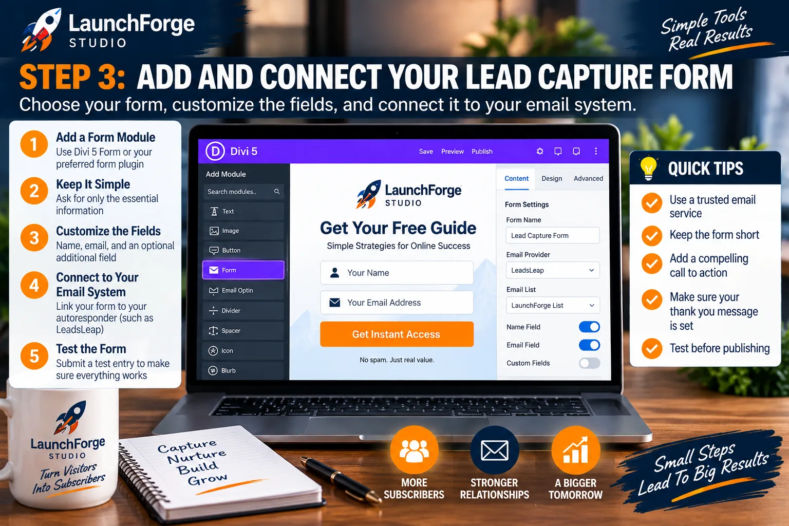
Keep your lead capture form simple, connect it to your email system, and test the entire signup process before publishing.
Now add the form that will collect the visitor’s information.
Depending on your setup, this may come from an email marketing service, WordPress form plugin, CRM, automation platform, or another lead-generation tool.
At LaunchForge Studio, the important consideration is not simply whether a form appears on the page.
The form needs to connect to whatever system will actually store and follow up with the lead.
Before moving on, verify that:
- The correct fields appear
- Required fields are clearly identified
- The form connects to the correct list or audience
- The subscriber receives the expected follow-up
- The form works correctly on desktop and mobile
- The submission sends the visitor to the intended next step
A beautiful form that does not properly add someone to your system is not a functioning lead capture system.
Test the entire process yourself before sending traffic to the page.
Step 5: Write the Call to Action
Your form needs a clear action button.
Instead of automatically accepting whatever generic button text your form tool provides, look at the action from the visitor’s perspective.
If the visitor is requesting a checklist, something like:
Get the Checklist
is clearer than:
Submit
If they are registering for training:
Start the Free Training
may communicate more value than:
Sign Up
The wording should match what actually happens after the click.
Do not promise instant access if the visitor must confirm an email first. Do not say something is free if there are conditions that make that misleading.
Clear expectations build trust.
Step 6: Add Supporting Proof and Reassurance
Once the core offer and form are in place, decide whether the visitor needs additional reassurance before opting in.
For a simple free checklist, a short privacy statement may be enough.
For a higher-commitment offer such as a consultation request, visitors may want more information about who they are contacting, what will happen next, and why they should trust the business.
Supporting elements might include:
- A brief explanation of your business
- Genuine testimonials
- A privacy statement
- Frequently asked questions
- Examples of what the visitor will receive
- A simple explanation of the next step
Add proof because it answers a legitimate question or reduces uncertainty, not because a landing-page template told you every page needs six testimonials and seventeen trust badges.
Step 7: Create the Post-Submission Experience
The lead capture process does not end when someone clicks the button.
After submitting the form, the visitor should immediately understand what happened.
A simple thank-you page can confirm the signup and explain the next step.
For example:
Thanks! Check your inbox for the checklist.
You could then explain when the email should arrive, whether the subscriber needs to confirm their address, or where they can access the promised resource.
This is also where your automation and follow-up system begin doing their jobs.
The lead capture page earns the opt-in.
The systems behind it continue the relationship.
Make Your Lead Capture Page Mobile Friendly
A lead capture page may look perfect on a desktop computer and still create a frustrating experience on a phone.
That matters because visitors may arrive from email, social media, paid advertising, search results, or other sources while using a mobile device.
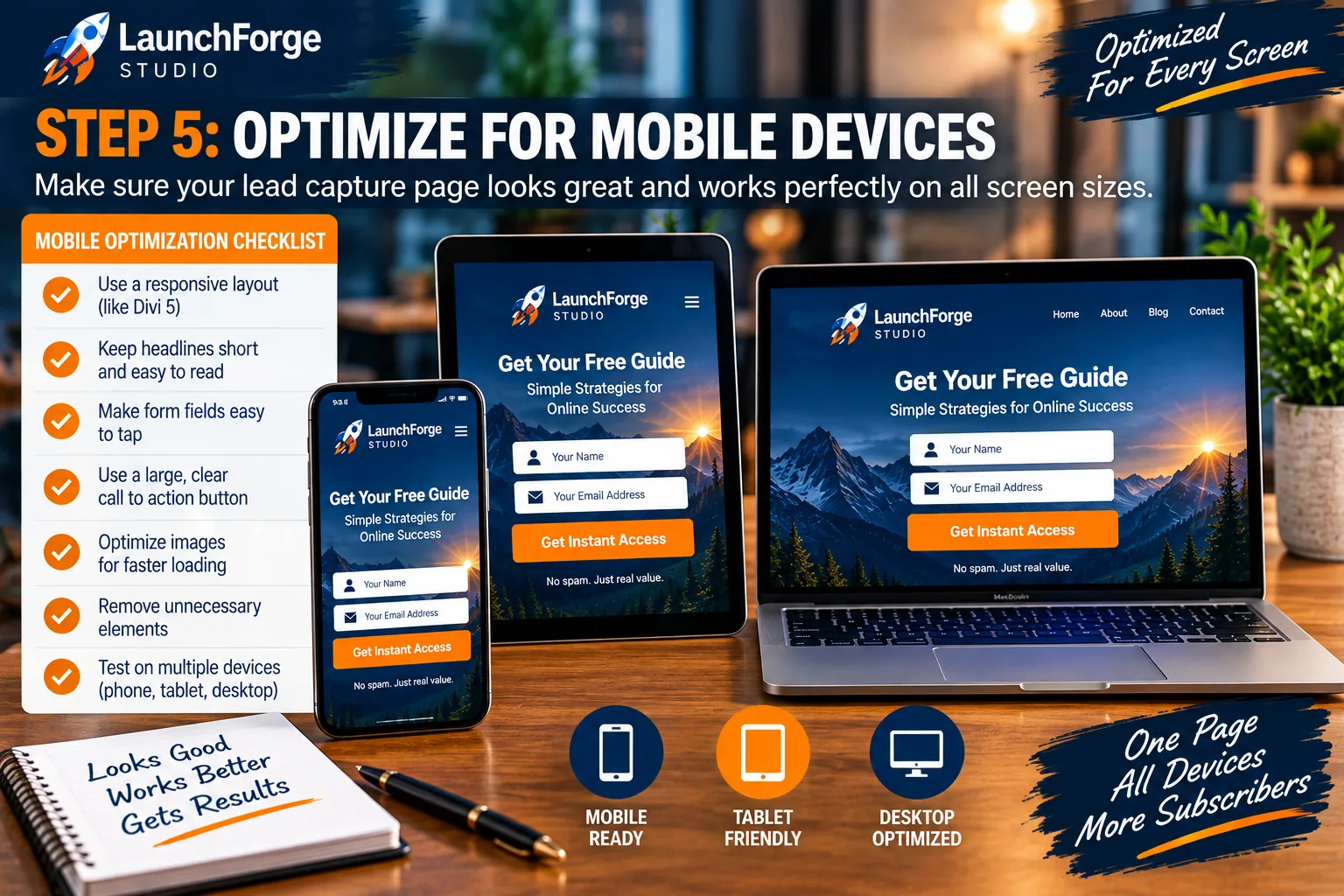
Test your lead capture page across mobile, tablet, and desktop so the form remains easy to read, tap, and complete.
Before publishing, check the page at several screen sizes.
Pay particular attention to:
- Headline size and line breaks
- Form width and field spacing
- Button size and placement
- Images that may become too large
- Text that becomes difficult to read
- Sections with excessive empty space
- Elements that overlap or extend beyond the screen
The form deserves extra attention.
Visitors should be able to tap into each field, enter their information, and press the call-to-action button without zooming, scrolling sideways, or fighting with the layout.
Keep the Mobile Experience Focused
Desktop layouts give you considerably more room to work with.
Mobile layouts do not.
That makes prioritization even more important.
The visitor should not need to scroll through several screens of decorative content before understanding the offer or finding the form.
Ask yourself what someone needs to know before deciding whether to opt in.
Put that information first.
Everything else should earn its place on the page.
Test the Entire Lead Capture Process Before Sending Traffic
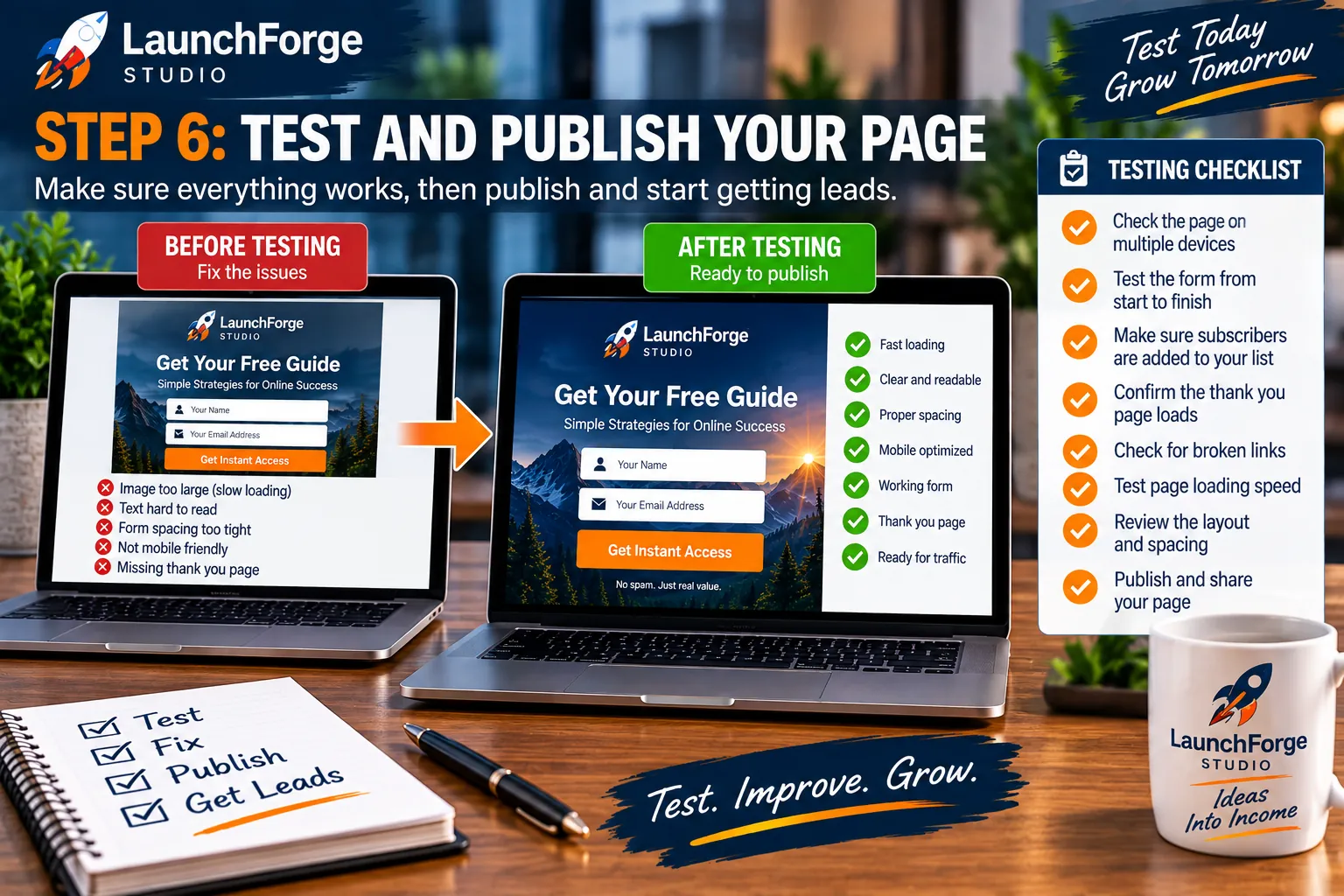
Test your form, links, thank-you page, mobile layout, and page speed before sending traffic to your lead capture page.
Finishing the design does not mean the page is finished.
You need to test what happens when a real visitor uses it.
Open the published or preview version of the page and go through the complete process yourself.
Do not simply look at the form and assume it works.
Actually submit it.
Use an email address you can access and verify the entire sequence from beginning to end.
Check the Form Submission
Confirm that the form accepts the information correctly and displays the expected success message or redirects to the correct page.
Then check the system receiving the lead.
Make sure the contact actually appears where it is supposed to appear.
If your form is connected to an email marketing platform, verify that the subscriber was added to the correct list, campaign, tag, or automation.
Check the Follow-Up Email
If the visitor is supposed to receive an email, make sure it arrives.
Check:
- The sender name
- The sender email address
- The subject line
- The formatting
- Any links inside the message
- Instructions for accessing the promised resource
If the email contains a download link, click it.
If it directs subscribers to another page, visit that page.
Test the experience the same way a new subscriber would experience it.
Check the Thank-You Page
If your form redirects to a thank-you page, make sure the page clearly confirms that the action was successful.
The visitor should know whether they need to check their inbox, confirm their email address, download something, watch something, or take another step.
A vague confirmation such as Submission Successful may technically work, but it wastes an opportunity to guide the visitor.
Tell them what happens next.
Test on More Than One Device
Check the page on both desktop and mobile.
If possible, also test it in more than one browser.
You do not need a laboratory containing twenty phones and seventeen computers.
You simply want to catch obvious problems before real traffic finds them for you.
Check Page Speed and Basic Usability
Large images, unnecessary scripts, excessive animations, and complicated layouts can make a simple lead capture page heavier than it needs to be.
Keep the experience focused.
Compress large images, remove unnecessary elements, and make sure the page responds quickly when visitors interact with it.
The goal is not to chase a perfect performance score at the expense of everything else.
The goal is to remove avoidable friction between the visitor and the action you want them to take.
Common Lead Capture Page Mistakes to Avoid
Even a technically functional page can make lead generation harder than necessary.
Before publishing, look for a few common problems.
Asking for Too Much Information
Every form field should serve a purpose.
If you only need an email address to deliver a resource, requiring a phone number, mailing address, company size, job title, and favorite breakfast cereal probably is not helping. 😂
Collect enough information to accomplish the next step.
You can build the relationship from there.
Using a Vague Offer
Visitors should not need to guess what they receive after submitting the form.
Explain the offer clearly.
What is it?
Who is it for?
What can it help them do?
What happens after they sign up?
Clear answers reduce uncertainty.
Adding Too Many Calls to Action
A lead capture page becomes less focused when every section asks the visitor to do something different.
Download the guide.
Read the blog.
Follow us on social media.
Check out another product.
Watch this unrelated video.
Visit the homepage.
Suddenly the page has stopped being a focused lead capture experience and become another navigation hub.
Keep the primary action obvious.
Forgetting the Follow-Up
Capturing an email address is not the finish line.
It is permission to continue the conversation.
If someone joins your list and then hears nothing for three weeks, the connection you just created begins fading immediately.
Have the first follow-up ready before you start driving traffic.
Publishing Without Testing
Never assume the automation works because all the settings look correct.
Forms break.
Links get entered incorrectly.
Emails land in unexpected places.
Automations get connected to the wrong list.
Thank-you pages point to old URLs.
Testing takes a few minutes and can prevent you from paying for traffic that arrives at a broken system.
Connect Your Lead Capture Page to a Bigger Marketing System
A lead capture page is useful, but it becomes much more valuable when it connects to the other parts of your online business.
Think about the complete journey.
A visitor first needs a reason to arrive on the page.
Then they need a reason to provide their contact information.
After they become a lead, you need a way to continue the relationship.
A simple version of that journey might look like this:
Traffic → Lead Capture Page → Signup Form → Thank-You Page → Follow-Up Emails → Next Offer or Resource
Each part has a different job.
The traffic source gets attention.
The lead capture page explains the value of opting in.
The form collects the information.
The thank-you page confirms what happens next.
The follow-up sequence continues the conversation.
And eventually, another useful resource, product, service, or offer may give the subscriber a logical next step.
Choose Traffic That Matches the Offer
Not all traffic arrives with the same expectations.
Someone clicking from an article about WordPress may respond differently from someone clicking an advertisement about affiliate marketing.
That is why the message that brings someone to the page should match what they find when they arrive.
If an advertisement promises a free website checklist, the landing experience should immediately reinforce that promise.
If a blog article recommends a related resource, the lead capture page should feel like a natural continuation of what the reader was already learning.
The closer the traffic source and offer align, the easier it becomes for visitors to understand why the page is relevant to them.
Use Content to Create Natural Entry Points
Your existing content can become one of the most useful places to introduce a lead capture offer.
Instead of placing the same generic email signup form underneath every article, think about what someone reading a particular article may logically want next.
A visitor learning how to build a landing page might be interested in a landing-page checklist.
Someone reading about email follow-up might want a simple welcome-sequence template.
Someone learning how to start an online business might want a launch checklist.
This creates a more natural progression:
The article solves one problem, and the lead magnet helps with the next one.
That is much more useful than interrupting every reader with an unrelated request to join a newsletter.
Follow Up With a Purpose
Once someone becomes a lead, resist the temptation to immediately bombard them with promotions.
Start by delivering what you promised.
Then help them understand what to do with it.
A simple follow-up sequence might:
- Deliver the requested resource
- Welcome the subscriber and explain what they can expect
- Provide another useful lesson or resource
- Address a related problem or question
- Introduce an appropriate next step when it makes sense
The exact sequence depends on your business and offer.
The important part is continuity.
The visitor should not feel as though they signed up for one thing and were suddenly dropped into an unrelated sales campaign.
Measure What Happens After the Click
Traffic alone does not tell you whether a lead capture page is doing its job.
Suppose 1,000 people visit your page but only a handful complete the form.
That tells you something very different from a page that receives 100 highly relevant visitors and generates a meaningful number of leads.
At minimum, it can be useful to understand:
- How many people visit the page
- How many complete the form
- Which traffic sources produce leads
- Whether subscribers receive and open the follow-up
- Whether visitors complete the next important action
You do not need an enormous analytics system on day one.
Start with the information that helps you make better decisions.
How to Improve a Lead Capture Page Over Time
Your first version does not need to be your forever version.
Once the page is working and receiving traffic, you can begin learning from what visitors actually do.
The important part is changing things deliberately rather than redesigning the entire page every time performance fluctuates.
Start With the Biggest Questions
If the page receives traffic but very few visitors opt in, look at the fundamentals first.
Is the offer relevant to the traffic?
Does the headline clearly explain the value?
Is the form asking for too much information?
Is the call to action obvious?
Does the page work properly on mobile?
Are visitors receiving what the page promised?
Fixing a fundamental mismatch usually matters more than changing a button because somebody on the internet claimed orange buttons convert 17.3 percent better on Tuesdays. 😂
Test One Meaningful Change at a Time
If you change the headline, offer, form, button, page layout, images, and traffic source simultaneously, you may see different results without knowing what caused them.
When possible, make focused changes.
You might test:
- A clearer headline
- Different benefit-focused supporting copy
- Fewer form fields
- A different call-to-action phrase
- A stronger visual representation of the offer
- A more relevant lead magnet
- A simplified mobile layout
Give the page enough traffic to learn something useful before declaring every small fluctuation a victory or disaster.
Let Real Behavior Guide Future Improvements
It is easy to spend hours debating what visitors might do.
Eventually, actual visitor behavior becomes more useful than speculation.
Build a clear first version.
Test the entire system.
Send relevant traffic.
Watch what happens.
Then improve the page based on what you learn.
That approach turns your lead capture page from a one-time design project into part of an online business system that can become stronger over time.
Lead Capture Page Checklist Before You Publish
Before you start sending visitors to your lead capture page, run through one final check.
Offer and Messaging
- Is the offer immediately clear?
- Does the headline explain what the visitor can expect?
- Does the supporting copy focus on useful benefits?
- Does the page match the message that brought the visitor there?
Form and Call to Action
- Are you asking only for information you actually need?
- Does the form work correctly?
- Is the call-to-action button easy to find?
- Does the button text clearly communicate what happens next?
- Is the form connected to the correct email list, tag, campaign, or automation?
Trust and User Experience
- Does the page explain how the visitor’s information will be used?
- Are any testimonials or claims accurate and genuine?
- Have unnecessary distractions been removed?
- Is the page easy to read and use on mobile devices?
- Do images and other page elements load properly?
Follow-Up
- Does the visitor see the correct confirmation or thank-you page?
- Is the promised resource actually delivered?
- Does the first follow-up email arrive?
- Do the links inside your emails work?
- Is the subscriber entering the correct follow-up sequence?
Final Testing
Complete the signup yourself one last time.
Do not test only the page.
Test the entire journey from visitor to subscriber to follow-up.
That final check can catch a broken link, incorrect automation, missing email, or form problem before you begin sending real traffic.
Build the Page, Then Build the Relationship
A lead capture page has a simple job: turn some of the people visiting your online business into people you have permission to communicate with again.
But the page itself is only one piece of the process.
You still need a relevant offer.
You need traffic that matches that offer.
You need a form connected to a working system.
You need a clear next step after someone opts in.
And you need follow-up that continues providing value after the initial conversion.
That is why it helps to think beyond the page.
A lead capture page works best when it becomes part of a larger system:
Traffic → Useful Content or Offer → Lead Capture Page → Follow-Up → Relationship → Next Step
You do not need to build an enormous funnel before you begin.
Start with one useful offer.
Build one focused page around it.
Connect the form to a simple follow-up process.
Test everything yourself.
Then begin sending relevant traffic and learn from what happens.
As your business grows, you can improve the offer, refine the page, test different approaches, and create additional lead capture pages for different audiences or traffic sources.
The important thing is to build a working first version instead of waiting for a perfect one.
At LaunchForge Studio, that is the approach we keep coming back to:
Build the system. Put it to work. Learn from the results. Improve what matters.
Your first lead capture page does not need to be perfect.
It needs to be clear, functional, connected to your follow-up system, and ready to give your visitors a useful reason to take the next step.