
More and more people are browsing websites, reading content, joining email lists, and making buying decisions from their phones.
That means a landing page cannot simply look good on a desktop computer. It also needs to be easy to understand, navigate, and use on a much smaller screen.
A mobile friendly landing page is designed around that experience.
The headline should be easy to read. The page should load quickly. Buttons should be easy to tap. Forms should be simple to complete. Images should fit the screen without slowing everything down. And the visitor should always understand what to do next.
The challenge is that a landing page can look perfectly fine on a desktop while creating an entirely different experience on a phone.
Text can become difficult to read. Images can take up too much space. Buttons can become awkward to tap. Forms that seemed simple on a computer can suddenly feel like work. Even the order of the content can change the way someone understands the page.
We have run into some of these same issues while building LaunchForge Studio.
A page can look finished inside the builder and still need adjustments once you start checking how it behaves on smaller screens. Sometimes the solution is a layout change. Sometimes it is spacing. Sometimes it is simplifying an element. And sometimes something as basic as replacing an oversized image can make a noticeable difference.
That is why mobile optimization should not be treated as the final checkbox before publishing.
It should be part of building the landing page.
In this guide, we are going to walk through how to make a landing page mobile friendly, what to check before sending traffic to it, and how to identify the small problems that can create unnecessary friction for mobile visitors.
You do not need to rebuild your entire landing page from scratch.
You need to look at it through the eyes of the person holding the phone.
Let’s start there.
What Is a Mobile Friendly Landing Page?
A mobile friendly landing page is designed to give visitors a clear, usable experience when they view the page on a smartphone or other smaller screen.
That involves more than making sure the page technically fits on the screen.
A visitor should be able to arrive on the page, understand the main message, read the content, interact with buttons or forms, and complete the intended action without constantly zooming, scrolling sideways, or struggling to tap small elements.
The experience should feel intentional.
Think about how differently someone uses a phone compared with a desktop computer.
On a desktop, there is plenty of room for multiple columns, larger images, longer navigation menus, and several elements appearing beside one another.
On a phone, that space disappears.
Content usually needs to stack vertically. Headlines wrap onto additional lines. Images become smaller. Buttons and form fields need enough room for someone to use them with a finger instead of a mouse.
Those changes affect more than the appearance of the page.
They can affect how someone experiences the entire message.
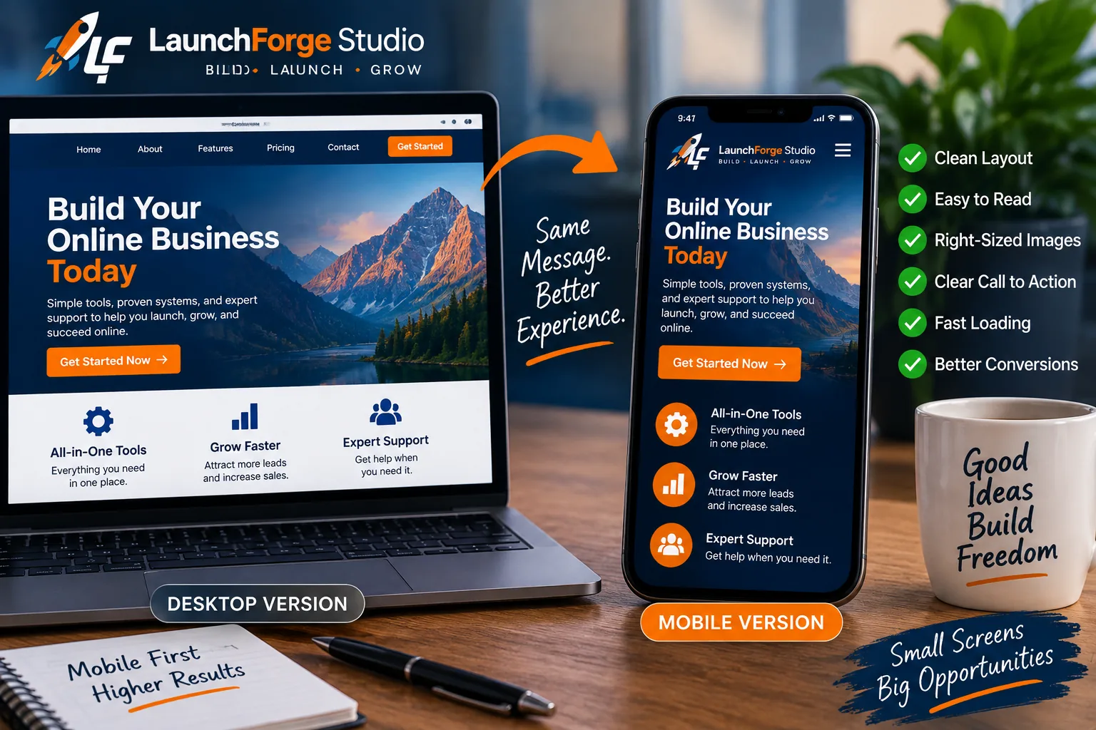
A mobile friendly landing page preserves the same message and conversion goal while adapting the layout, images, buttons, and content for a smaller screen.
Mobile Friendly Does Not Just Mean Smaller
One of the easiest mistakes to make is thinking that a mobile landing page is simply the desktop version squeezed onto a smaller screen.
It should not be.
A responsive website can automatically rearrange elements to fit different screen sizes, but that does not guarantee the resulting page is easy to use.
A desktop section containing several columns might technically stack correctly on mobile while putting the information in an awkward order.
A large hero image might resize without breaking the layout but still occupy so much of the screen that the visitor has to scroll before reaching the important message.
A button might fit perfectly on the screen but still be too small or crowded to tap comfortably.
Everything may technically be responsive while the actual experience still needs work.
That is why we need to look beyond whether the page simply fits.
We need to ask whether the page still makes sense.
Why the Mobile Experience Matters
Every landing page asks the visitor to make some kind of decision.
They might be deciding whether to keep reading, join an email list, download a resource, click a button, learn about an offer, or make a purchase.
Anything that makes those actions unnecessarily difficult adds friction to the journey.
On a phone, small problems can become surprisingly noticeable.
A paragraph that feels perfectly reasonable on a desktop can become a wall of text. A poorly positioned image can dominate the screen. A complicated form can suddenly feel much longer. A call to action can disappear beneath several screens of unnecessary content.
None of those problems necessarily mean the landing page itself is bad.
They mean the page needs to be considered from the perspective of the device being used.
The goal is not to create an entirely different message for mobile visitors.
The goal is to make sure the same message and the same intended action remain clear when the available screen becomes much smaller.
That begins with understanding the journey you want the mobile visitor to take.
Start With the Mobile Version of the Visitor Journey
Before changing font sizes, adjusting images, or moving buttons around, think about what the visitor is actually supposed to accomplish on the page.
Every landing page should have a purpose.
Maybe you want someone to join your email list. Maybe you want them to download a resource, register for something, request more information, visit an offer, or make a purchase.
Whatever that goal is, the mobile version of the page should make the journey toward it as clear as possible.
This is important because a mobile visitor experiences your landing page differently than someone sitting in front of a large monitor.
They see less of the page at one time.
That means every screen becomes part of the journey.
The headline leads to the supporting message. The supporting message leads to the next section. The next section gives the visitor another reason to continue. Eventually, that journey reaches the action you want them to take.
If unnecessary elements interrupt that progression, the page can begin to feel much longer and more complicated than it actually is.
Decide What You Want Mobile Visitors to Do
Start with one simple question:
What is the most important action someone should take on this landing page?
The answer should be clear.
If the page was created to generate leads, the signup form or call to action should support that goal.
If the page introduces an offer, the content should help the visitor understand the offer and decide whether taking the next step makes sense.
If the page gives away a resource, the visitor should quickly understand what the resource is, why it may be useful, and how to get it.
Problems begin when a landing page starts asking the visitor to do several unrelated things.
Join the list.
Read another article.
Follow us on social media.
Watch a video.
Check out three different products.
Click another menu.
Each additional choice competes for attention.
That can be distracting on any device, but the effect becomes even more noticeable on a phone because those choices are often stacked vertically across several screens.
A simple mobile experience keeps bringing the visitor back to the primary purpose of the page.
Remove Anything That Gets in the Way
Once you know the main action you want the visitor to take, look at everything surrounding it.
Ask whether each element helps the visitor move toward that action or creates another decision.
This does not mean every mobile landing page needs to be stripped down to a headline and a button.
Useful explanations, images, examples, trust elements, and supporting information can all have a legitimate purpose.
The question is whether they are helping.
An oversized image that pushes the main message farther down the page may not be helping.
A decorative section that looked great on desktop but requires another full screen of scrolling on mobile may not be helping.
A long navigation menu that pulls attention toward unrelated pages may not be helping.
Even extra spacing can become excessive when several sections are stacked one after another.
Mobile optimization is often less about adding something new and more about deciding what deserves to remain.
You are trying to create a clear path through the page.
When visitors can understand where they are, why the page matters, and what they should do next, the landing page has a much better foundation for everything that follows.
And once that journey is clear, we can start looking at the layout carrying them through it.
Keep the Mobile Layout Simple
Once the visitor journey is clear, the next thing to examine is the structure of the page itself.
A desktop landing page gives you a lot of room to work with.
You can place text beside an image, arrange features across several columns, position buttons next to supporting information, and show multiple elements on the screen at the same time.
Mobile changes that.
Most of those elements eventually need to fit inside a narrow vertical space.
That means a layout that feels balanced on a desktop can become surprisingly long or confusing once everything begins stacking on a phone.
The goal is not to eliminate every interesting design element.
It is to make sure the design continues supporting the message instead of competing with it.
A simple mobile layout helps visitors understand what they are looking at and where their attention should go next.
Use a Clear Visual Hierarchy
Visual hierarchy tells visitors what deserves their attention first.
Usually that begins with the headline.
Supporting text provides additional context. Images reinforce the message. Calls to action show the visitor what they can do next.
Those relationships may be obvious on a desktop because several elements can be viewed together.
On mobile, visitors often see only a small portion of the page at one time.
That makes hierarchy even more important.
Headings should look different from ordinary paragraphs. Important messages should stand out without overwhelming the page. Buttons should look like actions instead of disappearing into surrounding content.
Visitors should not have to study the design to figure out what matters.
As they scroll, each section should make the next part of the message easy to recognize.
Stack Content in a Logical Order
Responsive layouts often move elements that appear beside one another on desktop into a vertical stack on mobile.
That is useful, but the order matters.
Imagine a desktop section containing an image on the left and an explanation with a button on the right.
When that section stacks on mobile, you need to know which element appears first.
Sometimes the image should lead.
Other times the explanation needs to appear first so the image has context.
The same issue can happen with feature boxes, testimonials, forms, icons, pricing information, and other multi-column layouts.
Do not assume the automatic stacking order creates the best experience.
Read the mobile page from top to bottom as though you were seeing it for the first time.
Each element should make sense because of what came before it.
If the page starts telling the story out of order, rearrange the mobile layout.
Give Important Elements Room to Breathe
A simple layout does not mean squeezing everything together.
Mobile pages still need spacing.
Headlines need separation from paragraphs. Buttons need enough room around them to remain obvious. Forms should not feel crowded. Different sections should have enough visual separation that visitors can tell when one idea ends and another begins.
The problem comes when desktop spacing carries over to mobile without being checked.
Large amounts of padding can create huge empty areas on a phone.
Stack several sections with excessive spacing and visitors may find themselves scrolling through empty space just to reach the next piece of information.
Too little spacing creates the opposite problem.
Everything begins running together.
The goal is balance.
Give important elements enough room to be understood without turning every section into another full screen of scrolling.
When the layout has a clear hierarchy, a logical order, and intentional spacing, the visitor can move through the page without fighting the design.
Next, we need to look at one of the first things they will actually read: the headline.
Make Your Landing Page Headline Easy to Read on Mobile
Your headline is often one of the first things a visitor sees when they arrive on a landing page.
On a desktop screen, there is usually plenty of horizontal space for a headline to spread across one or two lines.
A phone gives you much less room.
The same headline may suddenly wrap across three, four, or even five lines. If the text is too large, too long, or poorly spaced, it can take over most of the screen before the visitor reaches anything else.
That does not mean every mobile headline needs to be short.
It means the headline needs to remain clear and comfortable to read when the available space changes.
A strong landing page headline should still communicate the main idea quickly, regardless of whether someone sees it on a large monitor or a phone held in one hand.
Keep the Main Message Visible
When someone reaches your landing page on a phone, the first screen has limited space.
Your headline may be competing with a logo, navigation, image, supporting text, button, announcement bar, or other page elements.
If too many things are fighting for that space, the main message can become buried.
Look at the page from the visitor’s perspective.
Can they quickly understand what the page is about?
Can they tell why they should continue?
Does the headline have enough visual importance to establish the purpose of the page?
You do not necessarily need to fit the entire headline, supporting paragraph, image, and call to action onto the first mobile screen.
Trying to force everything above the fold can create a cramped design that is harder to use.
Instead, make sure the beginning of the page establishes a clear direction.
The visitor should understand enough to know whether continuing to scroll is worth their time.
Watch Your Line Breaks
Line breaks can dramatically change the appearance of a headline on mobile.
A phrase that looks balanced on desktop may break in an awkward place when the screen becomes narrower.
Sometimes one important word gets pushed onto a line by itself.
Sometimes a headline becomes so tall that it dominates the entire opening section.
And sometimes manually inserted line breaks that looked great on desktop create strange spacing on smaller screens.
This is one reason previewing the mobile version matters.
Do not judge the headline only by how it looks inside the desktop editor.
Check how the words actually wrap at smaller widths.
If the headline becomes difficult to scan, you may need to adjust the font size, line height, width, spacing, or wording for the mobile layout.
The goal is not to make the headline tiny just so it occupies fewer lines.
It still needs enough visual weight to do its job.
You are looking for the balance between impact and readability.
When the headline is clear, readable, and positioned well, the visitor can understand the page without fighting through the first screen.
Then the next important question becomes obvious:
Can they easily tap the action you want them to take?
Make Buttons and Calls to Action Easy to Tap
A landing page can have a strong message, useful content, and a clear offer, but eventually the visitor needs a way to take action.
On mobile, that action usually happens with a finger.
That sounds obvious, but it changes the way buttons and other clickable elements should be designed.
A mouse pointer can accurately click a relatively small target. A thumb is much less precise.
If a button is too small, surrounded by other clickable elements, or positioned awkwardly, something that should be effortless can become frustrating.
Your call to action should not create that kind of friction.
When the visitor is ready to move forward, the next step should be obvious and easy to complete.
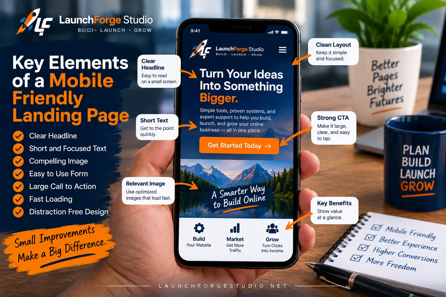
A mobile friendly landing page combines a clear headline, focused copy, optimized images, simple forms, easy-to-tap calls to action, fast loading, and a distraction-free layout.
Use Clear CTA Text
The words on a button matter just as much on mobile as they do on desktop.
Visitors should have a reasonable idea of what will happen when they tap it.
Generic language can sometimes make the next step less clear.
Instead of thinking only about what looks good inside the button, think about the action from the visitor’s perspective.
Are they downloading something?
Joining an email list?
Starting a trial?
Viewing an offer?
Registering for something?
Continuing to another page?
The button text should support that action.
You do not need to explain the entire process inside the button. The surrounding headline and copy can provide context.
But the call to action should feel like the logical next step rather than a mystery click.
Give Buttons Enough Space
Mobile buttons need enough size and surrounding space to be tapped comfortably.
That does not mean every button needs to stretch across the entire screen.
It means the clickable area should feel intentional rather than tiny.
Spacing around the button matters too.
If several links or buttons are packed closely together, someone can easily tap the wrong one. That becomes especially frustrating when the visitor is trying to complete a form or move to the next step in the funnel.
Look at what surrounds your primary call to action.
There should be enough separation for the button to stand out visually and enough physical room for someone to tap it without accidentally selecting something else.
This is another place where checking the actual page on a phone can reveal problems that are easy to miss in a desktop editor.
Do Not Make Visitors Hunt for the Next Step
A call to action should appear when it makes sense in the visitor journey.
If someone reads through the main message, understands the value of the page, and is ready to continue, they should not have to search for the button.
Longer landing pages may benefit from repeating the primary call to action at logical points.
That does not mean placing a button after every paragraph.
It means recognizing that a visitor may become ready to act before reaching the very bottom of the page.
The repeated action should remain consistent.
If one button says one thing, another promotes something unrelated, and a third sends the visitor somewhere completely different, the page starts creating competing paths again.
Keep the primary action recognizable.
Make it easy to tap.
And place it where the visitor naturally needs it.
If that action involves joining your email list or submitting information, the button is only part of the experience.
The form surrounding it needs to work just as well on a phone.
Simplify Forms for Mobile Visitors
Forms are one of the most important parts of many landing pages.
They are also one of the easiest places to create unnecessary friction on mobile.
Typing on a phone takes more effort than typing on a full-size keyboard. The screen is smaller, the keyboard covers part of the page, and moving between multiple fields can quickly become tedious.
That means a form that feels perfectly reasonable on desktop can feel much more demanding on a phone.
If the purpose of your landing page is to generate leads, the form should make that process easier rather than becoming an obstacle right before the visitor converts.
Ask Only for Information You Actually Need
Every additional form field asks the visitor to do more work.
Sometimes that information is necessary.
If someone is requesting a detailed quote or contacting a business about a specific service, you may legitimately need more than an email address.
But a simple lead capture page may not need a person’s name, phone number, company, website, location, job title, and six other pieces of information before they can join an email list.
Ask yourself what information you actually need at this stage of the relationship.
If an email address is enough to deliver what you promised and begin the follow-up process, a simple form may be all you need.
You can always learn more about the subscriber later.
The goal is not to collect as much information as possible.
The goal is to collect the information necessary for the next step.
Make Form Fields Easy to Complete
The form itself should also be comfortable to use on a smaller screen.
Fields need enough height and spacing to make them easy to select.
Labels should clearly explain what information belongs in each field.
Visitors should not have to zoom in to read instructions or figure out what the form is asking them to enter.
Pay attention to how the form behaves when the mobile keyboard appears.
Can the visitor still see the field they are completing?
Can they move naturally from one field to the next?
Does the submit button remain easy to reach?
If the form produces an error, is the message easy to see and understand?
These details may seem small, but they become part of the overall landing page experience.
The easier the form is to complete, the less unnecessary resistance you place between the visitor and the action they already decided to take.
Check What Happens After Someone Submits the Form
Mobile optimization should not stop when the visitor taps the submit button.
What happens next matters too.
If the form is supposed to add someone to an email list, confirm that the signup actually works.
If the visitor should be redirected to a thank-you page, make sure that page also works properly on mobile.
If you promised a download, instructions, webinar access, or another resource, verify that the visitor can actually reach it.
And if an email is supposed to arrive after signup, test that part of the process as well.
A beautiful mobile landing page does not accomplish much if the system breaks immediately after someone converts.
Test the entire experience from beginning to end.
Submit the form yourself.
Follow the redirect.
Open the email.
Tap the links.
Look at what the visitor sees after taking the action you asked them to take.
That is how you discover whether the mobile experience actually works instead of merely looking like it works.
Once the form and follow-up path are functioning correctly, there is another major part of the mobile experience worth examining:
The images your visitor has to download and view.
Optimize Landing Page Images for Mobile
Images can make a landing page easier to understand, reinforce the message, demonstrate a product, or simply make the page more visually interesting.
They can also become one of the biggest problems on mobile.
A large image that looks beautiful across a desktop screen may be far more than a phone needs to download and display.
That can affect page speed, consume unnecessary bandwidth, push important content farther down the screen, and create awkward cropping when the available space changes.
Mobile optimization does not mean removing every image.
It means making sure each image earns its place on the page and is prepared for the screen where someone will actually see it.
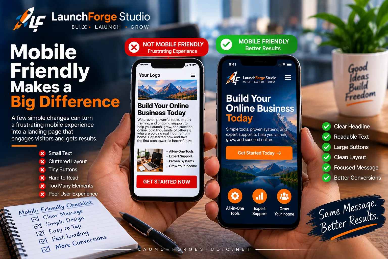
Small mobile improvements can turn a cluttered landing page into a clearer experience with readable text, larger buttons, focused content, and an easier path forward.
Do Not Make a Phone Download an Oversized Desktop Image
One of the lessons we encountered while building LaunchForge Studio involved the hero image on our own website.
The original image looked good, but it was much larger than we needed for the way it was being displayed on mobile.
The phone did not need all of those extra image dimensions just to display a much smaller version on the screen.
So we created a smaller, optimized version specifically suited to that use.
That is a simple example of something that can easily be overlooked while building a page from a desktop computer.
An image can resize visually without necessarily being optimized efficiently.
If a large desktop image is being displayed at a fraction of its original dimensions on mobile, look at whether a more appropriately sized version can accomplish the same job.
The visitor does not care how enormous the original file was.
They care that the page loads and the image looks good when it appears.
Keep Images Relevant to the Page
Every image also occupies valuable screen space.
On desktop, a decorative image may sit comfortably beside a block of text without interrupting the flow.
On mobile, that same image may become an entire section of the page.
That makes relevance more important.
Ask what the image is contributing.
Does it help explain the message?
Does it demonstrate something the visitor needs to understand?
Does it establish useful context?
Does it support the offer or action?
If the answer is yes, the image may deserve the space it occupies.
If the image exists primarily because the section looked empty without it, take another look at whether mobile visitors really need it.
This does not mean every image needs to be educational.
Visual design still matters.
But when screen space is limited, decorative elements should not repeatedly push useful information farther away from the visitor.
Check Cropping and Positioning on Smaller Screens
Images can also behave differently when their containers change shape.
A wide desktop image may need to fit inside a much narrower mobile area.
Background images can become especially tricky because portions of the image may disappear as the container changes dimensions.
The subject that appeared perfectly positioned on desktop can suddenly be cropped.
Text built into an image can become too small to read.
A person’s face can disappear behind another element.
An important part of a screenshot can get cut off.
That is why you need to look at the actual mobile presentation rather than assuming responsive settings handled everything correctly.
Check the crop.
Check the focal point.
Check what appears above and below the image.
If the image contains important information, make sure that information is still visible and understandable.
Sometimes adjusting the position is enough.
Sometimes you may need different dimensions.
And sometimes the best mobile decision is to hide a decorative image entirely rather than forcing it into a layout where it no longer works.
The goal is not to preserve the desktop design at all costs.
The goal is to preserve the purpose of the page.
Optimizing the dimensions and placement of your images helps with that experience.
But image optimization also connects directly to another major part of a mobile friendly landing page:
How quickly the page loads.
Improve Mobile Landing Page Speed
A mobile friendly landing page should not make visitors wait unnecessarily before they can use it.
Page speed matters on every device, but mobile visitors can experience conditions that are very different from someone sitting at a desktop computer with a fast connection.
They may be using cellular data.
They may have a weak signal.
They may be moving between networks.
And they may be trying to load your landing page while several other things are happening on their phone.
You cannot control all of those conditions.
What you can control is how much unnecessary work your landing page asks the visitor’s device to do.
A fast page begins with keeping the experience focused.
Compress Large Images
Images are one of the first places to look when a landing page feels heavy.
As we just discussed, displaying an image at a smaller size does not automatically mean the original file itself is small.
Pay attention to both the dimensions and the file size of the images you upload.
Compression can reduce the amount of data an image requires while still maintaining enough visual quality for the page.
Modern image formats can also help reduce file sizes when they are appropriate for your website and workflow.
At LaunchForge Studio, we use WebP for our website imagery because it allows us to keep visual quality while working toward smaller, more practical files.
But the format alone is not a magic solution.
A gigantic image is still a gigantic image if it was never prepared properly.
Resize images for the way they will actually be used, compress them appropriately, and then check the finished result.
The goal is not to destroy image quality in pursuit of the smallest possible file.
It is to avoid making visitors download more than the page needs.
Avoid Unnecessary Page Elements
Images are not the only things that can add weight to a landing page.
Videos, animations, third-party scripts, tracking tools, embedded widgets, custom fonts, popups, and other features can all contribute to the amount of work required to load and display the page.
Some of those elements may be useful.
The problem begins when features are added simply because they are available.
A landing page does not become better because everything moves, slides, fades, spins, pops up, or loads from another service.
Every element should have a reason to be there.
If something helps explain the offer, build trust, capture the lead, or move the visitor toward the intended action, it may be worth keeping.
If it adds complexity without helping the visitor, question whether you need it.
This is another advantage of keeping your first landing page simple.
There is less unnecessary machinery standing between the visitor and the reason they arrived.
Test the Page Instead of Guessing
It is easy to assume a landing page is fast because it loads quickly on your own computer or phone.
That is not enough information.
Your browser may already have some resources cached. Your connection may be faster than the visitor’s. Your device may handle the page differently.
Use performance testing as another source of information.
Tools such as Google PageSpeed Insights can help identify potential performance problems and show how the page behaves under simulated mobile conditions.
But do not turn performance scores into another game where the only goal is reaching 100.
A testing tool can point you toward issues worth investigating.
It cannot decide what your landing page needs to accomplish.
Use the results to find meaningful problems.
If an oversized image is slowing the page down, optimize it.
If an unnecessary script is creating additional work, investigate whether you need it.
If something important to the page has a performance cost, understand that tradeoff before removing it simply to improve a score.
The purpose of testing is to make the experience better for the visitor.
Not to collect a perfect number.
Once the page is loading efficiently, the visitor still needs to be comfortable reading what appears on the screen.
That brings us to typography, spacing, and readability.
Check Fonts, Spacing, and Readability
A landing page can be technically responsive and still be uncomfortable to read on a phone.
Typography plays a major role in that experience.
Visitors should not have to pinch and zoom just to understand your message. They also should not be confronted with enormous text that forces a short sentence to occupy most of the screen.
Like everything else on a mobile landing page, readability comes down to balance.
Your fonts, line spacing, paragraph length, and contrast should work together to make the content easy to follow as the visitor scrolls.
Make Body Text Comfortable to Read
Body text needs to be large enough to read comfortably on a smaller screen.
There is no reason to make visitors work for information you want them to understand.
At the same time, simply increasing the font size is not the entire solution.
Line height matters.
The width of the text matters.
Spacing between paragraphs matters.
Even the font itself can affect how comfortable a block of text feels on a phone.
Look at the finished page instead of relying entirely on the settings inside the builder.
Read a few paragraphs on your own phone.
If you immediately feel like zooming in, the text may be too small.
If only a few words fit on each line and every paragraph becomes extremely tall, the text may be too large for the available width.
The goal is comfortable reading without requiring the visitor to think about the typography at all.
When the text works, it disappears into the experience and lets the message do its job.
Watch Paragraph Length
Paragraph length becomes much more noticeable on mobile.
A paragraph that occupies four or five lines on desktop might become twice that length when displayed on a narrow screen.
Stack several long paragraphs together and the visitor can suddenly be staring at what feels like an uninterrupted wall of text.
Breaking ideas into shorter paragraphs can make the content easier to scan.
That does not mean every sentence needs its own paragraph.
And it does not mean useful explanations need to be reduced to a handful of bullet points.
We still want enough depth to actually teach something.
The purpose is to create natural visual breaks so readers can follow the information without losing their place.
Headings and subheadings help with this too.
They divide longer pages into recognizable sections and give someone scrolling on a phone clear landmarks throughout the article or landing page.
Keep Enough Contrast Between Text and Background
Readable text also depends on contrast.
A beautiful color combination is not very useful if visitors struggle to distinguish the words from the background.
Light gray text on a white background may look subtle and polished on a large monitor while becoming difficult to read on a smaller screen.
Text placed directly over an image can create similar problems when the background changes behind different parts of the words.
Make sure important text has enough contrast to remain clear.
If you place text over an image, consider whether the background needs an overlay or another treatment that keeps the words readable.
Buttons need the same consideration.
The button should stand apart from the surrounding page, and the text inside it should remain easy to read.
Do not make visitors hunt for information because the design is trying too hard to be subtle.
Good mobile typography does not need to call attention to itself.
It needs to make reading easy.
Once the page is readable, the next thing to examine is everything that might be interrupting that experience.
Remove Mobile Distractions
A landing page works best when visitors can focus on the reason they arrived.
That becomes especially important on mobile because there is less screen space available for everything competing for attention.
A desktop visitor may be able to see the main content while a menu, popup, chat widget, notification, or other element appears somewhere else on the screen.
On a phone, those same elements can cover a much larger percentage of the available space.
Something that felt like a small addition on desktop can suddenly become the dominant feature of the mobile page.
That does not mean every popup, menu, or interactive element is automatically bad.
It means you need to understand what happens when those elements compete with the primary purpose of the landing page.
Be Careful With Popups and Overlays
Popups can be useful for collecting leads, delivering announcements, presenting offers, or drawing attention to an important message.
But the mobile experience needs to be considered separately.
If a popup covers most of the screen before the visitor has even had a chance to understand the landing page, you may be interrupting the very journey you worked to create.
The same problem can happen with cookie notices, promotional bars, chat boxes, push notification prompts, and other overlays.
Individually, each element may seem reasonable.
Stack several of them together and the visitor can spend the first few moments closing things instead of reading the page.
If you use a popup on mobile, test it yourself.
Make sure the content fits comfortably within the available screen.
Make sure the close button is visible and easy to tap.
And think carefully about when the popup appears.
The goal should be to support the visitor experience, not ambush it.
Keep Navigation From Taking Over the Screen
Navigation can create another challenge.
A traditional desktop menu may contain several primary links, dropdowns, buttons, and other options.
On mobile, that navigation usually collapses into a smaller menu.
That is useful, but opening the menu should not create confusion or make important links difficult to use.
Check how the menu behaves.
Can visitors easily open and close it?
Are the links large enough to tap?
Do dropdowns work properly?
Does the menu cover the entire screen in a way that makes it difficult to understand where the visitor is?
More importantly, consider how much navigation the landing page actually needs.
A focused landing page may intentionally offer fewer ways to leave than a normal website page because the visitor arrived for one specific purpose.
The right amount of navigation depends on what the page is trying to accomplish.
But whatever you include should support the journey rather than becoming another collection of competing choices.
Protect the Main Conversion Goal
Every additional element on a landing page asks for some amount of attention.
That attention is limited.
If the primary goal is getting someone to join your email list, a large social media widget may pull them away before they subscribe.
If the goal is introducing an offer, several unrelated promotional banners may compete with it.
If the visitor is filling out a form, a popup appearing halfway through the process can interrupt the action entirely.
This is why the main conversion goal should act as a filter for the page.
Before adding something, ask whether it helps the visitor move forward.
Before keeping something, ask whether it still earns the attention it requires.
And before removing something, make sure you understand the role it was playing.
Mobile optimization is not about blindly stripping a page until nothing remains.
It is about protecting the path you intentionally created.
Once unnecessary distractions are under control, there is only one reliable way to know whether all of these decisions actually work together.
You need to test the finished landing page on a real phone.
Test Your Landing Page on a Real Phone
A responsive preview inside your website builder is useful.
It can show you how the layout changes at different widths and help you catch obvious problems before publishing.
But a preview is still a preview.
At some point, you need to put the landing page on an actual phone and use it the way a visitor would.
That is when you start noticing things that were easy to miss while working from a desktop computer.
Maybe the headline feels larger than expected.
Maybe a button that looked perfectly positioned in the builder requires too much scrolling to reach.
Maybe an image takes longer to appear than you realized.
Maybe the form becomes awkward once the mobile keyboard opens.
Those are exactly the kinds of details you want to discover yourself instead of leaving them for your visitors to find.
Do Not Rely Only on a Desktop Preview
Responsive editing tools are valuable because they let you make adjustments without constantly switching devices.
Use them.
But do not assume that selecting a little phone icon inside a page builder proves the mobile experience is finished.
The real device introduces variables the desktop preview cannot completely reproduce.
You are physically holding the screen.
You are scrolling with your thumb.
You are tapping actual buttons.
You are dealing with the browser interface, mobile keyboard, screen orientation, and the natural way someone moves through a page on a phone.
That experience matters.
Open the published or preview version of the landing page on your phone and start at the top.
Do not immediately begin looking for technical problems.
First, simply use the page.
Does it feel natural?
Can you understand the message?
Does anything interrupt the flow?
Are there places where you instinctively hesitate because you are not sure what to do next?
Those reactions can reveal usability problems that are difficult to recognize while you are still thinking like the person who built the page.
Test Links, Buttons, and Forms
Once you have walked through the page normally, test the interactive elements.
Tap every important button.
Open the links.
Use the navigation if the page includes it.
Complete the form.
Try the call to action.
If the page contains expandable sections, videos, menus, or other interactive features, test those too.
Do not assume something works because it worked on desktop.
Pay attention to the entire action.
If you tap a button, does it go to the correct destination?
If you submit the form, does the submission complete successfully?
If the visitor is redirected, does the next page work properly on mobile?
If an email should arrive, does it arrive?
Testing the full journey helps you catch problems beyond the visual design of the landing page itself.
Check More Than One Screen Size When Possible
Your phone is an excellent starting point, but it is not the only phone your visitors may use.
Mobile screens come in different sizes and proportions.
A layout that looks perfect on one device may wrap differently on another.
You do not need a drawer filled with twenty phones to test every possible combination.
Use the responsive tools available in your browser or website builder to examine additional widths, and test on another physical device when one is conveniently available.
Pay particular attention to layouts that depend on tight spacing.
Headlines can wrap differently.
Buttons can shift.
Images can crop in unexpected ways.
Columns may stack differently as the available width changes.
The goal is not to make every device display the page identically.
That would defeat the purpose of responsive design.
The goal is to make sure the experience remains usable as the screen changes.
And this is where the difference between theory and actually building something becomes important.
We have seen that firsthand while building LaunchForge Studio.
How We Handle Mobile Optimization at LaunchForge Studio
LaunchForge Studio has given us plenty of opportunities to see the difference between building a page on a desktop and actually experiencing that page on a phone.
We build primarily from a desktop computer because that gives us the workspace we need to design pages, write content, manage WordPress, and make changes efficiently.
But the people visiting the finished website are not necessarily using the same kind of screen.
That means desktop cannot be the end of the process.
As LaunchForge has grown, we have checked pages on smaller screens, adjusted layouts, changed spacing, optimized images, and looked for places where the mobile experience could be improved.
One of the clearest examples came from the hero image on the website.
Our Hero Image Taught Us a Useful Lesson
We originally had a much larger hero image being used on the site.
Visually, it worked.
The problem was that the mobile version did not need an image with those larger desktop dimensions to display it at a much smaller size.
So instead of assuming that responsive resizing was enough, we created a smaller optimized version for the way the image was actually being displayed on mobile.
That version was approximately 371 by 247 pixels.
It was a relatively small change in the overall process, but it reinforced an important lesson:
Responsive and optimized are not always the same thing.
A website builder may successfully make an oversized image fit on a phone.
That does not necessarily mean the phone needed to download that oversized image in the first place.
The experience improved because we looked beyond whether the design technically worked and started asking whether the asset itself made sense for the device.
We Check the Page Instead of Trusting the Builder
We use Divi 5 to build and manage pages on LaunchForge Studio.
Its responsive controls give us the ability to preview layouts and make device-specific adjustments while we work.
Those controls are extremely useful.
But we still do not want the builder preview to be the final judge.
After making changes, we look at how the actual page behaves.
That is where we can see whether the spacing feels right, whether images are taking up too much room, whether text wraps naturally, and whether the journey still makes sense once everything is stacked vertically.
Sometimes the page is fine.
Sometimes a small adjustment makes it noticeably better.
The important part is checking.
Mobile Optimization Is Part of the Build
This has also changed the way we think about mobile optimization.
We do not want to build an entire page for desktop, declare it finished, and then treat mobile as a repair job afterward.
It makes more sense to consider mobile while the page is being built.
If we create a multi-column section, we should already be thinking about what happens when those columns stack.
If we add an image, we should consider how large it needs to be.
If we create a button, we should think about how someone will tap it.
If we add a form, we should consider what completing that form will feel like on a phone.
That does not mean every mobile decision has to be made before the desktop version exists.
It means mobile becomes part of the same build process instead of a separate problem waiting at the end.
And we are still learning.
LaunchForge Studio is a working website and an evolving online business. As we add pages, publish content, test tools, and make improvements, we continue finding things that can be refined.
That is exactly why we believe in building along instead of pretending everything was perfect from day one.
Build it.
Use it.
Test it.
Find what needs improvement.
Then make it better.
That process applies to far more than mobile landing pages.
But mobile optimization is a perfect example of why it works.
And after working through the process ourselves, we have also learned that several mobile landing page mistakes show up again and again.
Common Mobile Landing Page Mistakes
Most mobile landing page problems are not caused by one enormous design failure.
They usually come from a collection of smaller decisions that made sense while building the desktop version but were never reconsidered for a smaller screen.
That is actually good news.
It means many mobile problems can be improved without rebuilding the entire landing page.
You need to know what to look for.
Here are some of the most common mistakes worth checking before you start sending visitors to the page.
Shrinking the Desktop Page and Calling It Done
Responsive design can do a lot of work automatically.
Columns stack. Images resize. Text wraps. Menus collapse.
But automatic responsiveness does not guarantee a good mobile experience.
The order of the content may still feel wrong.
Spacing may become excessive.
Important information may appear much farther down the page than expected.
A section that looked balanced horizontally may become unnecessarily long once every element is stacked vertically.
Use responsive behavior as the starting point.
Then evaluate the result.
The question is not simply, “Does the page fit?”
The better question is, “Does the page still work?”
Using Images That Are Too Large
We have already seen this one ourselves at LaunchForge.
An image can display correctly on mobile while still being larger than necessary behind the scenes.
That can create unnecessary work for the visitor’s device and connection.
Look at the images doing the most work on the page, particularly large hero images and other prominent visuals.
Make sure their dimensions and file sizes make sense for the way they are being used.
Compress them appropriately.
Use practical image formats.
And remember that bigger does not automatically mean better once the image is being viewed on a phone.
Making Buttons Too Small
A button may look clean and elegant on desktop while becoming annoying to use with a thumb.
Check the size of the clickable area.
Check the spacing around it.
And check whether other clickable elements are positioned too close.
The visitor should not need precision aim to take the action you are asking them to take.
A primary call to action deserves enough visual and physical space to be used comfortably.
Using Forms That Ask for Too Much
Long forms create work.
Sometimes that work is justified because the business genuinely needs the information.
But if the goal is simply to capture a lead or deliver a resource, asking for unnecessary details can create friction before the relationship has even started.
Review every field.
Ask why you need it.
If you cannot explain why that information is necessary at this stage, consider whether the field belongs there.
A shorter form is not automatically better in every situation.
A purposeful form is.
Cramming Too Much Above the Fold
The phrase “above the fold” refers to what someone can see before scrolling.
That area is valuable, but trying to force everything into it can make the mobile version worse.
You may want the logo, headline, supporting copy, hero image, trust elements, form, call to action, and several other pieces visible immediately.
A phone does not give you enough room for all of that without making something cramped.
You do not need to explain the entire landing page on the first screen.
Give visitors enough information to understand where they are and why they should continue.
Scrolling is not the enemy.
Confusion is.
Forgetting to Test the Finished Page
This may be the easiest mistake to avoid.
You spend hours building the page.
You adjust the desktop layout.
You check the responsive preview.
Everything looks good.
Then you publish and move on.
Take another few minutes and use the page yourself.
Open it on your phone.
Scroll through it.
Tap the buttons.
Complete the form.
Check the links.
Look at the images.
Read the headline.
Follow the next step.
You may discover nothing is wrong.
Great.
Or you may find one small issue that would have affected every mobile visitor who arrived after you started promoting the page.
That makes the test worth doing.
None of these mistakes require some secret mobile optimization strategy to understand.
They come back to the same principle we have followed throughout this guide:
Experience the landing page the way your visitor will experience it.
Once you do that, the final step is turning everything we have covered into a repeatable check you can use before sending traffic.
Mobile Friendly Landing Page Checklist
By this point, we have covered a lot of individual pieces.
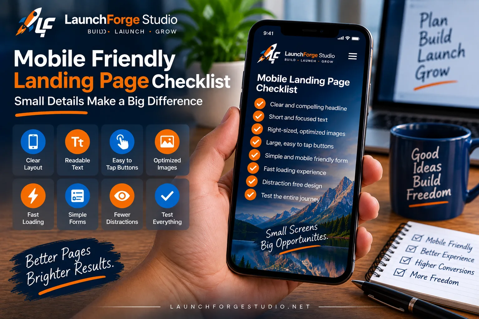
A mobile friendly landing page should combine a clear layout, readable text, easy-to-tap buttons, optimized images, simple forms, fast loading, fewer distractions, and real-world testing.
Layout.
Headlines.
Buttons.
Forms.
Images.
Page speed.
Readability.
Distractions.
Testing.
You do not need to memorize every detail each time you build a landing page.
What you need is a repeatable process for checking the important parts before you start sending people to it.
Use this checklist as a final walkthrough.
Check the First Mobile Screen
Open the landing page on your phone and look at the first screen before you start scrolling.
Ask yourself:
Can I tell what this page is about?
Is the headline easy to read?
Does anything unnecessarily dominate the screen?
Is there a clear reason to continue?
You do not need to fit the entire message above the fold.
You simply want the beginning of the page to establish enough context for the visitor to understand why they should keep going.
Check the Layout From Top to Bottom
Now scroll through the entire page.
Look at the order in which everything appears.
Make sure columns have stacked logically.
Watch for excessive empty space.
Check whether images, text, forms, and buttons appear in an order that still makes sense.
Each section should feel connected to the one before it.
If something feels out of place, investigate why.
Check the Headline and Text
Read the content instead of merely looking at it.
Make sure the headline wraps naturally.
Check that body text is comfortable to read without zooming.
Look for paragraphs that become overwhelming on the narrower screen.
Make sure headings clearly separate the different parts of the page.
And check the contrast between the text and its background.
If reading the page feels like work to you, it may feel like work to your visitor too.
Check Every Important Button
Tap the primary call to action.
Then test any other important buttons on the page.
Make sure they are large enough to use comfortably and separated from nearby clickable elements.
Confirm that each button leads to the correct destination.
If the primary call to action appears more than once, make sure those buttons support the same intended journey.
The visitor should never have to wonder which button actually moves them forward.
Check the Form
If the landing page contains a form, complete it yourself.
Test every field.
Watch what happens when the mobile keyboard appears.
Make sure labels and instructions remain readable.
Submit the form.
Then verify what happens next.
If there is a thank-you page, visit it.
If an email should arrive, check for it.
If the visitor should receive a resource, make sure the resource is accessible.
Do not stop testing at the submit button.
Check the Images
Look at every important image on the page.
Make sure nothing is awkwardly cropped.
Check that text inside images is still readable if you use it.
Pay particular attention to large hero images and backgrounds.
Ask whether each image needs to occupy the amount of space it currently uses.
And make sure you are not forcing a mobile visitor to download an unnecessarily oversized file simply because that was the version originally created for desktop.
Check the Loading Experience
Load the page again and pay attention to what happens.
Does important content appear quickly?
Do large images take noticeably longer to load?
Does the page jump around as different elements appear?
Do popups, widgets, or other scripts interrupt the experience?
Performance testing tools can provide additional information, but your own experience using the page is valuable too.
If something feels slow, find out why.
Check for Distractions
Look at everything competing with the primary purpose of the landing page.
Navigation.
Popups.
Chat widgets.
Announcement bars.
Social links.
Promotional banners.
Other offers.
None of those elements are automatically wrong.
But each one asks for attention.
Make sure the elements you keep are worth the attention they require.
Check the Entire Journey One More Time
Finally, stop thinking like the person who built the page.
Pretend you are the visitor.
Where did you come from?
What do you see first?
What are you being asked to do?
Why should you do it?
What happens after you take the action?
Walk through that entire journey from beginning to end.
A mobile friendly landing page is not created by passing one technical test.
It comes from making dozens of small decisions that collectively create an experience someone can understand and use.
Once those decisions are working together, you are ready for the most important part.
Put the page in front of real people, learn from what happens, and continue improving it.
Build for the Person Holding the Phone
Making a landing page mobile friendly is not about creating a perfect mobile score or following a checklist simply because someone said you should.
It is about the person on the other side of the screen.
That person may have discovered your page through Google.
They may have tapped a link in an email.
They may have found you through social media, an advertisement, another website, or a recommendation.
However they arrived, they probably are not thinking about responsive breakpoints, image dimensions, button spacing, or page speed scores.
They are trying to accomplish something.
Your job is to make that easier.
Start with the journey you want them to take.
Keep the layout clear.
Make the headline readable.
Give buttons enough room to be tapped comfortably.
Keep forms focused on the information you actually need.
Use images that support the page without unnecessarily slowing it down.
Pay attention to typography and spacing.
Remove distractions that compete with the main goal.
Then pick up your phone and test the entire experience yourself.
Do not assume that because something works on desktop it automatically works everywhere else.
And do not assume that because a page is technically responsive it cannot be improved.
We learned that while building LaunchForge Studio.
Sometimes improvement comes from something relatively small, such as replacing an oversized hero image with a version better suited to the way it is actually displayed.
Other times you may discover that a section needs to be reordered, a button needs more room, a form asks for too much information, or an element that looked great on desktop simply does not earn its space on mobile.
You will not discover every improvement before publishing.
That is okay.
Build the page.
Check it.
Use it.
Send people to it.
Pay attention to what happens.
Then improve the parts that actually need improvement.
That is a much more useful approach than endlessly adjusting a landing page because you are trying to predict every possible problem before a real visitor ever sees it.
A mobile friendly landing page does not need to be complicated.
It needs to respect the person using it.
Give them a clear message.
Give them a usable experience.
Give them an obvious next step.
And make that next step easy to take from the device already sitting in their hand.