
Getting visitors to your website is exciting.
You’ve spent time building your website, creating content, sharing links, and maybe even investing money in advertising. People are finally showing up, exploring your pages, and discovering what you have to offer.
But there’s one frustrating problem.
They’re visiting your website without taking action.
They’re not joining your email list. They’re not requesting information. They’re not clicking your affiliate links. And they’re certainly not becoming customers.
Sound familiar?
Many beginners focus almost entirely on getting more website traffic, believing that more visitors will automatically lead to more sales, subscribers, or inquiries.
Unfortunately, website traffic alone doesn’t guarantee results.
What matters is what happens after someone arrives.
That’s where understanding how to improve website conversion rates becomes so valuable.
Website conversion rate optimization, often called CRO, is the process of improving your website so more visitors complete a desired action. That action might be subscribing to your newsletter, downloading a free guide, requesting a quote, clicking through to an offer, or making a purchase.
And here’s something every beginner should understand:
You don’t necessarily need more visitors to get better results. Sometimes, you need to make better use of the visitors you already have.
Imagine two websites receiving 1,000 visitors each month.
The first website converts 1% of those visitors into leads, generating 10 leads.
The second website converts 3% of its visitors, generating 30 leads.
Both websites receive exactly the same amount of traffic.
Yet the second website generates three times as many leads.
Same traffic. Different results.
That’s the potential value of improving your website’s conversion rate.
And the good news? You don’t need to be a professional web designer, an experienced marketer, or a technical expert to begin making improvements.
Sometimes, relatively simple changes can make a meaningful difference:
- Writing clearer headlines that explain what you offer.
- Making your calls to action easier to find and understand.
- Simplifying forms so visitors aren’t overwhelmed.
- Improving your website’s mobile experience.
- Building trust before asking people to make a commitment.
- Removing distractions that prevent visitors from taking the next step.
Of course, not every change will increase conversions. That’s why learning how to measure results and test improvements is just as important as making the changes themselves.
In this beginner-friendly guide, we’ll explore 12 practical ways to improve website conversion rates, explain why visitors sometimes leave without taking action, and show you how to make your website more effective without immediately spending more money on advertising.
Whether you’re building your first online business, promoting affiliate products, growing an email list, or offering services, these principles can help you create a better experience for your visitors.
Because attracting visitors is only the beginning. Helping them confidently take the next step is where real progress happens.
What Is Website Conversion Rate Optimization?
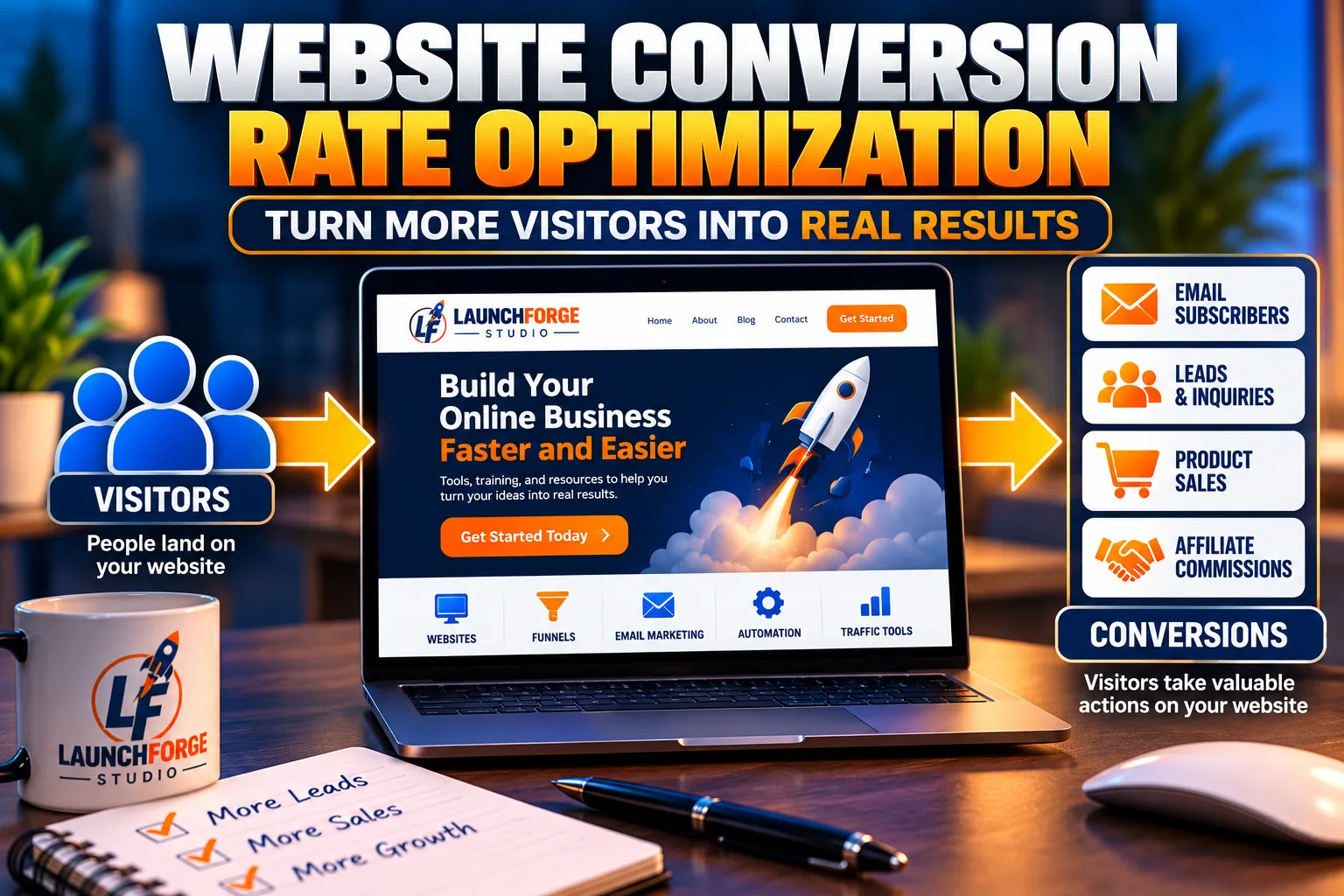
Website conversions happen when visitors take valuable actions, such as subscribing, requesting information, or making a purchase.
Website conversion rate optimization (CRO) is the process of improving your website to increase the percentage of visitors who complete a specific action.
In simple terms, CRO helps answer one important question:
How can I make my website more effective at turning visitors into leads, subscribers, or customers?
Every website has a purpose.
Some websites exist to sell products. Others collect email subscribers, generate leads, promote affiliate offers, or encourage visitors to request information.
Regardless of your business model, there is usually something you want visitors to do.
That desired action is called a conversion.
What Counts as a Website Conversion?
A conversion happens when a visitor completes an action you’ve identified as valuable to your business.
For example:
- Affiliate marketing website: A visitor clicks through to an affiliate offer.
- Service business: A visitor submits a contact or quote request.
- Blog: A reader subscribes to an email newsletter.
- Online store: A shopper completes a purchase.
- Landing page: A visitor downloads a lead magnet.
- Online business platform: A visitor registers for a webinar or demonstration.
Notice that not every conversion involves an immediate sale.
For a beginner building an online business, collecting an email subscriber or receiving a qualified inquiry may be an important step toward eventually generating revenue.
These smaller actions often play an important role in guiding potential customers toward a purchase. Our beginner-friendly guide on What Is a Sales Funnel and How Does It Work? explains how the different stages of a sales funnel help move visitors from initial interest toward making an informed buying decision.
That’s why it’s essential to define what success means for your particular website.
For example, a visitor clicking an affiliate link is a measurable conversion on your website, but it doesn’t necessarily mean that person purchased the product.
Understanding that distinction helps you measure progress accurately.
Why Conversion Rate Optimization Matters for Beginners
When you’re just starting an online business, your resources may be limited.
You might have a small advertising budget, limited website traffic, or only a few hours each week to work on your business.
That makes it especially important to get the most value possible from the traffic you already receive.
Consider what happens when you continually focus on attracting more visitors without addressing problems on your website.
You could spend more money on advertising, publish additional articles, and promote your business across multiple social platforms.
But if visitors cannot understand your offer, find your signup form, or figure out what to do next, much of that effort may produce disappointing results.
Conversion rate optimization encourages you to look beyond traffic numbers and evaluate the visitor experience.
It helps you identify questions such as:
- Is my website communicating its purpose clearly?
- Can visitors quickly understand what I’m offering?
- Is the next step obvious?
- Does my website feel trustworthy?
- Are visitors encountering unnecessary obstacles?
- Am I measuring the actions that matter to my business?
Answering these questions can reveal opportunities to improve your website without increasing your marketing expenses.
CRO Is About Helping Visitors, Not Pressuring Them
There’s an important distinction between improving conversions and aggressively pushing people to take action.
Effective conversion optimization isn’t about tricking visitors into clicking buttons, creating misleading urgency, or making exaggerated promises.
It’s about making your website easier to understand and use.
Imagine visiting a website where you immediately understand what the business offers, who it helps, and what you should do next.
The information is clearly organized. The pages load properly. The calls to action make sense. And you feel comfortable exploring the website.
Now compare that experience with a confusing website filled with competing buttons, vague headlines, unexpected popups, and complicated forms.
Which website would you feel more comfortable using?
That’s the principle behind responsible conversion rate optimization.
When you remove confusion, build trust, and make the next step easier, you give visitors a better opportunity to take meaningful action.
And that’s exactly what we’re going to learn throughout this guide.
How Do You Calculate Your Website Conversion Rate?
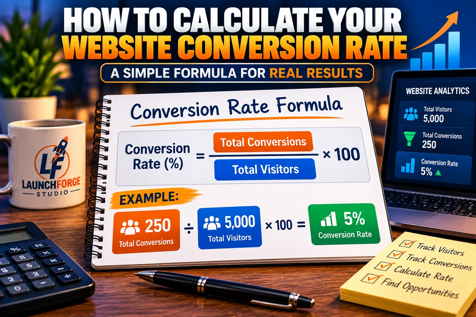
Calculate your website conversion rate by dividing conversions by visitors and multiplying by 100.
Before you can improve your website’s conversion rate, you need to understand how to calculate it.
Fortunately, the formula is much simpler than it sounds.
You don’t need advanced mathematics, expensive analytics software, or a background in digital marketing.
You simply need to know two things:
- How many visitors reached your website or landing page.
- How many of those visitors completed the action you wanted them to take.
Once you have those numbers, you can calculate your conversion rate as a percentage.
Understanding this basic calculation is one of the most important first steps in learning how to improve website conversion rates because it gives you a starting point for measuring progress.
The Website Conversion Rate Formula
The basic formula is:
Conversion Rate = (Number of Conversions ÷ Number of Visitors) × 100
Let’s break that down.
Imagine you’ve created a landing page offering a free beginner’s guide to starting an online business.
Over the course of one month, your landing page receives 500 visitors.
Of those visitors, 25 subscribe to receive your free guide.
Your goal is to generate email subscribers, so each successful signup counts as a conversion.
Using our formula:
(25 ÷ 500) × 100 = 5%
Your landing page has a 5% visitor-to-subscriber conversion rate.
That means approximately five out of every 100 visitors complete your desired action.
Simple enough, right?
But here’s where things get interesting.
Your conversion rate becomes even more useful when you start comparing results over time.
Understanding What Your Conversion Rate Actually Tells You
Let’s say your landing page continues receiving approximately 500 visitors each month.
During the first month, you generate 25 subscribers.
Your conversion rate is 5%.
You decide to make a few improvements.
You rewrite your headline to explain the benefits of your free guide more clearly. You also simplify your signup form by removing unnecessary fields.
During the second month, your landing page again receives 500 visitors.
But this time, 35 people subscribe.
Your conversion rate has increased to 7%.
Let’s look at those results individually.
Month 1: Before the Improvements
- Website visitors: 500
- Email subscribers: 25
- Conversion rate: 5%
Month 2: After the Improvements
- Website visitors: 500
- Email subscribers: 35
- Conversion rate: 7%
Your conversion rate increased from 5% to 7%.
That’s an improvement of 2 percentage points, representing a 40% relative increase in your conversion rate.
More importantly, you generated 10 additional subscribers without increasing your website traffic.
Of course, this is a simplified example.
In a real business, changes in traffic quality, visitor behavior, and normal fluctuations can influence your results.
You shouldn’t automatically assume that your new headline or signup form caused the improvement.
However, comparing conversion rates gives you a starting point for understanding whether your website is moving in the right direction.
The goal isn’t simply to collect more numbers. It’s to understand what those numbers can teach you about your visitors.
Different Website Goals Require Different Conversion Rates
One mistake beginners sometimes make is trying to measure every website action as though it represents the same result.
But different actions tell you different things.
For example, imagine you operate a website that promotes online business tools.
During one month, your website receives 1,000 visitors.
Of those visitors:
- 100 click a button to learn more about a recommended tool.
- 40 subscribe to your email newsletter.
- 15 complete a contact form.
You could calculate a separate conversion rate for each action.
Example 1: Affiliate Offer Clicks
Your website receives 1,000 visitors, and 100 click through to learn more about a recommended product.
The calculation is:
(100 ÷ 1,000) × 100 = 10%
Your affiliate offer click-through conversion rate is 10%.
This tells you how many visitors took the next step toward exploring your recommendation.
However, clicking an affiliate link doesn’t necessarily mean someone purchased the product.
Example 2: Email Newsletter Signups
Your website receives 1,000 visitors, and 40 subscribe to your newsletter.
The calculation is:
(40 ÷ 1,000) × 100 = 4%
Your email subscription conversion rate is 4%.
This measures how effectively your website encourages visitors to join your email list.
Example 3: Contact Form Submissions
Your website receives 1,000 visitors, and 15 submit a contact form.
The calculation is:
(15 ÷ 1,000) × 100 = 1.5%
Your contact form conversion rate is 1.5%.
This helps you understand how frequently visitors reach out for additional information.
Each percentage measures a different outcome.
And each can help you understand how visitors interact with your website.
Keep in mind that the same visitor might complete more than one action.
For example, someone could subscribe to your newsletter and later submit a contact form.
Those actions shouldn’t automatically be added together to calculate a single overall visitor conversion rate.
It’s also important to distinguish between total conversions and unique visitors who converted.
One person submitting the same form twice may produce two recorded events but represent only one converted visitor.
The most useful conversion rate is the one connected to a clearly defined business goal.
What Is a Good Website Conversion Rate?
This is one of the most common questions beginners ask.
And the answer might surprise you.
There isn’t one conversion rate that every website should aim for.
A conversion rate that looks impressive for one business might be disappointing for another.
That’s because conversion rates depend on several important factors.
Your Industry
Different markets attract visitors with different expectations, needs, and buying behaviors.
Someone shopping for an inexpensive everyday product may make decisions differently from someone researching a major business investment.
Your Offer
Downloading a free checklist requires less commitment than purchasing an expensive product or subscribing to a paid service.
The amount of time, money, or personal information you’re asking visitors to provide can influence whether they take action.
Your Traffic Source
Visitors arriving from a highly targeted search may behave differently from people clicking a general social media post.
Someone actively searching for a solution may already understand their problem and be ready to explore available options.
Your Audience
A website attracting people who are genuinely interested in its topic may experience different conversion results from a website attracting broad, untargeted traffic.
Understanding who visits your website is just as important as knowing how many visitors arrive.
Your Website Experience
Page speed, mobile usability, trust, navigation, and the clarity of your message can all influence how comfortable visitors feel taking action.
Your Conversion Goal
Newsletter signups, affiliate link clicks, quote requests, webinar registrations, and completed purchases represent different levels of commitment.
Comparing them as though they’re identical can lead to misleading conclusions.
This is why comparing your website against a random industry average isn’t always helpful.
Instead of worrying about whether your conversion rate matches someone else’s, focus on understanding your own performance.
If your landing page currently converts 2% of visitors into subscribers, your first objective might be to identify what prevents more visitors from signing up.
Then you can make targeted improvements and measure whether they help.
Your starting conversion rate is a baseline, not a judgment of your business.
Why Traffic Quality Matters Just as Much as Conversion Rate
Let’s look at another important consideration.
Imagine two different traffic sources sending visitors to your website.
The first traffic source sends 1,000 visitors during the month.
Of those visitors, 10 subscribe to your email list.
That gives you a conversion rate of 1%.
Now imagine a second traffic source sends only 200 visitors.
However, 20 of those visitors subscribe to your email list.
That gives you a conversion rate of 10%.
Let’s compare what happened.
Traffic Source A
- Total visitors: 1,000
- Email subscribers: 10
- Conversion rate: 1%
Traffic Source B
- Total visitors: 200
- Email subscribers: 20
- Conversion rate: 10%
Traffic Source A sends five times as many visitors.
But Traffic Source B produces twice as many subscribers.
That tells you something valuable.
More traffic doesn’t always mean more meaningful results.
Visitors who arrive with a clear need, a specific question, or genuine interest in your offer may be more likely to convert.
For example, someone searching for “how to create an email list for my small business” may be more interested in an email marketing tutorial than someone who casually clicks a general advertisement about making money online.
Understanding where your visitors come from can help you determine which traffic sources attract people who are genuinely interested in your content and offers.
This is also why conversion rate optimization and traffic generation should work together rather than compete for your attention.
You want visitors who are interested in what you offer, and you want a website that makes it easy for those visitors to take the next step.
How to Establish Your First Conversion Rate Baseline
If you’re just beginning to track website conversions, don’t worry about creating an elaborate reporting system.
Start with one important page and one meaningful goal.
For example, you might choose:
- Your main lead capture page.
- Your contact page.
- A landing page promoting a free resource.
- A service page encouraging visitors to request information.
- A page introducing visitors to an affiliate offer.
Next, identify the specific action you want visitors to complete.
Then follow these steps.
Step 1: Choose Your Conversion Goal
Decide exactly what counts as a successful action.
For example, a completed email signup might be your primary conversion.
Avoid trying to measure too many unrelated actions at once.
Starting with one clear goal makes it easier to understand your results.
Step 2: Select a Measurement Period
Choose a consistent period, such as 30 days, so you can compare results over time.
Consistency is important because comparing one week of traffic against three months of traffic won’t give you a particularly useful picture.
Step 3: Record Your Visitor Count
Use your analytics platform to identify how many people visited the selected page during that period.
Depending on the platform, you may see measurements such as users, sessions, or page views.
These are not interchangeable.
For a visitor-based conversion rate, use a consistent visitor measurement and make sure it matches how you’re counting conversions.
Step 4: Record Your Conversions
Count how many visitors completed your chosen action.
This could include email signups, completed contact forms, or clicks on a specific offer.
Make sure your conversion count and visitor count use compatible measurement definitions.
Step 5: Calculate Your Conversion Rate
Divide the number of converted visitors by your total visitors and multiply by 100.
For example, if 12 out of 300 visitors subscribe to your newsletter:
(12 ÷ 300) × 100 = 4%
Your visitor-to-subscriber conversion rate is 4%.
Step 6: Save Your Results
Record your baseline somewhere you can easily reference later.
A simple spreadsheet or tracking document is perfectly adequate.
Include the page you’re measuring, your conversion goal, the measurement period, total visitors, completed conversions, and calculated conversion rate.
You don’t need a complicated dashboard to begin making informed decisions.
Step 7: Review Your Performance After Making Improvements
Once you make a change, allow enough time to gather meaningful data before deciding whether it helped.
For websites with limited traffic, results may fluctuate significantly from week to week.
Avoid drawing strong conclusions from only a handful of visits or conversions.
The purpose of this process isn’t to become obsessed with percentages.
It’s to make more informed decisions about your website.
Use Website Analytics to Understand the Bigger Picture
Calculating your conversion rate is an excellent starting point.
But numbers become even more useful when you understand the visitor behavior behind them.
For example, your analytics might reveal that:
- A landing page receives plenty of traffic but generates very few signups.
- Mobile visitors convert less frequently than desktop visitors.
- Visitors from search engines engage differently from visitors arriving through social media.
- Certain pages consistently encourage visitors to explore additional content.
- A particular traffic source produces a higher percentage of qualified leads.
These observations can help you decide where to focus your attention.
Rather than changing everything on your website, you can investigate the pages and experiences that appear to need the most improvement.
If you’re still learning how to measure website performance, our guide on How to Track Website Traffic and Conversions: A Beginner’s Guide explains the fundamentals of understanding traffic sources, visitor behavior, and conversion tracking.
You don’t have to master every analytics feature immediately.
Start with a few meaningful measurements, learn what they tell you, and gradually expand your understanding.
Remember: Conversion tracking tells you what’s happening. Conversion rate optimization helps you decide what to improve.
Why Are Visitors Leaving Without Taking Action?
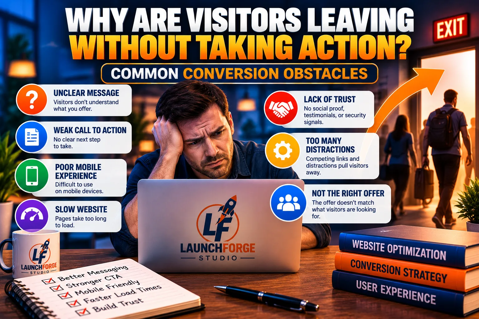
Unclear messaging, confusing calls to action, and poor usability can prevent website visitors from taking the next step.
You’ve attracted visitors to your website. They’re clicking your links, reading your content, and exploring what you have to offer.
But they’re not subscribing, requesting information, or taking the next step.
What’s going wrong?
Before you start changing headlines, redesigning pages, or experimenting with different buttons, it’s important to understand something:
Not every visitor who leaves your website represents a missed opportunity.
Some people are simply researching. Others may not need your solution right now. And some visitors might have arrived expecting something different from what your website offers.
That’s normal.
However, when visitors consistently leave without taking meaningful action, it may indicate that something about your website experience needs attention.
The challenge is identifying what that something might be.
Your Website Doesn’t Immediately Explain What You Offer
Imagine arriving at a website for the first time.
You’re greeted by an attractive image, a colorful headline, and several buttons.
But after spending 15 seconds looking around, you still can’t figure out what the business actually does.
Would you keep searching for answers?
Some visitors might. Others will leave.
One of the most common conversion obstacles is unclear messaging.
Your homepage or landing page should quickly help visitors understand three things:
- What your website offers.
- Who your website is designed to help.
- What visitors should do next.
For example, consider a headline that says:
“Discover Unlimited Possibilities for Your Future.”
It sounds inspiring, but what does it actually mean?
Are you selling software? Offering business training? Promoting financial services?
Now compare it with:
“Build Your First Online Business With Beginner-Friendly Websites, Funnels, and Marketing Tools.”
The second headline communicates a clearer purpose.
Visitors can immediately determine whether the offer is relevant to their needs.
Clarity is more valuable than cleverness when someone is trying to understand your business.
Visitors Don’t Know What to Do Next
Another common problem is the absence of a clear call to action.
A call to action, or CTA, is the instruction that encourages visitors to take a specific step.
Examples include:
- Download the Free Guide
- Join the Email List
- Explore the Business Platform
- Request More Information
- Watch the Training Webinar
Without a clear CTA, visitors may enjoy your content but leave without taking further action.
The same problem can occur when a page presents too many competing choices.
Imagine a landing page encouraging visitors to subscribe to a newsletter, watch a webinar, purchase a product, visit five different pages, and follow four social media accounts.
That’s a lot to process.
Instead, identify the primary purpose of each important page.
If the goal is generating email subscribers, make that action easy to understand and complete.
If the goal is encouraging visitors to explore a service, guide them toward the information they need.
Every important page should have a clear next step that makes sense for the visitor.
Your Website Creates Unnecessary Friction
In website conversion optimization, friction refers to obstacles that make it harder for visitors to complete an action.
Sometimes those obstacles are obvious.
A signup form might request too much information. A button might be difficult to find. Or a page might take too long to load.
Other obstacles are less noticeable.
For example, visitors might hesitate because they don’t understand what happens after submitting a form.
Will they receive an email? Will someone call them? Are they signing up for a free resource or a paid subscription?
Uncertainty can create hesitation.
Consider a newsletter form requesting a visitor’s name, email address, phone number, mailing address, and business details.
If the visitor only wants to receive a free checklist, that amount of information may feel excessive.
A simpler form requesting only the information genuinely needed could create a more comfortable experience.
Look for unnecessary steps, confusing instructions, and unanswered questions throughout your website.
The easier you make it for visitors to complete a meaningful action, the fewer avoidable obstacles stand in their way.
Your Website Doesn’t Build Enough Trust
Trust plays an important role in online decision-making.
When someone visits your website for the first time, they may know nothing about you or your business.
Before sharing their email address, requesting information, or purchasing something, they want reassurance that your website is legitimate and your offer is worth considering.
Several factors can influence that impression.
For example:
- Clear information about your business and its purpose.
- Accurate descriptions of your products or services.
- Easy-to-find contact information.
- Transparent pricing and terms when applicable.
- Genuine testimonials or reviews when available.
- A professional, mobile-friendly website experience.
- Honest explanations of what visitors can expect.
For beginners, building trust doesn’t require pretending to be a large corporation.
In fact, authenticity can be one of your greatest strengths.
Explain what you offer, who you help, and why you’ve created your business.
Be transparent about affiliate relationships and avoid promising results you cannot guarantee.
Trust grows when your website communicates honestly and consistently.
Your Website Isn’t Meeting Visitors’ Expectations
Sometimes a website’s conversion problem begins before the visitor even arrives.
Imagine someone searching for information about building a free website.
They click a search result promising a beginner-friendly tutorial.
But instead of finding useful instructions, they land on a page immediately pushing an expensive software package.
That creates a mismatch between their expectations and the content they receive.
The visitor came looking for education, but the page focused almost entirely on selling.
This is why search intent matters.
Your website content should deliver on the expectations created by your headlines, advertisements, search listings, and social media posts.
If you promise a tutorial, provide a useful tutorial.
If you promote a free resource, make the resource easy to access.
If someone clicks to learn about a business platform, explain the platform before asking them to make a decision.
When your content matches what visitors expected to find, you create a more relevant and helpful experience.
How to Identify Your Biggest Conversion Obstacles
Now that you understand some common reasons visitors hesitate or leave, where should you begin?
Start by examining one important page.
Look at it from the perspective of someone who has never visited your website before.
Ask yourself:
- Can I understand the purpose of this page within a few seconds?
- Is the main benefit clearly explained?
- Can I easily identify the next step?
- Does the page work properly on a mobile phone?
- Am I asking visitors for unnecessary information?
- Are there distractions competing with the primary goal?
- Does the content match the promise that brought visitors here?
- Have I provided enough information to help someone make a confident decision?
Then compare your observations with the information available in your website analytics.
For example, if mobile visitors rarely complete your signup form, test the form on an actual phone.
If visitors frequently reach a landing page but seldom click its main CTA, examine whether the button is visible, understandable, and relevant.
Remember that analytics can reveal patterns, but they don’t always explain why those patterns occur.
You may need to test different explanations before identifying the real problem.
The goal isn’t to find something wrong with every page. It’s to identify the improvements most likely to help your visitors.
Once you understand the obstacles, you’re ready to begin making practical changes.
And that’s where conversion rate optimization becomes especially useful.
12 Practical Ways to Improve Website Conversion Rates
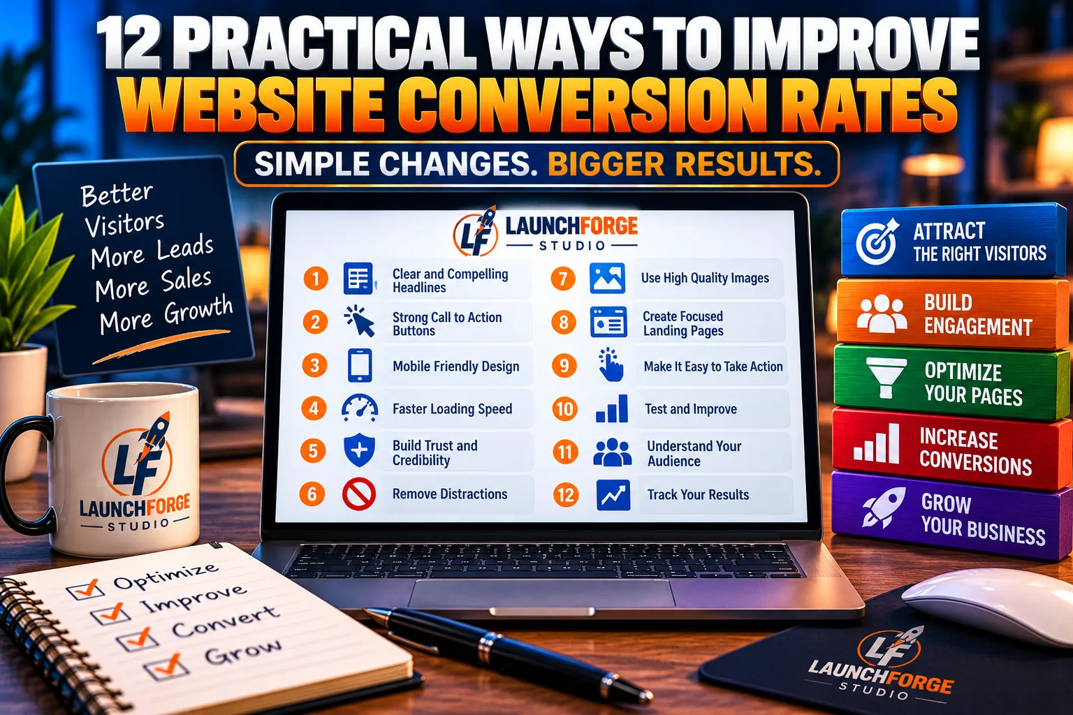
Explore 12 practical ways to improve website conversions through clearer messaging, better usability, stronger trust, and ongoing testing.
Now that you understand what conversion rates are and why visitors sometimes leave without taking action, let’s explore practical improvements you can make.
You don’t need to implement all 12 strategies immediately.
Start with the changes that address the biggest obstacles on your website, measure the results, and build from there.
1. Write Headlines That Clearly Communicate Value
Your headline is often one of the first things visitors notice.
It should quickly explain what you’re offering and why someone should care.
Avoid vague statements that sound impressive but don’t communicate a specific benefit.
For example, instead of:
“Unlock Your Unlimited Potential.”
Try:
“Build Your First Online Business With Beginner-Friendly Tools and Training.”
The second headline gives visitors a clearer understanding of what they’ll find.
When reviewing your headlines, ask whether someone unfamiliar with your business could understand your offer without reading several additional paragraphs.
2. Make Your Calls to Action Clear and Easy to Find
A call to action tells visitors what to do next.
If your primary button is hidden, confusing, or surrounded by competing options, visitors may hesitate.
Use direct language that describes the action.
For example:
- Download the Free Checklist
- Explore the Platform
- Watch the Free Training
- Get Started
- Request More Information
Place your primary CTA where visitors can find it naturally, especially after you’ve explained the value of your offer.
Want to make your buttons and links more compelling? Our guide on Landing Page Call to Action: How to Write One That Gets Clicks explains how to create clearer, more persuasive calls to action that encourage visitors to take the next step.
For longer pages, repeating the same relevant CTA at appropriate points can help visitors act when they’re ready.
A strong CTA should make the next step obvious without creating unnecessary pressure.
3. Improve Your Website’s Mobile Experience
Many visitors browse websites using smartphones.
If your website is difficult to navigate on a smaller screen, you could be creating unnecessary obstacles.
Check that:
- Text is readable without zooming.
- Buttons are large enough to tap comfortably.
- Forms are easy to complete.
- Images fit properly within the screen.
- Navigation menus work as expected.
- Important content isn’t hidden or cut off.
Don’t rely exclusively on how your website looks on a desktop computer.
For a more detailed walkthrough, check out our guide on How to Make a Mobile Friendly Landing Page, where we explore practical ways to create a better experience for visitors using smartphones and tablets.
Open your important pages on an actual phone and try completing the actions you want visitors to take.
A mobile-friendly design helps create a more accessible experience for your audience.
4. Make Your Website Load Faster
Website speed influences how smoothly visitors can interact with your content.
Slow-loading pages may frustrate visitors, particularly those using mobile connections.
You can begin improving performance by:
- Compressing large images.
- Using appropriately sized image files.
- Removing unnecessary plugins or scripts.
- Avoiding excessive animations.
- Choosing reliable hosting.
- Testing important pages with Google PageSpeed Insights.
You don’t need to chase a perfect performance score.
Focus on improvements that make your website noticeably faster and easier to use.
5. Simplify Your Signup and Contact Forms
Every unnecessary form field creates another task for your visitor.
If someone wants a free downloadable guide, do you really need their phone number, mailing address, and company size?
Probably not.
Ask only for the information necessary to complete the intended action.
Make field labels clear, explain what happens after submission, and confirm that the form works correctly.
For email subscriptions, clearly communicate what visitors are signing up to receive.
A simpler form can reduce friction, but it should still collect the information your business genuinely needs.
6. Strengthen Your Website’s Trust Signals
Visitors are more likely to consider taking action when they feel comfortable with your website.
Trust signals help communicate credibility.
Examples include:
- A clear About page.
- Accessible contact information.
- Honest product descriptions.
- Transparent pricing and terms.
- Genuine customer testimonials.
- Relevant examples of your work.
- A clear privacy policy.
Never invent testimonials, exaggerate results, or display endorsements you haven’t earned.
If you’re just starting your business, focus on transparency, useful educational content, and consistent communication.
7. Remove Distractions From Important Landing Pages
A landing page works best when visitors understand its primary purpose.
If you’re new to landing pages and want to understand how they fit into your online marketing strategy, our beginner-friendly guide on What Is a Landing Page and How Does It Work? explains their purpose, how they function, and why they’re important for generating leads and conversions.
Too many competing buttons, unrelated offers, and intrusive popups can make that purpose harder to recognize.
Review your landing pages and ask:
Does every major element help visitors understand the offer or complete the intended action?
You don’t necessarily need to remove all navigation or supporting information.
Instead, reduce distractions that compete directly with your main conversion goal.
For example, a page offering a free beginner’s checklist should make accessing that checklist straightforward.
8. Match Your Content to Visitor Search Intent
Visitors arrive with expectations.
Someone searching for a beginner’s tutorial wants useful instructions.
Someone comparing software platforms wants understandable features, benefits, limitations, and pricing information.
Someone ready to purchase may need reassurance before making a decision.
Your content should address those needs.
Use descriptive headings, answer relevant questions, and avoid forcing a sales pitch into content intended primarily to educate.
The better your content matches what visitors came to find, the easier it becomes to guide them toward a relevant next step.
9. Use Relevant Lead Magnets
Not every visitor is ready to purchase something immediately.
A lead magnet gives interested visitors a reason to stay connected with your business.
If you’re looking for more ways to encourage visitors to take that next step, our guide on How to Turn Website Visitors Into Leads: A Beginner’s Guide walks you through the process.
Common examples include:
- Beginner checklists.
- Downloadable guides.
- Templates.
- Short email courses.
- Helpful worksheets.
The key is relevance.
If you’re ready to create a valuable free resource for your audience, our step-by-step guide on How to Create a Lead Magnet: A Beginner’s Step-by-Step Guide walks you through the process of developing an offer that encourages visitors to join your email list.
A checklist about creating your first landing page is more useful to someone reading a landing page tutorial than an unrelated giveaway.
Explain what visitors will receive and how it helps solve a specific problem.
If you collect email addresses, be transparent about any additional marketing messages they’ll receive.
10. Improve the Readability of Your Content
Even valuable information can become difficult to use when it’s presented in large, overwhelming blocks of text.
Make your content easier to scan by using:
- Descriptive headings and subheadings.
- Short, focused paragraphs.
- Bullet points where appropriate.
- Clear examples.
- Meaningful bold emphasis.
- Helpful images when they genuinely clarify a concept.
Avoid unnecessary jargon, especially when writing for beginners.
Your goal is to help visitors understand the information without working harder than necessary.
Clear, readable content can also make it easier for visitors to locate the next step.
11. Test One Meaningful Change at a Time
Conversion optimization involves learning what works for your particular audience.
You might test a clearer headline, a shorter signup form, or different CTA wording.
Before changing something, identify the problem you’re trying to solve.
For example:
Problem: Visitors reach your signup page but rarely complete the form.
Possible explanation: The form requests too much information.
Proposed improvement: Remove unnecessary fields while keeping essential information.
Then measure what happens.
For a formal A/B test, compare variations under similar conditions and use enough data to draw a meaningful conclusion.
If your website receives very little traffic, results may be too uncertain to declare a winner.
In that situation, prioritize usability improvements and gather more information before making strong claims about performance.
12. Review Your Conversion Results Regularly
Improving website conversions isn’t a one-time project.
Visitor behavior, traffic sources, offers, and business goals can change.
Set aside time to review a few important measurements:
- Visitors to your most important pages.
- Completed conversions.
- Conversion rates.
- Traffic sources.
- Mobile and desktop performance.
- Changes you’ve recently made.
Look for meaningful patterns rather than reacting to every small fluctuation.
If an improvement appears promising, continue monitoring it.
If results decline, investigate what changed before making another adjustment.
The goal of conversion rate optimization isn’t perfection. It’s continuous improvement based on what your visitors actually need.
Start with one page, one problem, and one practical change.
Over time, those improvements can help you create a website that’s easier to use, more trustworthy, and better aligned with your business goals.
Your 7-Day Website Conversion Improvement Checklist
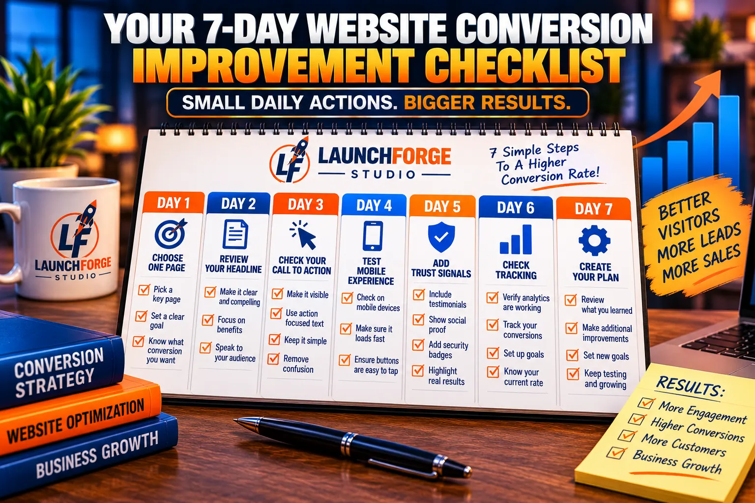
Follow seven practical steps to review your website, reduce conversion obstacles, and build a plan for improving visitor experiences.
Learning how to improve website conversion rates doesn’t mean you need to redesign your entire website overnight.
In fact, making too many changes at once can make it difficult to understand what’s helping and what isn’t.
Instead, use this simple seven-day checklist to identify opportunities, make practical improvements, and establish a foundation for measuring results.
Day 1: Choose One Important Page
Start with a page that serves a clear business purpose.
This might be your homepage, lead capture page, service page, or a landing page promoting an affiliate offer.
Identify the primary action you want visitors to complete.
Your goal: Know exactly what success looks like for that page.
Day 2: Review Your Headline and Message
Read your page as though you’re visiting it for the first time.
Can you immediately understand what the page offers, who it’s for, and why it matters?
Rewrite confusing headlines and remove unnecessary jargon.
Your goal: Make your offer easier to understand.
Day 3: Examine Your Call to Action
Find your primary CTA.
Is it easy to locate? Does the wording explain what happens when someone clicks?
Make sure your CTA supports the page’s main purpose.
Your goal: Give visitors one obvious next step.
Day 4: Test the Mobile Experience
Open your page on a smartphone.
Check the navigation, buttons, images, and forms.
Try completing your desired action yourself.
Your goal: Identify and fix obstacles that make mobile interactions difficult.
Day 5: Improve Trust and Reduce Friction
Review your contact information, offer descriptions, and signup forms.
Remove unnecessary form fields and explain what visitors can expect after taking action.
Your goal: Make the experience clearer and more trustworthy.
Day 6: Check Your Conversion Tracking
Confirm that your analytics setup measures the action you’ve chosen.
Record your current visitor count and conversion rate using consistent measurement definitions.
Your goal: Establish a reliable baseline for future comparisons.
Day 7: Create Your Improvement Plan
Review what you’ve discovered.
Prioritize one or two meaningful improvements instead of changing everything simultaneously.
Document your changes and decide when you’ll review the results.
Your goal: Build a repeatable improvement process.
Remember, seven days is enough time to complete an initial website review, but it may not be enough time to determine whether your changes improved conversions.
Meaningful results require sufficient data and ongoing observation.
Frequently Asked Questions About Website Conversion Rates
Can I Improve Website Conversions Without Paying for Advertising?
Yes. Improving headlines, simplifying forms, clarifying calls to action, and creating a better mobile experience are all changes you can make without increasing your advertising budget.
However, the results will depend on your audience, offer, and existing website performance.
How Long Does Conversion Rate Optimization Take?
Some usability improvements can be completed in a single afternoon.
Measuring their effectiveness may take considerably longer, especially if your website receives limited traffic.
Focus on gathering meaningful evidence rather than expecting immediate results.
Do I Need Expensive Software to Improve Conversion Rates?
No. Beginners can start with their existing website tools, free performance testing resources, and basic analytics.
Specialized optimization software may become useful as your business grows, but it isn’t necessary for every website.
Should I Focus on Website Traffic or Conversions First?
Both matter.
You need relevant visitors to generate meaningful conversions, but attracting additional traffic won’t necessarily solve problems with unclear messaging or difficult signup processes.
A balanced approach focuses on bringing the right people to your website and helping them take appropriate next steps.
Final Thoughts: Better Website Conversions Start With Better Visitor Experiences
Understanding how to improve website conversion rates is an important step toward building a more effective online business.
But conversion optimization isn’t about manipulating visitors or chasing impressive percentages.
It’s about understanding what people need, removing unnecessary obstacles, and helping them make informed decisions.
Start small.
Choose one important page. Identify one problem. Make one thoughtful improvement.
Then measure what happens.
Whether you’re building your first website, growing an email list, promoting affiliate offers, or introducing visitors to an online business platform, the same principle applies:
Make your website easier to understand, easier to trust, and easier to use.
You don’t need to change everything today.
You just need to start making meaningful improvements.
Because more traffic can create more opportunities, but a better visitor experience helps you make the most of the opportunities you already have.